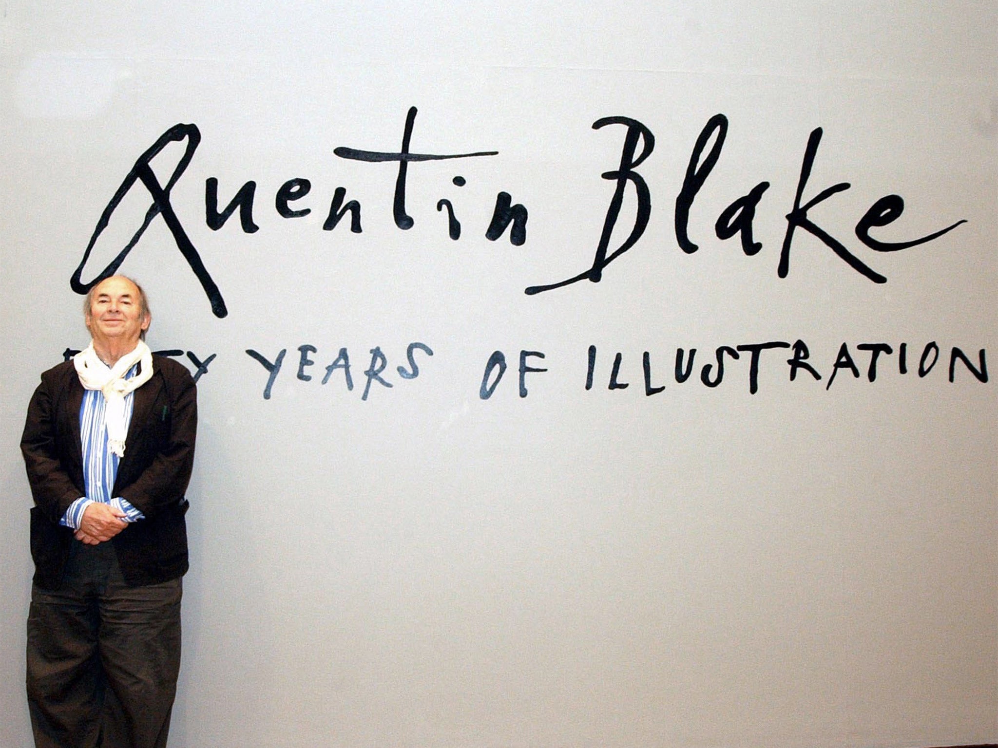
Quentin Blake: Roald Dahl illustrator’s unique handwriting captured in font typeface
Graphic designers created special font which captures spiky spontaneity and joy of his etchings for future generations

Your support helps us to tell the story
From reproductive rights to climate change to Big Tech, The Independent is on the ground when the story is developing. Whether it's investigating the financials of Elon Musk's pro-Trump PAC or producing our latest documentary, 'The A Word', which shines a light on the American women fighting for reproductive rights, we know how important it is to parse out the facts from the messaging.
At such a critical moment in US history, we need reporters on the ground. Your donation allows us to keep sending journalists to speak to both sides of the story.
The Independent is trusted by Americans across the entire political spectrum. And unlike many other quality news outlets, we choose not to lock Americans out of our reporting and analysis with paywalls. We believe quality journalism should be available to everyone, paid for by those who can afford it.
Your support makes all the difference.The distinctive style of Sir Quentin Blake, acclaimed illustrator of Roald Dahl’s novels, is surely inimitable.
But now graphic designers have created a special font which captures the spiky spontaneity and joy of his etchings for future generations.
Still in demand at 83, Sir Quentin, who brought Dahl classics The Twits and The BFG to visual life, is too busy to meet every request from film and computer games for handcrafted work.
Collaborating with Monotype, a font design agency, Sir Quentin has approved a new typeface, based on his handwriting, which incorporates chance elements to capture his anarchic approach to lettering.
Working from handwritten samples, Monotype type designer Toshi Omagari has constructed a typeface that he believes accurately reflects the playfulness and whimsy of a Blake original.
The typeface will be used in publishing, apps based on Dahl’s stories and merchandise which will continue to preserve Sir Quentin’s humorous design style, long after he is unable to craft his own work.
For Omagari’s typeface to appear authentic, it had to mimic Blake’s own handwriting idiosyncrasies - the “small and varying lowercase height, the unpredictable stroke thickness, the exaggerated crossbars and tails.”
Quentin Blake knighted, February 2013
It also had to capture the rhythm and spacing Sir Quentin would use when laying out a piece of lettering by hand, and be sufficiently flexible for translation into foreign languages.
After redrawing individual letters, numbers and symbols provided by Sir Quentin, the designer found a balance between variety and regularity. “It had to look random, and it had to hide the fact that it’s not his actual handwriting,” Omagari said. “Without variants, handwriting fonts run the risk of looking unnatural; too many and the process can become unmanageable.”
“Quentin’s writing is anything but regular but it’s not totally random either. There’s something you can find in it to say that it’s his - just as no single cloud is identical to another and has no definite shape, when you find one in the sky you can still tell it’s a cloud.”
The typeface offers users options which Sir Quentin only enjoys subconsciously – as each letter is typed, one of four variants appears in an order that avoids repetition of the same shape, making it appear random.
Sir Quentin has approved the typeface for use in a Dahl-inspired app called Twit or Miss, a television programme Britain’s Favourite Children’s Books, and a series of new mugs for sale on his website. It will ultimately be used in screen and stage titles, captions and graphics.
Omagari, who did not meet the illustrator during the process, said Sir Quentin’s electronic imprint could translate into Russian or Greek.
However one design critic claimed on Twitter that the typeface “looks clunky and lifeless beside the handwriting. It evidently shows the limitations of emulating handwriting in a font.” Sir Quentin responded: “No typeface could capture the thought & skill that goes into hand-lettering; but it’s very good when the ‘real thing’ not available.”
Sir Quentin, who is to publish a new picture book, Three Little Monkeys, said: “I have been impressed by the way that Monotype interpreted my handwriting in various forms, so that it has the distinctive characteristics but at the same time is eminently usable as a typeface in any number of situations.”
Popular celebrity fonts for public use include digital replica signatures of English Monarchs (“from Richard II through Elizabeth II including Stuart pretenders” for £12.99), American Presidents and Hollywood Stars, a collection of autographs of famous actors, including Marilyn Monroe and Al Pacino, which can be used to “sign” a card or email. Copyright protection does not cover type fonts and unique typographical designs in the US, boosting a typeface industry.
A Kickstarter campaign launched by a typographer in Germany recently raised the money to develop a computer typeface mimicking the handwriting of Albert Einstein.
Join our commenting forum
Join thought-provoking conversations, follow other Independent readers and see their replies
Comments