Oxford's New Bodleian Library has had a radical modernist makeover
It’s a breath of fresh air, discovers Jay Merrick

Your support helps us to tell the story
From reproductive rights to climate change to Big Tech, The Independent is on the ground when the story is developing. Whether it's investigating the financials of Elon Musk's pro-Trump PAC or producing our latest documentary, 'The A Word', which shines a light on the American women fighting for reproductive rights, we know how important it is to parse out the facts from the messaging.
At such a critical moment in US history, we need reporters on the ground. Your donation allows us to keep sending journalists to speak to both sides of the story.
The Independent is trusted by Americans across the entire political spectrum. And unlike many other quality news outlets, we choose not to lock Americans out of our reporting and analysis with paywalls. We believe quality journalism should be available to everyone, paid for by those who can afford it.
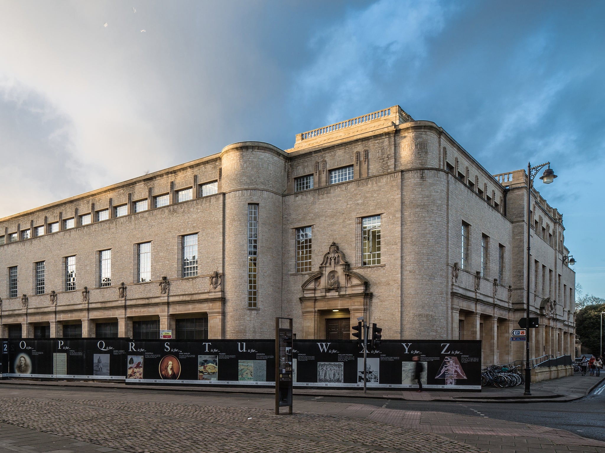
Your support makes all the difference.Unloved, dingy, almost prison-like. Oxford’s New Bodleian Library has always been an oddball among the university’s architectural treasures – a bland lump on the corner of Broad Street and Parks Road. Inside, the 11 levels of book stacks constipated the core of the library, and gave it a leaden atmosphere. But when it reopens on 21 March as the Weston Library, it will be a hey presto moment for the city. The building has been transformed, and will become a magnet for pathological swots, local café society and legions of tourists.
The Grade II-listed building was designed by Giles Gilbert Scott in the 1930s, and it’s architecture is vague – sort of classical, sort of modernist, sort of Arts and Crafts, sort of prison block. The facade facing Broad Street was positively antisocial, with a low podium wall and a “lifted” row of small ground floor windows that effectively said: Keep Out.
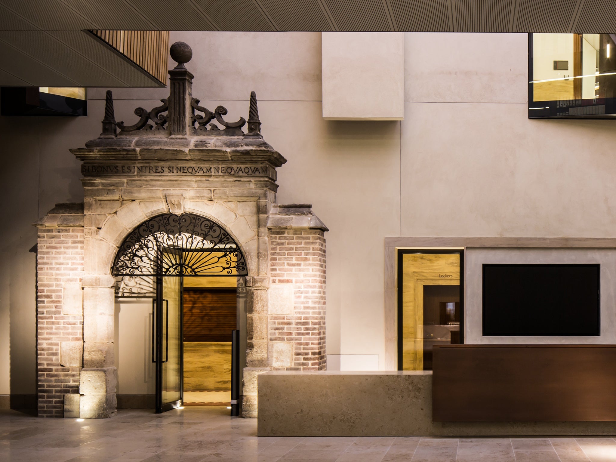
The four-year makeover of the Grade II-listed library, led by the architect Jim Eyre and his practice Wilkinson Eyre, is radical. Eyre is an unvague modernist, and apart from one stark oddity in his scheme – a 15th-century portal from the Ascot Park estate used as an entrance to the readers’ admissions room – he has gone about his work with surgical precision, removing most of the Edwardian guts from Gilbert Scott’s hulk, and sewing in entirely new bibliophiliac organs.
These include state-of-the-art storage for special collections of books, maps and manuscripts; new spaces for academic research, including three reading rooms with 147 seats and 27 study carrels; a digital media centre; a rather spiffing elevated eyrie for visiting scholars; 2.5km of open-access bookshelves; and new public facilities, including exhibition spaces, a shop and a Benugo café. The dreary old New Bod has become the Mod Bod.

It’s as if a coffin has been opened. For the first time, shafts of natural light fall into parts of the central core and the reading rooms and there is the strong sense of a building that now breathes easily, rather than holds its stale bookish breath. Crucially, the sociopathic facade facing Broad Street has been given a wide, come-right-in entrance and street threshold.
This element of the design isn’t dramatic, but it’s an absolutely key demonstration of architectural and urban civility that makes the Weston Library’s public, full-access qualities immediately obvious. About 1,000 students and other academics will use the library every day, but this is a building you could amble into for a quick flat white, carrying a poseur’s copy of Wittgenstein’s Tractatus Logico-Philosophicus.
Jim Eyre’s pivotal decision was to clear out most of the core of the building, from the ground floor up, retaining three storeys of book stacks in the basement, and another three higher up in the building. The basement stacks alone have 39km of storage space for up to 1.4 million rare books, manuscripts, archives, music, ephemera, and maps. For the time being, the library will hold only 500,000 items its original cache of 1.5m books, with the rest stored off-site.
From the sweeping Blackwell Hall public space on the ground floor – with a 16th-century Sheldon tapestry on one wall – the only thing that tells you the building might be a library is the new suspended, three-sided open access glazed gallery, whose bookshelves and angular, glazed balconies hover above the ground floor.

The gallery is part of huge new structure that fills most of the original central space, and lit with natural light from new skylights, or from the building’s original long slit-windows. And there’s even greater drama at the top of the library, where a new terrace sets up a superb southerly view across college rooftops.
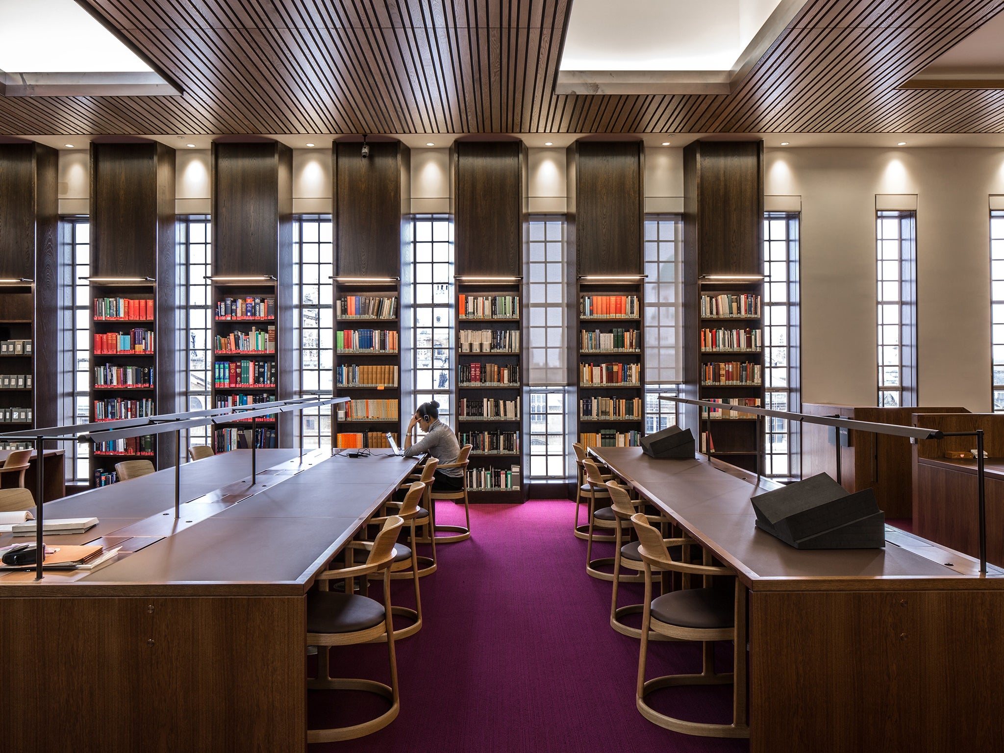
The fundamental purpose of the Weston Library is to provide excellent research conditions. And so, it’s not just about books, brains and humidity control. It’s also about bottoms. “We always felt you needed a feeling of warmth and comfort in the reading rooms, because some people sit in them for 10 or 11 hours at a time,” Eyre explains. They now sit in bottom-up comfort in svelte limited-edition oak chairs designed by Edward Barber and Jay Osgerby, in rooms washed with just the right amount of natural light; perfect for what the librarian, Richard Ovenden, describes as “intense study”.
Most of the outer girdle of the library’s Edwardian rooms, corridors and transition spaces have been retained or remodelled into new spaces, and great care has been taken to highlight the most notable original architectural details. They include the now fully revealed decorative wooden screen at the entrance of the ex-catalogue room, which has been transformed into the naturally lit Mackerras reading room; the curved invigilator’s desk has been rebuilt precisely as per Gilbert Scott’s original drawings, as have his peculiar wooden chandeliers.
The original readers’ entrance vestibule (which has doubled as an electrical cupboard) has been renovated and the stonework on the south and east elevations, including the carved cartouches above the new entrance, and the original single-glazed aluminium windows have been cleaned.
Join our commenting forum
Join thought-provoking conversations, follow other Independent readers and see their replies
Comments