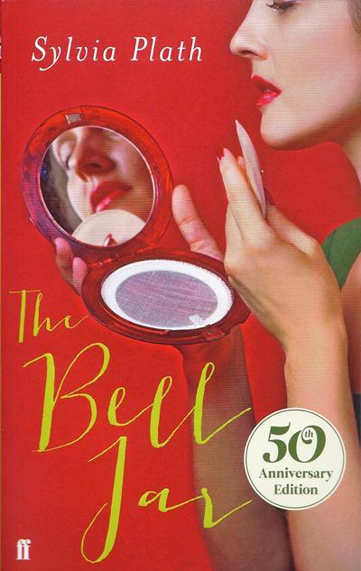
'An insult to women everywhere' - Sylvia Plath’s The Bell Jar gets a 'chick lit' makeover
Publisher Faber is facing a serious backlash from disgruntled readers

Your support helps us to tell the story
From reproductive rights to climate change to Big Tech, The Independent is on the ground when the story is developing. Whether it's investigating the financials of Elon Musk's pro-Trump PAC or producing our latest documentary, 'The A Word', which shines a light on the American women fighting for reproductive rights, we know how important it is to parse out the facts from the messaging.
At such a critical moment in US history, we need reporters on the ground. Your donation allows us to keep sending journalists to speak to both sides of the story.
The Independent is trusted by Americans across the entire political spectrum. And unlike many other quality news outlets, we choose not to lock Americans out of our reporting and analysis with paywalls. We believe quality journalism should be available to everyone, paid for by those who can afford it.
Your support makes all the difference.The Bell Jar is a searing semi-autobiographical look at Sylvia Plath’s struggle with mental illness. But its publishers Faber seem to want to attract a new readership for the troubled poet who died with her head in an oven in 1963. The 50th anniversary edition of her cult first novel, published shortly before her death, has been repackaged as “chick lit” according to a host of appalled readers.
The anniversary edition is a far cry from Shirley Tucker’s 1966 design for Faber in cream and green concentric circles, or the later paperback version of a woman resembling Plath but with her hair and skin unnaturally colourful, the edges of which bleach out and bleed into one another distorting the portrait.
Today's cover is a bright bubblegum pinky red (above), contrasting with a 1950s photo of a young woman patting powder from a compact onto her face, her ruby lips reflected in its mirror. For its stylised, and "Vintage", attractiveness - recalling the glamour of the 1950s and 60s so in Vogue thanks to Mad Men and Call The Midwife - , the cover has provoked a huge backlash, with many calling it an insensitive choice for a book ground-breaking for detailing the suffocating power of gender stereotyping.
Twitter is a awash with reaction: Letters of Note founder Shaun Usher called it "hideous” and journalist Sarah McAlpine tweetied: “This is just an insult to women everywhere”. Language consultancy The Writer said: “Oh dear. How did Faber get the new cover of The Bell Jar so wrong? Have they read it?” Graphic designer Andy Pressman called it “Awesomelycomicallyhistorically inapprop”; and marketing manager at Melville House Dustin Kurtz tweeted: “How is this cover anything but a ‘f*** you’ to women everywhere?”
The accompanying blurb has also been rewritten in a style that has caused offence for highlighting the "fashions" and "cocktail parties" and aspirations of its protagonist rather than the deep-rooted social unease and fears, such as of the "endless corridors of pain" of birth and motherhood, that much of the novel deals with. It tells us: “When Esther Greenwood wins an internship on a New York fashion magazine in 1953, she is elated, believing she will finally realise her dream to become a writer. But in between the cocktail parties and piles of manuscripts, Esther's life begins to slide out of control.”
The appearance and tone of the new edition has been lambasted by Fatema Ahmed writer for The London Review of Books “for treating fiction by women as a genre, which no man could be expected to read and which women will only know is meant for them if they can see a woman on the cover.”
One Twitter user, Cethan Leahy, was so appalled he even came up with his own alternative cover: "Based on what little I know about the novel, I have made a book cover of The Bell Jar Hire Me! pic.twitter.com/A6kQddvK "
Faber was unavailable for comment at press time.
Join our commenting forum
Join thought-provoking conversations, follow other Independent readers and see their replies
Comments