They came in with William Caxton's printing press, but typefaces still matter in the digital age
A new typeface once took years to create, now thousands are available at the click of a drop-down menu. So why do most of us still rely on the old classics, asks Meg Carter?

Your support helps us to tell the story
From reproductive rights to climate change to Big Tech, The Independent is on the ground when the story is developing. Whether it's investigating the financials of Elon Musk's pro-Trump PAC or producing our latest documentary, 'The A Word', which shines a light on the American women fighting for reproductive rights, we know how important it is to parse out the facts from the messaging.
At such a critical moment in US history, we need reporters on the ground. Your donation allows us to keep sending journalists to speak to both sides of the story.
The Independent is trusted by Americans across the entire political spectrum. And unlike many other quality news outlets, we choose not to lock Americans out of our reporting and analysis with paywalls. We believe quality journalism should be available to everyone, paid for by those who can afford it.
Your support makes all the difference.It's one of the most successful type designs in history and yet Times New Roman could be on its way to becoming the next Comic Sans – something of a laughing stock.
Last week, Bloomberg asked three typography experts about the best and worst fonts to use on job applications and one issued a stark warning to job seekers who use Times New Roman. "It's telegraphing that you didn't put any thought into the typeface that you selected," designer Brian Hoff said. "It's like putting on sweatpants."
Regardless of whether a font really is the equivalent of wearing the wrong trousers at a job interview (the consensus of the men and women of letters was that Helvetica is the safest bet for CVs), that a typeface created in 1931 is still making headlines is proof of the enduring power of fonts not only in print, but also online.
"Today," writes Simon Garfield, in his best-selling book Just My Type, "we can imagine no simpler everyday artistic freedom than the pull-down font menu… Computers have rendered us all gods of type, a privilege we could never have anticipated in the age of the typewriter."
And yet because some fonts, including Times New Roman, are a default font in software programmes such as Word, using them looks like you've not bothered to navigate the font dropdown, says Will Pyne, the co-founder of the creative agency Holler. "A shift in the social ether and the technology-driven democratisation of creativity and design has meant that lots more people now have an interest in fonts," he says.
"More people now have a more sophisticated understanding of visual design and typography. This means we're all more discerning. Maybe that's why the lone wolf who uses Times New Roman on their CV is now seen as some kind of graphical terrorist."
Phil Wilce, the creative director at the digital agency TH_NK, goes further. "Fonts are as important in a digital age as they've ever been, if not more," he believes.
Every single day, we use products and services in our digital lives that have no physical presence, with which we have no human interaction. In these instances, fonts can bring personality – such as warmth, humour or confidence – that we'd not experience without walking into a high-street store. "Fonts can bring provenance, trust or authority when you need it," Wilce adds. "And the choice of font can be pivotal to the success of a digital business."
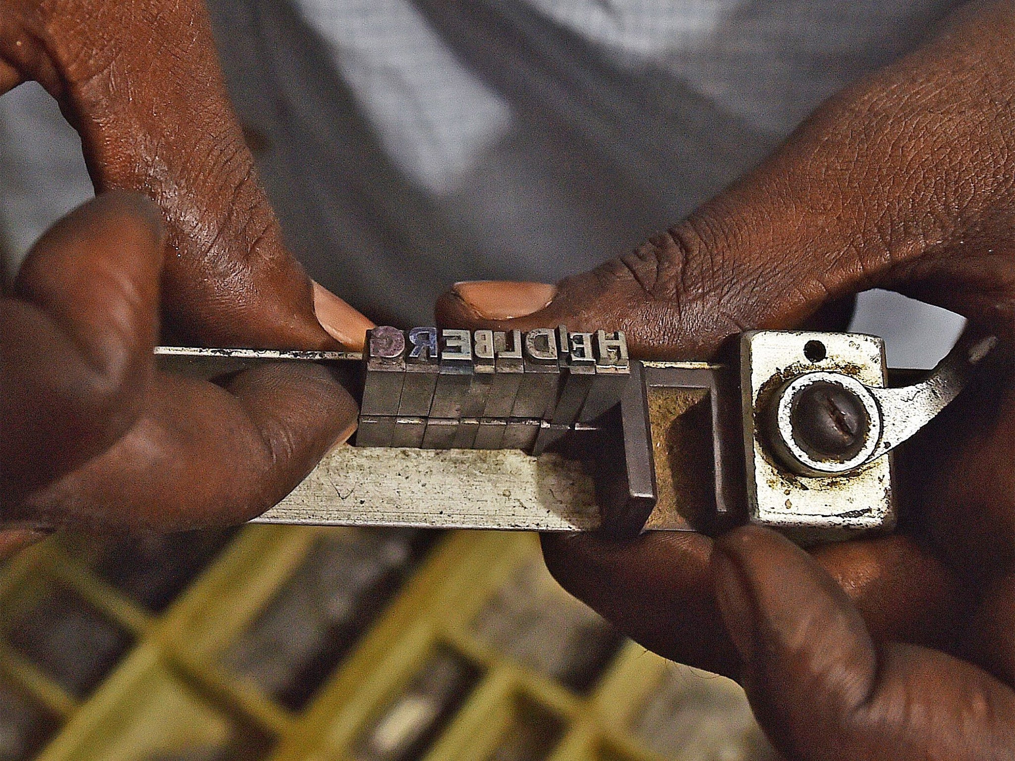
Before the dawn of digital and desktop publishing, printing involved first setting out every page of text within frames using thousands of individual metal blocks – each featuring a different, single character. The style of lettering was the "typeface" while the subset of blocks used, which could vary according to size, was the "font" (though for many people, nowadays the two terms have become interchangeable).
Crafted by hand, traditional fonts could take years to create. But even in a digital age where a new font can be created in minutes, the cultural legacy of traditional craft skills lives on.
Take the serif – the small line attached to the end of a stroke in a letter or symbol was caused by the chisel when ancient Romans carved letters into stone, says Steven Bennett-Day, the global creative director at the digital agency Havas Helia.
"Even with the wide array of new digital typefaces now readily available, serif ones are still perceived by many as lending greater weight," he says.
Then there's the new generation of young designers creating new fonts not from their design studios, but digital type "foundries".
"Our name is a tongue-in-cheek reference to the factories that once made metal and wood typefaces," explains Ed Harrington, the co-founder of Colophon Foundry, which has created fonts for Fulham FC and Grey Goose vodka.
Almost anyone can create a typeface these days thanks to the internet democratising their design as well as revolutionising their distribution. A mind-boggling 27,515 different fonts are currently available for download on DaFont.com, the world's biggest font site.

Not that volume guarantees quality. "Lots of fonts are now available free and there has been a stigma attached to many of these, although the Google Fonts programme, with its open-source fonts, has challenged this and quality is rising," Harrington says.
"The key to a good font is how you translate an interesting alphabet into a usable software font file – all are software at the end of the day. The more you refine them, the easier they are to use, so what makes a good one is time."
The digital world is also helping typeface design to evolve in innovative and unexpected ways. Take Homelessfonts (homeslessfonts.org) – an initiative by the homelessness charity Arrels Foundation to create a collection of typefaces based on the handwriting of homeless people living on the streets in Barcelona. When someone pays to use the font, the profit goes towards helping the 1,400 people whom the charity supports. Each font is named after the individual whose writing it represents.
Or the Universal Typeface Experiment (theuniversaltypeface.com), conceived for the pen maker Bic, which last August released a crowdsourced typeface based on handwritten letters from anyone willing to draw them. There's environmentally friendly typeface courtesy of Ryman Eco, which is called Eco Font (rymaneco.co.uk) and is designed to capitalise on the ink bleed and toner spill that occurs on home and office printers to save ink.
More attention is being paid to the accessibility of typefaces, too, with new fonts created to be more legible by the visually impaired. There's a specific font for dyslexics, Dyslexie (dyslexiefont.com), designed to be easier to read with larger-than-normal openings, alternating stick and tail lengths, and a heavy base line.
But with so many fonts now to choose from, why do we see a far smaller variety actually in regular use – especially online?
"Online variety was limited to initial restrictions on what you could do while ensuring your copy was accessible across every different desktop computer," Bennett-Day explains. "But technology has evolved to enable you to use almost any font you want to online, the limiting factor now being screen size."
Accepted taste can have a big impact on what is perceived as "good" font design. Fashion, too, has a role to play and has driven the recent popularity of fonts that feel "real" and "authentic".
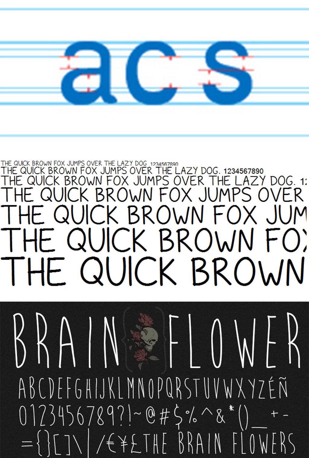
Take the spindly, upper-case scrawl Brain Flower (dafont.com/brain-flower.font), affectionately known as "hipster sans serif", which now crops up on anything from magazine covers to menus, salad bags and yoghurt pots. It's a move away from technology even though it's being delivered and enabled by technology – a backlash against the internet-y-ness of things.
"Today's handwritten fonts that don't look as if they have been designed by computer, even though they probably have, are a kick against the made-by-machine vibe," Andy Lockley, the creative director at the advertising agency Grey London, who worked on the launch of Ryman Eco, says. They are an attempt to put the real world into the digital world, he believes. And Lockley believes the reason's simple: "Designers just won't let the old traditions and traditional fonts that were forged out of metal die."
Join our commenting forum
Join thought-provoking conversations, follow other Independent readers and see their replies
Comments