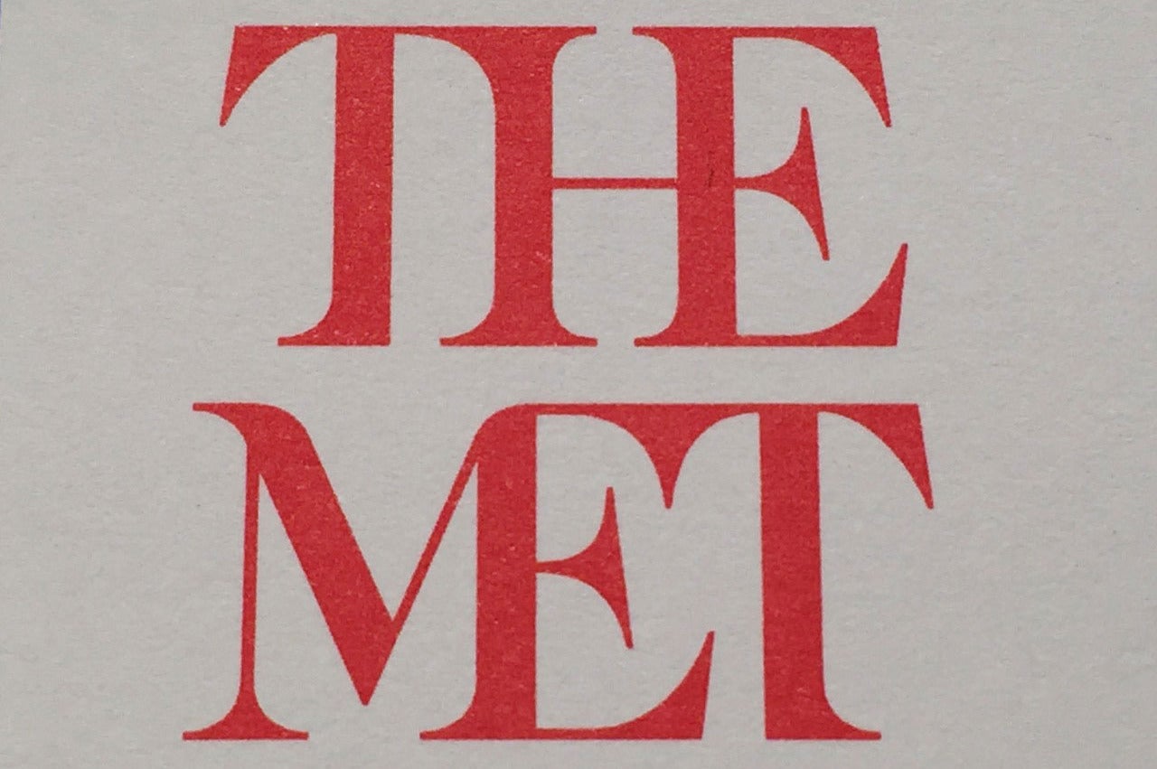
The Met museum’s new logo is infuriating typography enthusiasts
'The entire top half of the new logo consists of the word 'the''

Your support helps us to tell the story
From reproductive rights to climate change to Big Tech, The Independent is on the ground when the story is developing. Whether it's investigating the financials of Elon Musk's pro-Trump PAC or producing our latest documentary, 'The A Word', which shines a light on the American women fighting for reproductive rights, we know how important it is to parse out the facts from the messaging.
At such a critical moment in US history, we need reporters on the ground. Your donation allows us to keep sending journalists to speak to both sides of the story.
The Independent is trusted by Americans across the entire political spectrum. And unlike many other quality news outlets, we choose not to lock Americans out of our reporting and analysis with paywalls. We believe quality journalism should be available to everyone, paid for by those who can afford it.
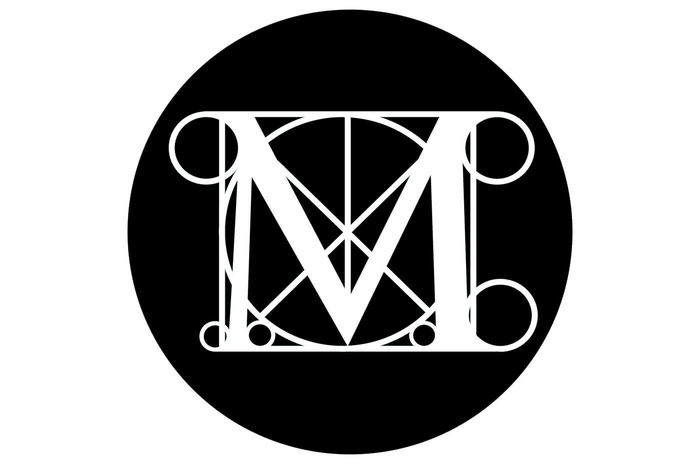
Your support makes all the difference.New York’s Metropolitan Museum of Art is ditching the iconic M logo it has been using since 1971 in favour of a font-based one that looks a lot like the title of a 70s lifestyle magazine.
The logo is part of a rebrand the museum is undergoing and has been described as “a graphic misfire” and “a disaster”.
It was given a particularly savage thrashing by Pulitzer Prize-winning music and architecture critic Justin Davidson, who wrote in Vulture: “In its logo, the Met is now THE MET, the two short words printed in scarlet letters, stacked and squashed together.
“The whole ensemble looks like a red double-decker bus that has stopped short, shoving the passengers into each other’s backs.
“Worse, the entire top half of the new logo consists of the word the.”

The museum responded to the widespread criticism on Thursday evening, saying that it chose the font “because it represents something simple, bold, and indisputable: The Met is here for everyone.”
“We think it’s great that people are talking about the work. At Wolff Olins [London-based branding firm], we always aim to create work that people feel strongly about,” said Amy Lee, the strategy director, and Lisa Smith, creative director and head of design at Wolff Olins, New York. “The project is about far more than just a logo—it is about expanding the reach and relevance of the Met.”
Join our commenting forum
Join thought-provoking conversations, follow other Independent readers and see their replies
Comments