Great Works: The London Underground Map (1931)
London Transport Museum
Your support helps us to tell the story
From reproductive rights to climate change to Big Tech, The Independent is on the ground when the story is developing. Whether it's investigating the financials of Elon Musk's pro-Trump PAC or producing our latest documentary, 'The A Word', which shines a light on the American women fighting for reproductive rights, we know how important it is to parse out the facts from the messaging.
At such a critical moment in US history, we need reporters on the ground. Your donation allows us to keep sending journalists to speak to both sides of the story.
The Independent is trusted by Americans across the entire political spectrum. And unlike many other quality news outlets, we choose not to lock Americans out of our reporting and analysis with paywalls. We believe quality journalism should be available to everyone, paid for by those who can afford it.
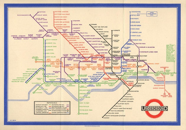
Your support makes all the difference.Some maps look like images, not by trying, but simply because some lands look like figures. Great Britain, for example, resembles an approximate figure: Scotland the head, East Anglia the bottom, Wales the hands, the West Country an extended leg. Some very old maps can look like caricatures. It's as if they had taken a country's profile and pulled it out of shape, giving it a grim or cheerful character. Some maps, though, have very little relation to geography. Think of the London Underground Map.
Other cities show you the facts. In Paris, at any station, you can find a layout of the Metro's lines, a dense and irregular web, superimposed accurately on a street map of the city. The London tube map left earthly reality behind long ago. In the early 1930's Harry Beck introduced his revolutionary design.
Beck's great innovation is that his map is not a map. It's a plan or diagram. Using geometrical forms, it displays the lines, the sequence of stations, their connections, in as transparent a way as possible. Tunnels go straight. They lie horizontally, vertically or at 45 degrees. They bend in regular curves. Stations are at regular intervals. Beck's plan observes topology, paying only a minimal respect to geography.
It's a model of order for tube journey planning. It can be very misleading for judging true distances or making walks. The Beck diagram makes the London Underground into a parallel dimension. Its stations become mysterious portals between this self-contained system and the real world above. Few travellers have any idea of where its actual routes run beneath the city streets. All we know is this beautiful fiction. Should we call it a work of art?
It obviously has an aesthetic. Its geometrical forms are a modernist idiom, conveying modernist values: functionality, efficiency, economy. It looks a bit like a Mondrian abstract, or like an electric circuit board. (Circuitry wasn't in fact Beck's inspiration, as is sometimes thought, but the likeness is clear enough.) And this visual language doesn't only present the plan's information very efficiently. It suggests that the tube itself is a very efficient system, a utopia for the traveller. Beck's diagram is not a caricature of what it describes, but the opposite: an idealisation.
That's a general effect. But the peculiarity of the Beck plan is that it offers its maker considerable freedom of operation. A proper map allows little liberty. The mapper must trace the world obediently. The Beck scheme has its rules for translating tunnels into lines, but their application is flexible. A bend can happen here or there. Lines may be level or diagonal, parallel or symmetrical. It leaves many choices open, both in its overall formation and in details.
So questions of design arise. What guides these choices? Did Beck arrange his plan with any patterns or figures in his mind? When he has an option about how lines go, does he ever decide by artistic criteria? Balance, energy, tension, grace, depiction even? In short, is he drawing with his stout coloured lines? Is he composing?
His graphic decisions may only be guided by clarity, and if we see a composition in his diagram, it may be something we fancy, like a constellation in the stars. True. But then Beck himself may be susceptible to these fancies. It may simply be impossible for him to avoid some form of art.
Perhaps it's too much to suppose he consciously shaped the likeness of a "hippocampus" – ie Neptune's mythical merhorse – that seems to ride out over the wavy Thames on the west side of the plan (its head ending at Uxbridge, its bending legs at Hounslow West and Richmond, its fishtail descending to Wimbledon). But it's hard to believe that Beck was wholly blind to the abstract forces he was playing with. The five parallel diagonals going across the top are a gratuitous, unignorably dynamic feature.
This is the odd aspect of Beck's map. It can perform its function, the clear presentation of information about tube routes, and it can also take off onto free, creative shaping. Or rather, this combination is odd for a map. It's perfectly normal for a pot or a chair, for a piece of craft, where utility and play are expected to coexist. And with his revolutionary design Beck invented, no doubt accidentally, not only a new form of map-making (which can be used for any similar transport system), but a new form of two-dimensional craft.
About the artist
Harry Beck (1902-74): it's another story of British genius under-recognised. He was an engineering draughtsman employed by London Underground when he began to work, in his spare time, on a redesign of the Tube map. His first proposal in 1931 was rejected, but when issued experimentally it proved popular and was adopted. Much of Beck's later life was devoted to refining the design, and trying unsuccessfully to keep control over it. The map went through many versions, by him and others. Beck left London Underground after the Second World War and taught at the London College of Printing. His last design to be used was in 1960. Today Beck's name is recognised and the map has returned to something near to his original model.
Join our commenting forum
Join thought-provoking conversations, follow other Independent readers and see their replies
Comments