Veronese's pigments of the imagination at the National Gallery
The first ever British exhibition devoted to Veronese will shed light on the painter’s dazzling palette
Your support helps us to tell the story
From reproductive rights to climate change to Big Tech, The Independent is on the ground when the story is developing. Whether it's investigating the financials of Elon Musk's pro-Trump PAC or producing our latest documentary, 'The A Word', which shines a light on the American women fighting for reproductive rights, we know how important it is to parse out the facts from the messaging.
At such a critical moment in US history, we need reporters on the ground. Your donation allows us to keep sending journalists to speak to both sides of the story.
The Independent is trusted by Americans across the entire political spectrum. And unlike many other quality news outlets, we choose not to lock Americans out of our reporting and analysis with paywalls. We believe quality journalism should be available to everyone, paid for by those who can afford it.
Your support makes all the difference.Orpiment, realgar, azurite, ultramarine … the colours used by the 16th-century Italian artist could hardly be more luxuriously named. And in the masterly hands of Paolo Veronese, whose work is about to be celebrated at the National Gallery in the first British show dedicated to him, this intense rainbow ended in rich and resonant canvases that, 400 years on, are set to dazzle as seldom before.
This exceptional opportunity to see compositions that often hang high and dimly lit in the buildings for which they were created will, while taking the works out of their context, allow visitors to see Veronese’s distinctive palette evolve over 40 years, and also reveal some of the secrets of the pictures’ own ever-changing lives.
Veronese, often linked with the Venetian colourists Titian and Tintoretto, thrived in Venice, but as the name accorded to him by admirers suggests – he was born Paolo Caliari in 1528 – he originated in Verona, where his apprenticeship began. He came from a family of craftsmen: his father worked in stone, a skill echoed in the decorative balustrades over which figures lean eagerly in the artist’s great crowd scenes. One brother went into textiles, while many of the artist’s early patrons also made their money from fabrics, leading him to depict them lavishly. An outstanding example of this is coming to London: The Adoration of the Kings, the altarpiece from Santa Corona in Vicenza, paid for by wealthy clothmaker Marcantonio Cogollo, in which the Magi wear sumptuous brocade in jewel-like shades of emerald, sapphire, ruby and gold.
Because Veronese was perfecting his craft in snug and dry Verona, and not in dank Venice, he was able to learn the techniques – and the chalkier palette – of fresco too: painting directly on to fresh plaster, instead of canvas, a practice that failed in the Venetian mist and that links him directly to the earlier masters of the Renaissance.
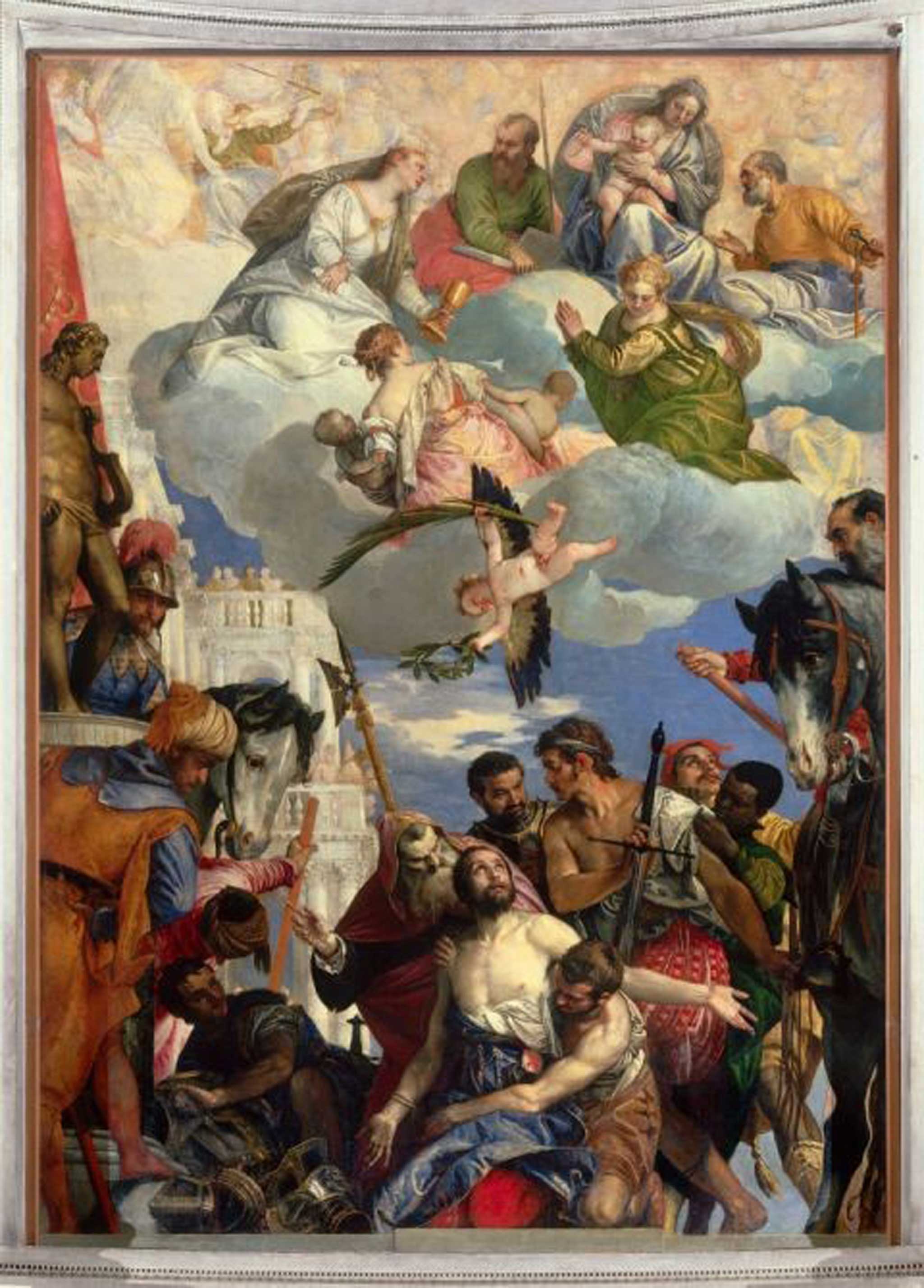
And it is another commission, The Martyrdom of Saint George, for Verona’s church of San Giorgio in Braida, which is one of his masterpieces. “It is one of the great, great paintings of the world,” says Xavier F Salomon, chief curator of the Frick Collection in New York and curator of Veronese: Magnificence in Renaissance Venice. The picture has only left the church once before, in 1797, when it was seized by Napoleon’s troops.
Returned in 1815, it has never before been lent to a show. “You are meant to see it hung very high and in a low light, albeit with windows on either side,” says Salomon. Just this once, the visitor will come nearly face to face with the saint’s tormentors, and the angels that dive to his aid, in a dynamic composition whose colour juxtaposition makes the characters leap off the canvas.
Aged 12 or 13, Veronese entered the workshop of the competent Antonio Badile, where he would have learnt to grind pigments, an essential skill for an aspiring artist; there was no short cut to art fame. Because of the proximity of Venice and its links with the Orient, some materials would have been more readily available to him than to artists further south. Most precious of all was ultramarine: made from crushed lapis lazuli and dug from a single quarry (then, as now, in Afghanistan), it was costlier even than gold, and so highly valued that the desired quantity of it would be agreed in the contract between artist and patron. For radiant heavens or statement apparel, only ultramarine would do, but the price put its extensive use beyond even the wealthiest merchant or church’s purse. Azurite was a sufficiently bright substitute, also mineral, but with a greenish tinge. And that greening becomes more dominant with time – for time is the one ingredient in the alchemical process of mixing colours over which the artist had no control.
No one knew, for example, that another handy blue, smalt, a by-product of Venice’s glass industry, would leave a gloomy legacy. “Smalt is almost as intense as ultramarine,” explains Salomon. “What no one knew at the time is that after 50 or 100 years, smalt changes colour because it reacts with the linseed oil. When you see an overcast sky in a Veronese painting, you can be sure that it was meant to be blue. This was not known until 15 or 20 years ago. People were praising Veronese’s subtle, grey skies.”
To this chemical reaction add temptation, and the mix can become even muddier. “In some cases, Veronese used all three blues – smalt, azurite and ultramarine. I don’t want to cast any doubt on Veronese himself, but where a patron is paying for a certain amount of ultramarine, he is not to know whether all of that was used in his painting, or whether the artist was able to keep some back ….”
Vibrant oranges were created with minerals too – realgar and orpiment, which are sulphides of arsenic and become flatter with time. Whereas reds, as seen in his magnificent work The Family of Darius before Alexander, from the National Gallery’s own collection, for example, were often derived from insects; trade with the New World had put beetle-based cochineal from Mexico within reach. Greens were copper-based, but reacted with oil and gradually turned brown, so that Veronese’s populous world tends to the autumnal.
And what colour did Veronese – quickly in demand on his arrival in Venice and famed for his teeming compositions set amid noble architecture – choose when depicting himself? Like many artists, he slipped the occasional self-portrait into his painted throngs. In his great work The Marriage Feast at Cana, now in the Louvre, he sits smack-bang in the middle of the scene, bowing a viol and swathed not in juicy crimson or velvety blue like those around him but in damask of a creamy white. “White is not an expensive colour for a painter to use,” explains Salomon. “But it is very expensive as a fabric: it’s dirty in a day. Only the doge wore white.”
Veronese, duke of colour, lord of composition. “Colour and composition always go hand in hand,” says Salomon. “It’s intuitive. It’s the bit of art you cannot quite explain.”
‘Veronese: Magnificence in Renaissance Venice’ is at the National Gallery, London, 19 Mar to 15 June.
Join our commenting forum
Join thought-provoking conversations, follow other Independent readers and see their replies
Comments