Ronald McDonald the muse? Why artists like Banksy, Ron English and Keith Coventry are lovin' it
There's a new wave of artists taking inspiration from McDonald's. There's the sculptor who makes figures out of beef burgers (they don't decompose), the artist who draws Ronald as he should look (fat) and more...
Your support helps us to tell the story
From reproductive rights to climate change to Big Tech, The Independent is on the ground when the story is developing. Whether it's investigating the financials of Elon Musk's pro-Trump PAC or producing our latest documentary, 'The A Word', which shines a light on the American women fighting for reproductive rights, we know how important it is to parse out the facts from the messaging.
At such a critical moment in US history, we need reporters on the ground. Your donation allows us to keep sending journalists to speak to both sides of the story.
The Independent is trusted by Americans across the entire political spectrum. And unlike many other quality news outlets, we choose not to lock Americans out of our reporting and analysis with paywalls. We believe quality journalism should be available to everyone, paid for by those who can afford it.
Your support makes all the difference.Next time you chow down on a burger, take a moment to consider the aesthetics of what it is wrapped in. Keith Coventry, an artist propelled to success as one of the Young British Artists, has just unveiled nine new artworks and his muse of choice is the burger brand, McDonald's. The American fast-food chain caught his attention nearly 15 years ago when Coventry noticed that most of the rubbish being trodden into the pavement across the road from his Camberwell studio was emblazoned with those ubiquitous golden arches.
He has since had something of a love affair with the brand, picking up bent and stomped on wrappings to take home and observe how the shapes in that unmistakeable logo are changed by the process of being discarded. "I particularly like the cups, which have a large logo on them," Coventry reveals. "Depending on where they have fallen, whether they've been crushed or walked on, the image has been edited. It's like a ready-made – the composition has been made for me."
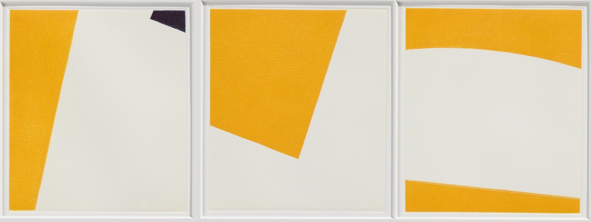
It is hard to avoid the burger chain given it has an estimated 35,000 outlets and 68 million customers daily. But Coventry, whose work appears to be part indictment, part celebration, has an interesting stance on why those arches and that curvy "M" are so enduring. "Red, yellow and blue are the colours of Modernism – the colours of [Kazimir] Malevich and [Piet] Mondrian," he says.
"It is interesting that in the first half of the 20th century those colours were revolutionary, but then McDonald's appropriated them for its own purposes. And now it has come full circle with artists like myself appropriating [the logo]."
Coventry is far from the first artist to have used McDonald's and all it represents in his work. Walk through any city in the world for long enough and there is a strong likelihood that you'll come across a graffiti mural mocking or criticising McDonald's. It may not be quite as reliable as the company's giant billboards, but as far as unsolicited advertising goes, it is hard to overestimate its reach.
A case in point is one of Banksy's most famous murals, Napalm, which shows a naked nine-year-old victim of the Vietnam war hand in hand with Mickey Mouse and Ronald McDonald – revealing how easy it is for artists to use the brand or its mascot as shorthand when lampooning America.
Jake and Dinos Chapman took countless swipes at the company during their major 2002 Tate exhibition The Chapman Family Collection – a play on so-called 'primitive' art – featuring, among other things, a carved wooden relic of a grinning Ronald McDonald holding packets of chips.
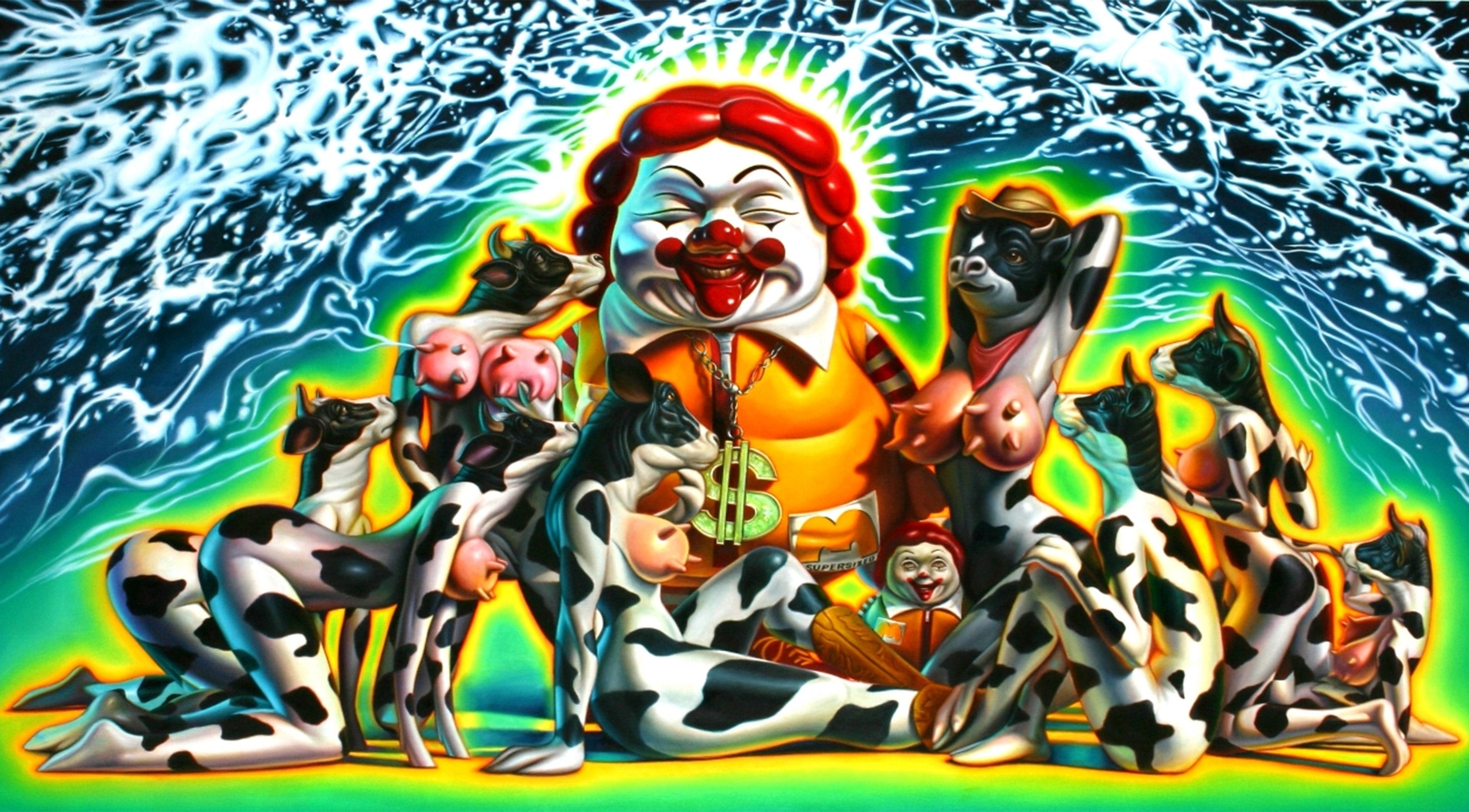
Ron English, another celebrated street artist, indirectly has McDonald's to thank for his success having been commissioned by Morgan Spurlock to create the poster for the 2004 film Super Size Me. His kitsch take on Ronald McDonald drew global attention to his work.
Dallas-born English says that he had "heightened awareness" of the clown, being called Ronald himself and sought to create his own, more plausible rendition, making his first version four decades ago. "In the 1970's when American society was all a twitter about 'empty calories' I saw a wonderfully executed illustration of Ronald revealing his emaciated torso beneath his yellow jumpsuit," English says. "I remember thinking, 'wouldn't he actually be fat?' I went home and painted my own version."
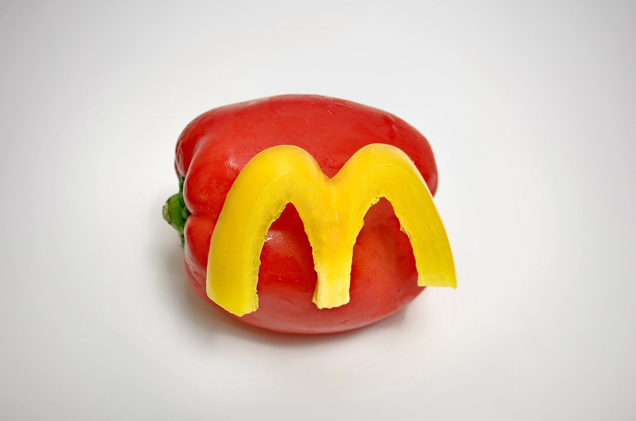
Another critique of the artery-clogging nature of McDonald's comes in a work by Australian artist and designer Domenic Bahmann who used the naturally eye-popping reds and yellows of the humble pepper to mimic its logo. Quite whether the fast food chain appreciates the use of an un-fried, un-mayo-ed vegetable remains to be seen, but Healthy M as it is called was intended as "a funny take on healthy fast food".
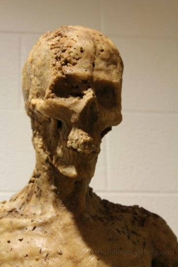
Ben Campbell from Texas has taken things rather further by using McDonald's fare as the material from which to construct a sculpture of a skeleton, which he has jokingly dubbed "McMummy". Turns out those meat patties, chips and sauces are a wonderful (and cheap) medium to sculpt with. It is also rather hardier than you might expect. "McDonald's food doesn't decompose if left to dry out," Campbell says. "Seriously, just google it. Archaeologists from the future will be digging this stuff up thousands of years in the future. Especially if something cataclysmic happens to our society."
Jack Daws, meanwhile, made a Jenga-style tower sculpture of McDonald's chips held together with only Heinz ketchup.
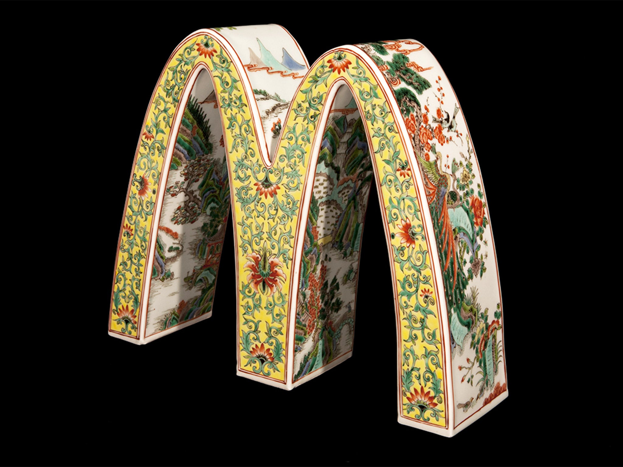
At the other end of the scale is contemporary sculptor Li Lihong who trained with a master ceramicist in the art of Chinese porcelain and now uses his skill to produce the most ornate and beautiful renderings of the golden arches you'll ever see. His handiwork might better befit a Ming-era vase (if he could time travel, that is), but if I were McDonald's, I'd be buying his work and placing it in the most elite branches.
Quite what the company thinks of the activities of these various artists is not clear. Having contacted them for comment, I was assured there wouldn't be one by a curt press officer. Neither English nor Coventry has ever been contacted by the firm even though their work is potentially in breach of copyright.
"It wasn't until Morgan Spurlock spotted one of my billboards and put MC in his documentary Supersize Me that MC Supersized got big enough to get on McDonald's radar. By then they had already been through the McLibel suit and I am assuming they did not want to create a similar PR fiasco," English says. "Also MC Supersized is a copyrighted character that is an obvious parody. McDonald's has never presented their clown as an obese victim of unhealthy food."
An apparent reluctance to engage with artists working independently hasn't stopped McDonald's trying to harness art's visual power in a more corporate way. Last year the English artist Ben Mosley was commissioned to create art for its chip packaging and his painting, Fans of the World, was seen by an estimated 60 million people worldwide.
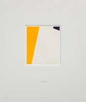
Who knows, perhaps Coventry will find one of Mosley's discarded chip packets and the cycle will continue. Coventry, who says he's always been "into detritus", claims his work is a sort of purification process. "I have always been interested in hard, clear, and repeatable images, rather than an atmospheric quality. The colour is provided by the McDonald's logo, and the white or blank space represents a purity, edging out the commercial image in favour of a more abstract composition."
He uses gesso, which contains rabbits' skin glue, and beeswax to create that corporate McDonald's sheen – but his medium is all natural and bears no resemblance to the plastics and vinyls of a Maccy Ds sign, despite being equally glossy. "It's a transformation. For art to be any good, it's got to be transformative," he says.
Keith Coventry's Junk exhibition is at the Paul Stolper gallery until 6 June
Join our commenting forum
Join thought-provoking conversations, follow other Independent readers and see their replies
Comments