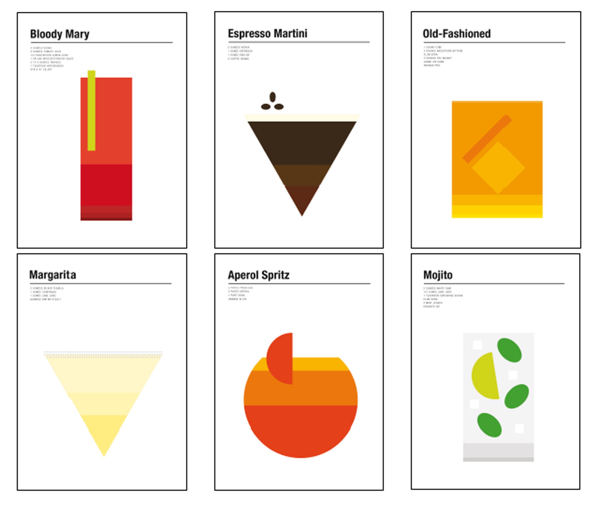
Graphic designer Nick Barclay breaks down classics cocktails in his minimalist poster designs
The designer came up with an interesting way of letting people know the drinks' ingredients and measures, while making it look cool

Your support helps us to tell the story
From reproductive rights to climate change to Big Tech, The Independent is on the ground when the story is developing. Whether it's investigating the financials of Elon Musk's pro-Trump PAC or producing our latest documentary, 'The A Word', which shines a light on the American women fighting for reproductive rights, we know how important it is to parse out the facts from the messaging.
At such a critical moment in US history, we need reporters on the ground. Your donation allows us to keep sending journalists to speak to both sides of the story.
The Independent is trusted by Americans across the entire political spectrum. And unlike many other quality news outlets, we choose not to lock Americans out of our reporting and analysis with paywalls. We believe quality journalism should be available to everyone, paid for by those who can afford it.
Your support makes all the difference.When Londoner Nick Barclay emigrated to Sydney six years ago, he was immediately impressed by the city's booming cocktail scene. Returning to our capital for a visit last year, he saw that it was catching on here, too. The graphic designer had been looking for a new project, and on the flight back to Australia, inspiration struck.
"I was thinking about how a lot of people drink cocktails but don't know what's in them," he says. "I thought it might be interesting to devise a way of letting them know the ingredients and measures, while making it look cool."
The result is a series of minimalist poster designs that break down cocktails and place them in their preferred glass.
The 35-year-old has previously worked on projects based on simplified brand logos, and Star Wars characters reimagined as three-colour shapes. "With a lot of my work, the idea is that I want to inform people with something that looks arty enough that they want to put it on their wall too," he explains.
The cocktails don't stray far from the classics; one of Barclay's first jobs in his new home was freelancing for Australian Bartender magazine, and he got in touch with the editor to ask which he should cover.
The international orders for his work are revealing, he says. His biggest seller in Italy is the Aperol Spritz; the UK likes the classic and espresso Martinis, while America is partial to an Old Fashioned. As for Barclay, he prefers a Negroni. "It sounds a bit bolshie, but I think it's the only acceptable cocktail for a man to drink," he laughs. "It looks sexy and it's pure alcohol."
For more of his work and to order prints: nickbarclaydesigns.com
Join our commenting forum
Join thought-provoking conversations, follow other Independent readers and see their replies
Comments