Tate Britain unveils £45m refurbishment
The latest makeover won’t make Tate Britain 'cool', but it has become far more welcoming and architecturally elegant
Your support helps us to tell the story
From reproductive rights to climate change to Big Tech, The Independent is on the ground when the story is developing. Whether it's investigating the financials of Elon Musk's pro-Trump PAC or producing our latest documentary, 'The A Word', which shines a light on the American women fighting for reproductive rights, we know how important it is to parse out the facts from the messaging.
At such a critical moment in US history, we need reporters on the ground. Your donation allows us to keep sending journalists to speak to both sides of the story.
The Independent is trusted by Americans across the entire political spectrum. And unlike many other quality news outlets, we choose not to lock Americans out of our reporting and analysis with paywalls. We believe quality journalism should be available to everyone, paid for by those who can afford it.
Your support makes all the difference.Will the £45m spent on London’s newly renovated Tate Britain art gallery make it significantly more popular than Chester Zoo?
The 116-year-old institution currently attracts 1.5m visitors a year, about the same as the zoo, and it lags more than 3m visitors short of both Tate Modern and the National Gallery.
Tate Britain is in the world’s art destination premier league, but it’s currently mid-table.
Click here or on 'view gallery' for more images of Tate Britain's redesign
A couple of signings, to continue the football metaphor, have changed all that. The architects Peter St John and Adam Caruso – known for their intellectually fancy footwork – were brought in six years ago to create a design strategy that would up the visitor tempo and revitalise Tate’s entrance sequence, which reopened today.
It’s the second of a major three-phase transformation of the Grade II listed Tate. In May, Caruso St John Architects’ renovation of ten Victorian galleries banished memories of scores of great paintings being hung in wretched conditions typified by poor lighting, and crude temperature and humidity controls.
The latest makeover won’t make Tate Britain cool, a la Tate Modern. But the arrival experience, once like being trapped in an architectural hernia, has become far more welcoming and architecturally elegant. The clear order and finely crafted detail of the redesign has opened up new circulation routes in this part of the main building: the calm spaces breathe, and connect properly, for the first time.

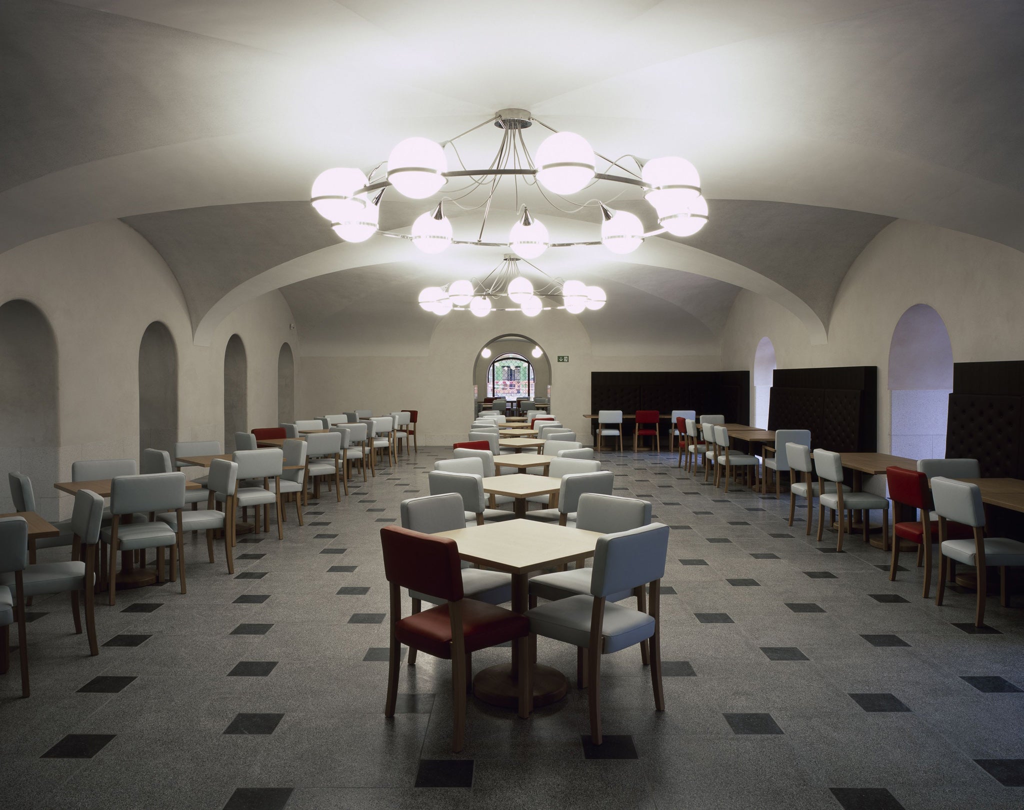
The overall restraint of the interventions gives us only one Wow moment: a new circular staircase in the Rotunda, scalloped with Art Deco patterns. The stairs swirl you down from the entrance level of the Rotunda into the remodelled space between the renovated Whistler restaurant, and a big new café with crypt-like vaulting and glazed doors that open onto a semi-sunken terrace. The miserably pokey descent to the original grimly groovy café is history.
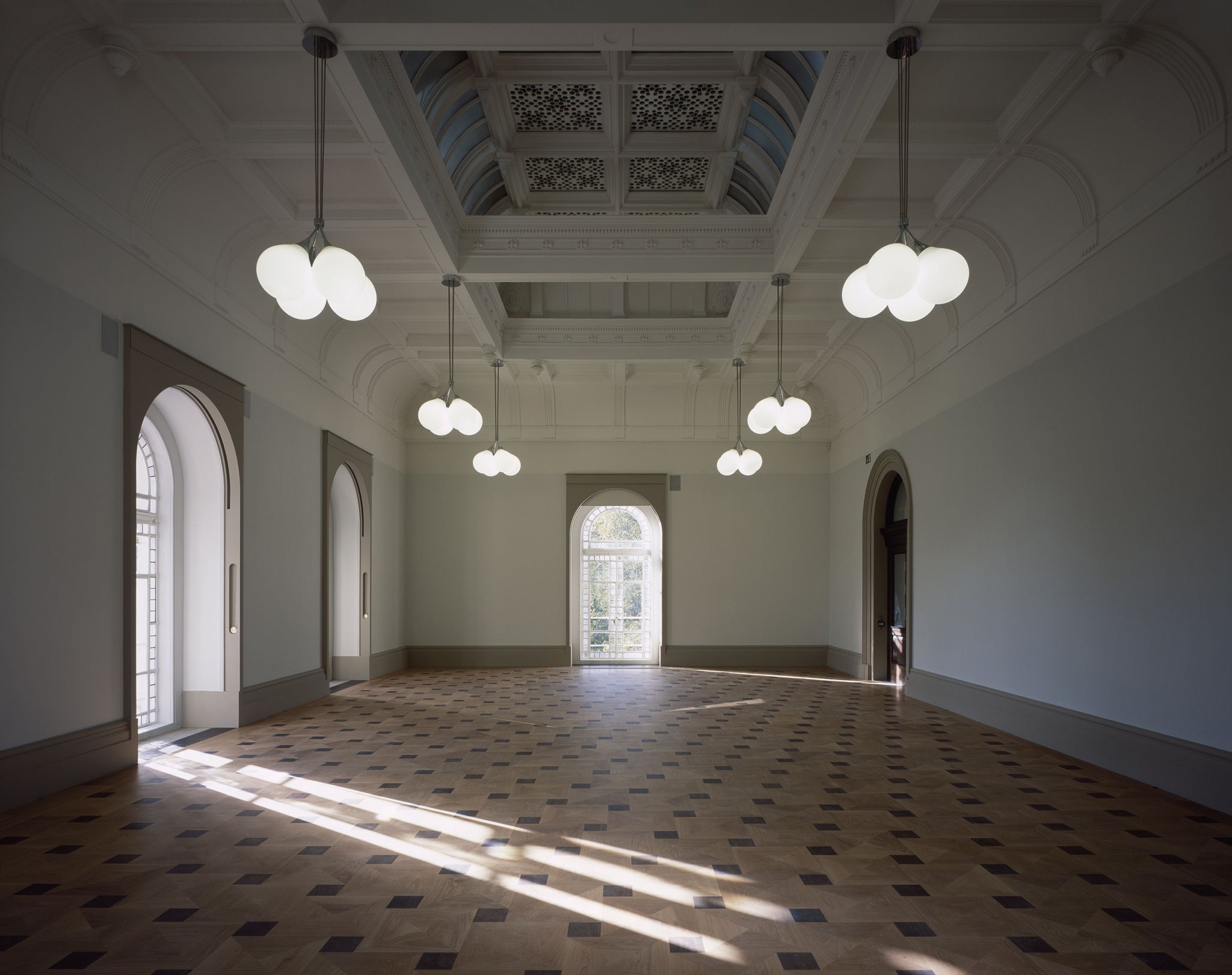
Yet history lives on in new and different ways. Peter St John suggests that the changes at the Tate are “radical”, but they’re not. The new interventions are architecturally logical, and fastidiously subtle. This fusion of history and modern spatial organisation has given the Tate a much more relaxed gravitas: the subtle new paint colours, terrazzo flooring, and joinery are all based on the original palette of materials specified by Sidney Smith, who designed the original building in 1892.
There is no jarring sense of old and new, for example, in the way the Grand Salon on the first floor has been transformed into an events room overlooking the Thames; and in the building’s undercroft, the creation of a new education reception space and archive galleries (in the foundations of the 19th century Millbank Penitentiary) has completely renergised this segment of the building.
There is wit and a dash of refined style in the new lighting, and in the furnishings of the Tate members’ terrace in the Rotunda. Here, you can sit on leather-clad Lutyens chairs or – a slightly wicked touch, this – on very short stools at the low-slung bar, like children banished to the Naughty Step.
The transformation of Tate Britain’s core building will seem effortless to many, but it didn’t come easily. The process was tortuous: the architects met Tate officials three times a month since 2006 to gradually refine the design. These new interiors float like pristine swans on a lake of creative sweat.

Join our commenting forum
Join thought-provoking conversations, follow other Independent readers and see their replies
Comments