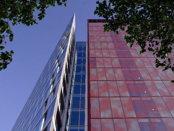
Paddington's Merchant Square building is a bit of a mind-bender

Your support helps us to tell the story
From reproductive rights to climate change to Big Tech, The Independent is on the ground when the story is developing. Whether it's investigating the financials of Elon Musk's pro-Trump PAC or producing our latest documentary, 'The A Word', which shines a light on the American women fighting for reproductive rights, we know how important it is to parse out the facts from the messaging.
At such a critical moment in US history, we need reporters on the ground. Your donation allows us to keep sending journalists to speak to both sides of the story.
The Independent is trusted by Americans across the entire political spectrum. And unlike many other quality news outlets, we choose not to lock Americans out of our reporting and analysis with paywalls. We believe quality journalism should be available to everyone, paid for by those who can afford it.
Your support makes all the difference.Britain is awash with large commercial buildings whose façades have been tarted up with supposedly creative gubbins because planners encourage the so-called Per Cent For Art approach. We're not talking Anish Kapoor. Nine times out of ten, that 1 per cent of building cost pays for witless "artistic" glass fins projecting from façades.
Some architects – Eric Parry's ceramic faience façade at London's 50 New Bond Street is ravishingly exemplary – enrich our fields of vision stylishly. Others, such as that godfather of early modernism Adolf Loos, warned that ornament was crime. And then there are those designers who take architectural perception into entirely new zones.
London-based Michel Mossessian is one of them. A 14-storey-high burgundy red wedge slices through his new Merchant Square building in Paddington Basin, presenting its sharp edge to the Basin, and its flat façade to the busy A40. It's there to mess, very subtly, with your head. Prompted by Philippe Schyns's perceptual research at Glasgow University, Mossessian patterned the huge, two-layer glass façades of the wedge with dotted fritting so that, from a distance, they shimmer with cloud forms; from closer up, curtains are suggested.
"I wondered how you could give interesting depth to a flat glass façade," says Mossessian, "a perception that suggested distance, and focus, but with a seamless transition between what you saw from a distance, or from closer. It's pure perception – a new kind of architectural canvas." Let's hope Mossessian finds a client with a satirical sense of humour. Just think of it: a massive façade conveying a vision of glass fins, in the style of Cézanne, which segues into the grinning dental implants of a property developer.
Join our commenting forum
Join thought-provoking conversations, follow other Independent readers and see their replies
Comments