The Independent's journalism is supported by our readers. When you purchase through links on our site, we may earn commission.
Samsung Galaxy Note 8 review: So close to perfection
A remarkable, highly desirable handset that matches great looks with standout performance
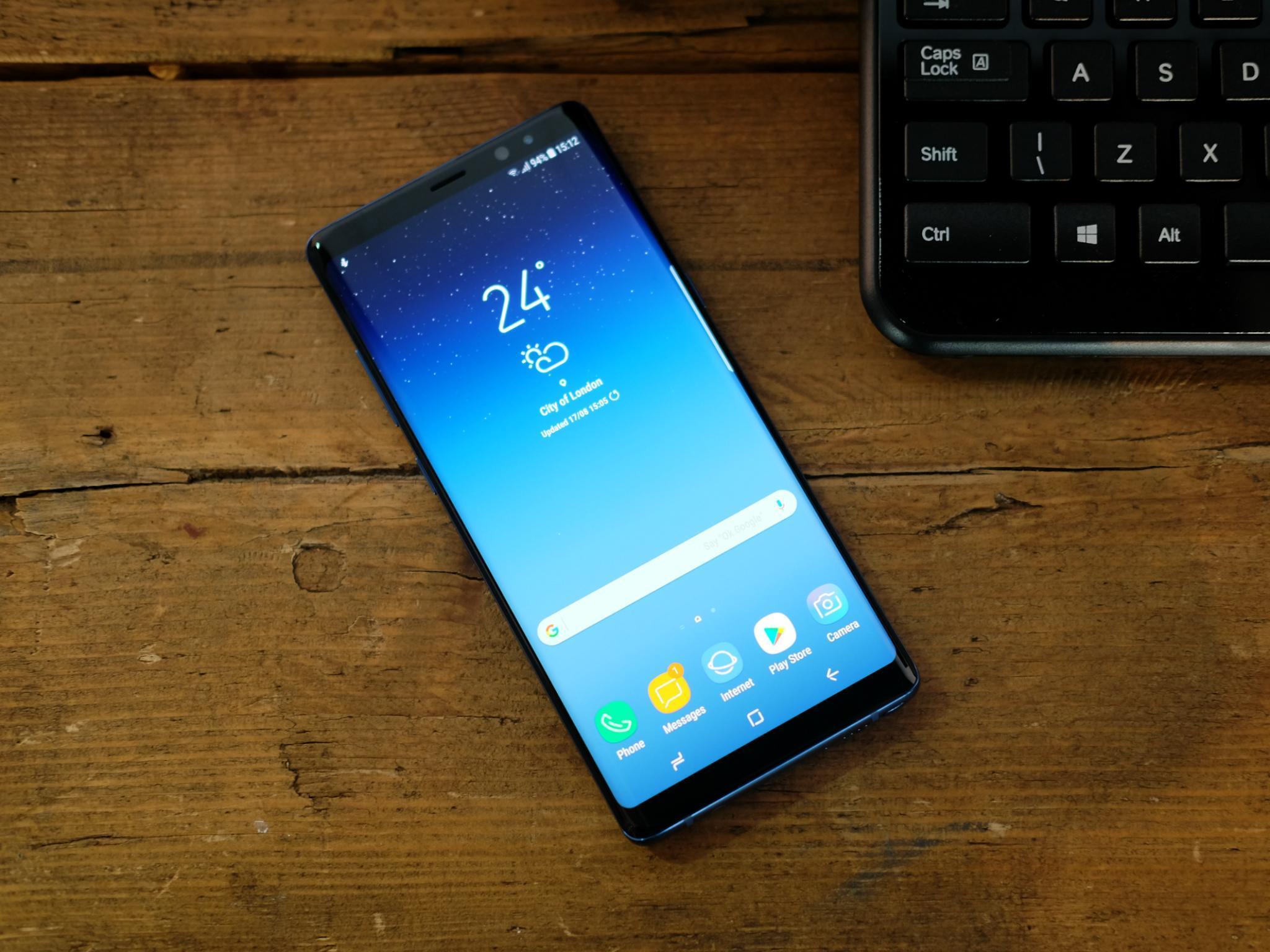
The Samsung Galaxy Note is Samsung’s large-screen phone series. The first seemed preposterous when it was released in 2012 with its 5.3-inch display.
However, though there were doubters, the Note series won praise and supporters.
I’ve been testing the latest iteration for the past five days.
Design
This year, we’re up to the Galaxy Note 8. It has a screen that is a full inch bigger than the original Note at 6.3 inches. But because it uses a differently shaped display with an 18.5:9 ratio, just like on this year’s first Samsung flagship, the Galaxy S8, it feels manageable in the hand. It’s longer and narrower so it doesn’t stretch your hands as you hold it.
And compared to the S8, the Note 8 has a differently shaped edge with tighter, steeper curves which make it even more comfortable in the hand. I’ve never found a phone this big this comfortable before.
The steeper edges also mean there’s less distortion of the picture onscreen as it reaches the edges, but you can still see glimpses of the display from the side, as though the pixels on screen just couldn’t contain themselves in their excitement.
And why not – it’s an exciting-looking phone, with a sleek, shiny all-in-one feel to it. In its gloss black finish (maple gold is also available) it’s hard to tell where the screen ends and the glass back begins.
It has a greater integrity of design than most phones, matched only by the new Nokia 8 and, well, every iPhone ever made.
And here, there’s a confidence to its styling which is wholly attractive. As though it’s saying, I’m the one you’ve been waiting for, every phone should be designed like this’. It’s a claim that’s pretty persuasively made. This is easily the most stylish-looking, attractive phone Samsung has made so far.
Security sensors
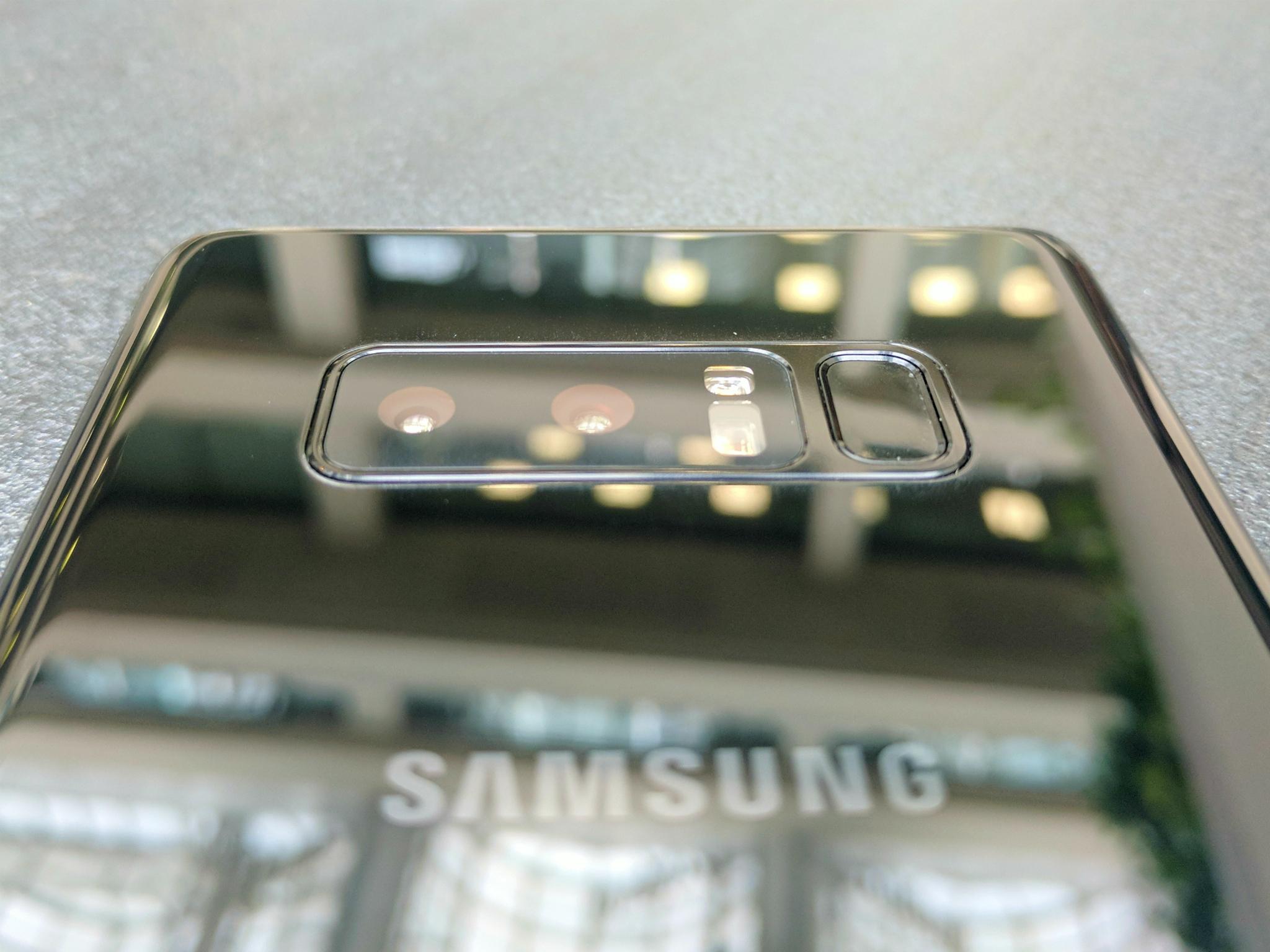
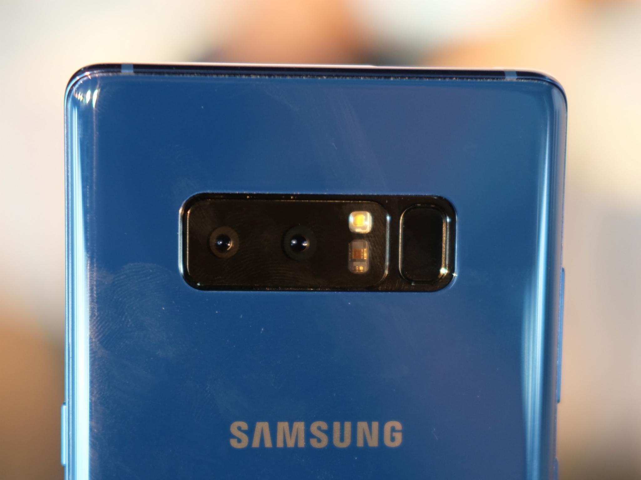
There’s only one downside, and it’s one that this phone shares with the Galaxy S8 that preceded it: the positioning of the fingerprint sensor. It’s on the back, as it is on rival phones like the LG G6 and the Google Pixel.
But the problem is, here it’s right alongside the camera lenses, so it’s effortlessly easy to smudge your finger onto the lens when you’re blindly seeking to unlock the handset.
At least the positioning is a little further from the lens than on the S8 so it’s not quite so easy to misplace your finger. Even so, it’s the least effective place to put this important feature.
Samsung would tell you, though, that there are other ways to unlock it, so you may not need the fingerprint sensor. Of course, there’s a pin code, which many still feel is the most secure.
But this phone also has an iris scanner and a facial recognition system. The iris scanner requires you to look directly at the display – you can even set it so comical cartoon eyes are staring back at you to be sure you look in just the right place. You may have to open your eyes wide.
The facial recognition setup, introduced earlier this year, is also interesting. It’s now been improved to work more quickly. I found that most of the time it worked very well, and speedily. But for some of the time, perhaps one in four times that I looked at it, it didn’t work at all. Maybe this is an early sample issue, but the problem with this kind of tech is it needs to be better than the options that went before, both in terms of speed and reliability and for me, it isn’t yet.
Incidentally, all this palaver and the reason the fingerprint scanner is on the reverse is simple: there’s so much display on the front, there’s no room for anything else.

Display
The Note 8 is nearly all screen on the front, over 83 per cent. So it looks magnificent, helped along by the fact that this is an AMOLED screen, Samsung’s speciality, with its bright, vivid colours, deep black shades and pin-sharp details thanks to its high resolution (521 pixels per inch).
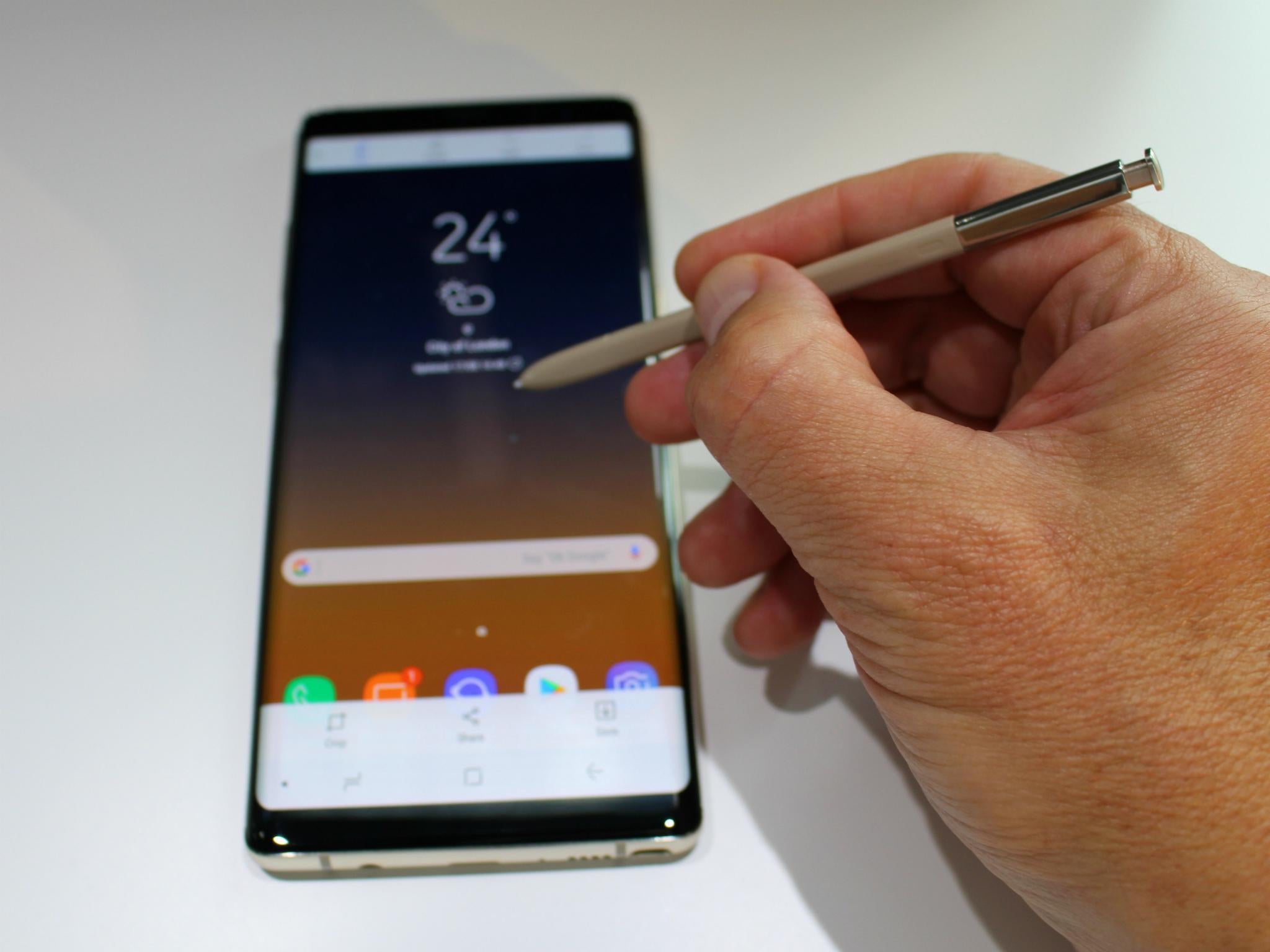
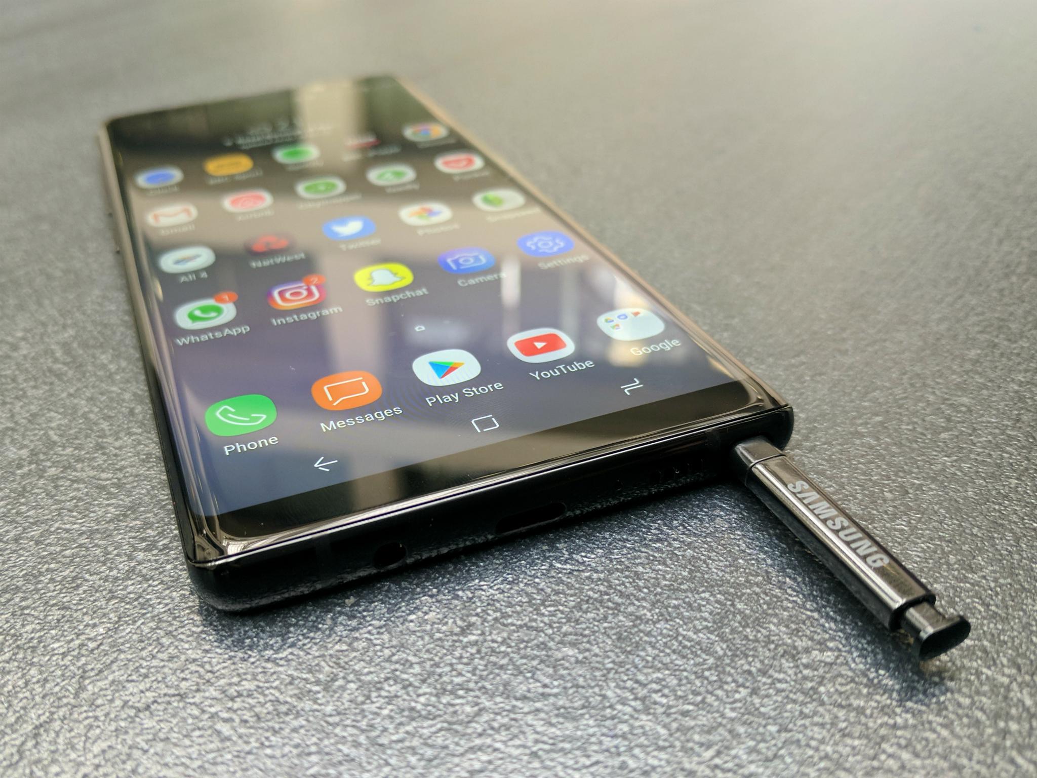
And there’s another benefit to the steep-edged display – it makes it easier to use the S Pen stylus. This being a Note, it comes with a smart stylus which is stored inside the body of the phone.
It’s easier to use it on this screen compared to less precipitously sloped predecessors, as Carolina Milanesi, the endlessly insightful consumer tech analyst at Creative Strategies, pointed out to me.
She’s right, there’s less chance of the stylus slipping near the edge, it’s that little bit closer to writing on a pad, say. Which is one of the things the S Pen is designed for.
S Pen
On the Note 8, if inspiration strikes, you can jot down your immortal prose straight on the lock screen. And if you’re very wordy, don’t worry, it’ll save up to 100 pages of your scribbles, whether they’re plans to save the world or, well, more likely, a grocery list.
Since I’m on the S Pen, here’s what else is good about it. The stylus is now waterproof and when you press on the base to spring it out of its lair in the corner of the handset, it launches a wide range of stylus-compatible features in a slick semi-circle of icons.
These include one splendid and fun new feature: Live Messaging. If words are not enough in your text message, why not draw something? You can do so in multiple colours and with different brush strokes. Then, send your creation as a marvellous animation. And since it’s saved as a GIF file, it’s compatible with other brands of mobile. This is a small, simple, even silly extra feature. But, my goodness, it’s fun.
There are plenty of serious functions for the S-Pen, of course, but this is my favourite.
Edge capabilities
Since the first Samsung phone with a sloping edge to the display, the company has added extra functionality to the fact that it was doing something that nobody else had (or really has, even now).
So, for instance, if your phone was face down on the table because you were in a business meeting, you could see if an important contact was calling because the edge would light up, colour-coded according to who it was.
Now, with the Note 8, the edge can flash colour notifications even if the phone is facing up.
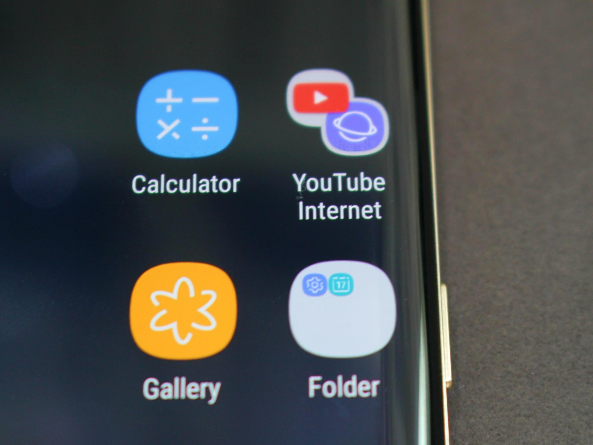
And there are multiple collections of apps which you can activate by swiping from the edge of the display. One swipes a bunch of apps onto the main screen, one shows contacts and so on.
Highlights include the Quick Tools collection, which has a ruler (inches or cm), a compass and a torch. The ruler is especially good as it’s much easier to measure stuff with it than on a display that didn’t slant down towards.
Another new feature this time around is pairing apps. This means you can, with one swipe from the edge of the display, fit two apps onscreen together, handy if you want to type a text on the bottom half of the screen while watching YouTube on the top.
You can even choose two of the same app in some cases, so it’s possible to split the screen into two web-browsing windows, both active at the same time.
These pairs are easy to set up and use, with enough flexibility and simplicity as to be inviting.
Camera
This is often the main event on mobile phones these days. Recently, there’s been a move to twin-sensor cameras, effectively two separate cameras. These are sometimes a way of sidestepping the fact that it’s very difficult to put an optical zoom on a smartphone, since it fattens the phone up like nobody’s business.
Here, there are two lenses, each with its own 12-megapixel sensor. One is telephoto and one wide-angle. With one tap of the screen you can switch from one to the other, effectively giving the phone 2x optical zoom. Digital zoom is less desirable because it merely crops the centre of an image, thus reducing resolution when that centre area is enlarged.
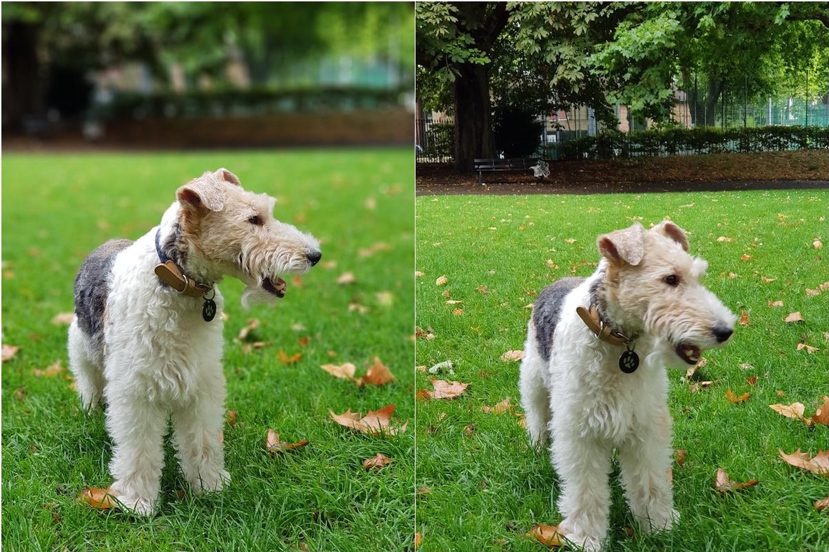
There’s another benefit to twin sensors, the bokeh effect. That’s the artfully attractive way when you shoot a portrait that your subject can be in sharp, pristine focus but the background behind them is blurred, making it less likely to distract from the subject.
This effect, which alters the depth of field of the image, is common to high-end cameras and is achieved here by software manipulation. Both of the cameras shoot together and the phone works out what’s background and what’s not, blurring it as appropriate.
The Apple iPhone 7 Plus is the best-known phone capable of this effect.
But here it has extra features. You can decide exactly how blurred you want the background to be. And you can make this decision either as you shoot, or afterwards. You get to see the level of blurring on the screen as you prepare to take the photo. It works well and the added degree of flexibility after you’ve taken the shot is excellent. Huawei has had something similar on its cameraphones for some time but here it is especially slickly done.
At the top edge of the camera interface there’s a new feature, which the S8 lacks. Tap the button and the display switches to Full View, where as you’d expect from the name, the camera view takes over the entire screen.
It looks fantastic.
There’s one curiosity in the interface, though. It’s to do with the button that switches from the telephoto to the wide-angle camera and vice versa. A similar icon appears onscreen on the iPhone 7 Plus, saying either 1x or 2x in a small circle and indicates the level of zoom. So, obviously when you are at 1x zoom it says 1x on the display. Tapping the icon takes you to 2x zoom, so the icon reads 2x accordingly and the image zooms in.
That’s not what happens here and it’s deeply counter-intuitive. The circle icon says x2 when you’re at 1x zoom or reads x1 when you’ve zoomed in to 2x zoom. I understand that Samsung wants you to think of the button as meaning ‘press here to take you to 2x zoom’ but it’s confusing, I’d say.
Overall, this is a fantastic camera that shoots without noticeable shutter lag and thrives even in lower light conditions.
Since in some settings it shoots on both cameras, you can also choose which of the two separate shots you like best, close-up or wide-angle. This is something that no DSLR has been able to do and it makes for great versatility. I’m looking forward to using this camera more.
Performance
This is a brand-new phone with a nippy processor and plenty of RAM so you’d expect it to be fast, right? Don’t worry, it is. I never found any hesitation or stuttering, whatever it was doing. I also found battery life to be good – these are early days, of course, but so far, so good. Worries that Samsung’s caution in installing a smaller battery than last year, to guard against the issues that the Note 7 notoriously experienced, would lead to an underpowered handset, seem unfounded.
Verdict
I feel I’m only just getting to grips with the Note 8. It’s gorgeous, has a tremendous camera and fits the hand beautifully, and way better than you might have expected. The S Pen gives plenty of extra functionality and all the previous features of the S8 (waterproofing, versatile wireless charging, Samsung Pay, HDR display) are included here, too.
But it’s worth remembering that this is a very expensive phone, clocking in at £869 when bought without contract. Oh my, that’s pricey. Even so, I don’t think it takes away from the overall excellence of this phone as most people will be buying it on contract, where the impact is more subtle and spread out. Even so, if you think the S Pen isn’t for you, or prefer something a little smaller, the Samsung Galaxy S8 is cheaper. It has a great camera, too, though it’s not on a par with this one.
It’s that fingerprint sensor placement that stops the phone from quite earning five stars, in my opinion – take this as a 4.5-star handset.
But this is still a remarkable, highly desirable phone that matches great looks with standout performance.
Join our commenting forum
Join thought-provoking conversations, follow other Independent readers and see their replies
Comments
Bookmark popover
Removed from bookmarks