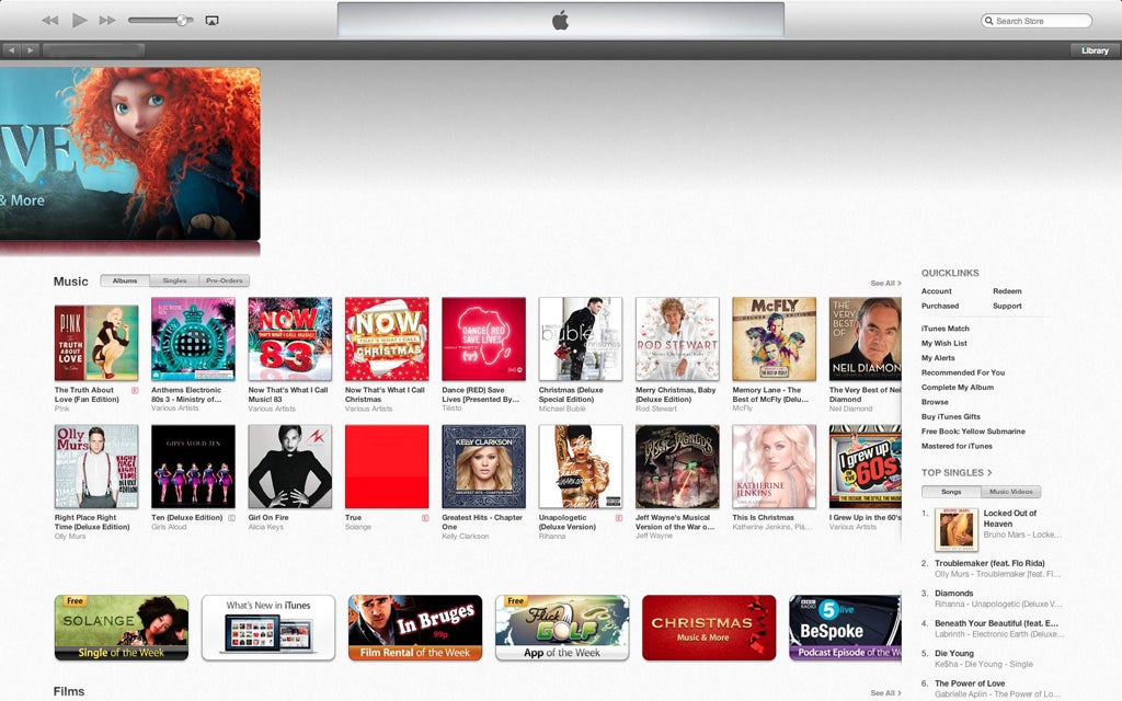
iTunes 11 review: It's prettier but offers little else new
Eleven years on from its launch Apple's flagship music software hasn't seen many major changes to its core attributes - even with the much anticipated release of iTunes 11

Despite iTunes 11 becoming available today, it remains much the same as it has always been - bar some radical new design and front-end improvements.
At a glance, the visual redesign is an instant hit, with music selection laid out in a far more logical manner that ever before.
The ability to search by song, album, genre or artist transforms iTunes into your iPhone's music library for your Mac instead of the completely separate entity that it was before. One of the few new features to be implemented in the update is the inclusion of the Miniplayer which, instead of simply being a mode within the application, appears in a completely new window. There doesn't seem to be much you can't do using Miniplayer as opposed to using the full window, but it does lose a lot of the attractiveness that Apple has only recently gifted us.
Another simple, yet helpful, addition is the inclusion of buttons which allow users to switch between the iTunes store and back to the library. In earlier versions of iTunes, the store was along the left hand side column and, in the past, some users complained about failing to realise where they are searching. With the new ease-of-use buttons this and many other similar problems are eliminated.
Look beyond the interface, however, and iTunes 11 could be considered exactly the same as its predecessor. However, the design changes make it a must-download for any iTunes user.
Join our commenting forum
Join thought-provoking conversations, follow other Independent readers and see their replies
Comments
Bookmark popover
Removed from bookmarks