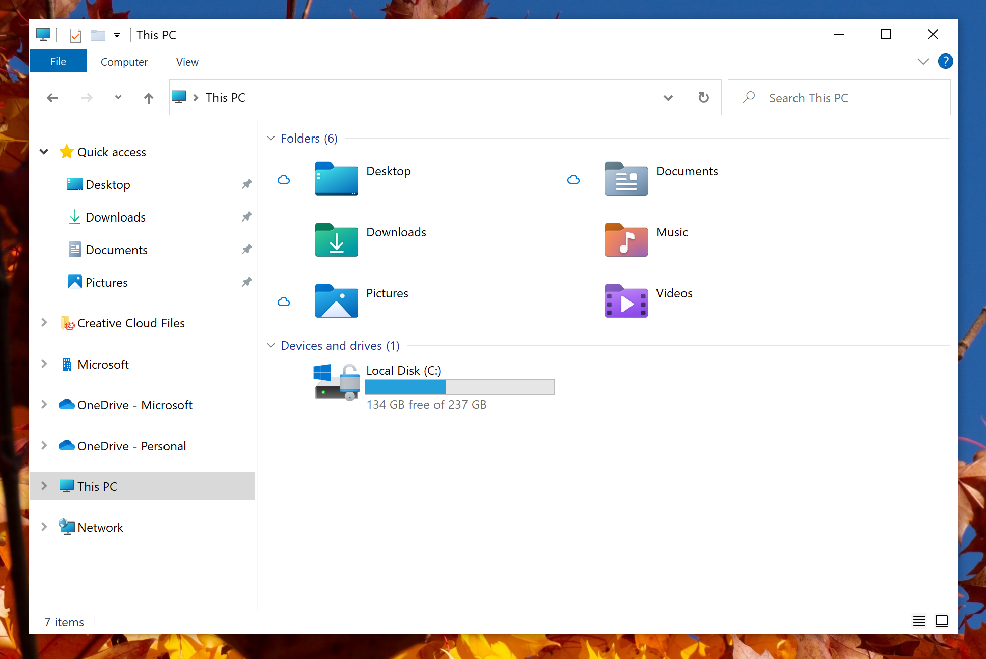
Microsoft’s new version of Windows has a whole new design - and gets rid of the old floppy disk
The update marks an end to the old Windows 95 aesthetic

Microsoft is refreshing the icons for its operating system, marking an end to the old Windows 95 icons which have been a staple of the OS.
The new interface, codenamed “Sun Valley”, was spotted by Windows Latest. Classic icons including the hibernation monitor and the floppy disk have been revised – the former moving from a CRT screen to a more modern one, and the latter looking sleeker (insofar as a floppy disk can be).
These are all set to match the style of Drive and Recycle Bin desktop icons revealed in the Windows 10 Insider Preview Build 21343.
“Several changes, such as the orientation of the folder icons and the default file type icons, have been made for greater consistency across Microsoft products that show files”, Microsoft said at the time.

“Notably, the top-level user folders such as Desktop, Documents, Downloads, and Pictures have a new design that should make it a little easier to tell them apart at a glance”.
The icon for Windows Security, the Narrator icon, and the icon for Notepad have also been updated, and we have seen previews for other apps including Calculator, Groove Music, Mail, Voice Recorder, Alarms & Clock, Movies & TV, and Calendar.
All of this is part of a greater trend to modernise the Windows experience, both with regards to the operating system and Microsoft’s iconic Office products.
As revealed at its Build 2020 conference, Windows 10 will soon feature a search-bar similar to Spotlight on Apple’s computers, and a “Fluid Office” update that makes Word, PowerPoint, and Excel more similar to Google Docs, Sheets, and Slides.
With Build 2021 is starting later this month, it is expected that further developments of Windows will follow then.
Join our commenting forum
Join thought-provoking conversations, follow other Independent readers and see their replies
Comments
Bookmark popover
Removed from bookmarks