Microsoft is replacing its default Office font - and wants you to pick the new one
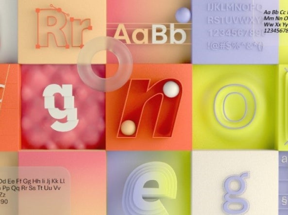
Tenorite, Bierstadt, Skeena, Seaford, and Grandview are the five fonts to be considered, and are available now

Microsoft is looking for its new default font and is encouraging users to decide which it will be.
The company’s default font on all Microsoft products has been Calibri, which replaced Times New Roman in 2007.
There are now five new contenders for the default font: Tenorite, Bierstadt, Skeena, Seaford, and Grandview.
“The degree to which seemingly minute differences in typography can create visceral responses”, Microsoft says, is apparently “a testament to the art and science of font design.”
The various fonts described “pan the various sans-serif styles—humanist, geometric, swiss-style, and industrial”, Microsoft adds.
Tenorite, by Erin McLaughlin and Wei Huang, “has the overall look of a traditional workhorse sans serif”, and is round, wide, and crisp, according to the designers. Its tight fit apparently allow for more words to fit on a line yet has “generous character spacing”.
Bierstadt, by Steve Matteson, is inspired by mid-20th century Swiss typography. It has large, block-style letters with little flourishes or contrast between thick and thin strokes.
“Microsoft already has Arial—which has many attributes from grotesque types preceding Helvetica—and my approach was to design a sans serif which would contrast with Arial by being far more mechanical and rationalized,” Matteson says.
“The terminal endings are precisely sheared at 90 degrees—a modern note contrasting the softer, angled endings in Arial—and a lack of somewhat fussy curves found in Arial’s ‘a’, ‘f’, ‘y’ and ‘r’.”
Skeena, by John Hudson and Paul Hanslow, is a “humanist” sans serif font with modulated strokes and a noticeable contrast between thick and thin lines, apparently making it ideal for body text in long documents. That contrast is usually associated with luxury branding, which work in large type but can be “unsightly and … brittle” if too small.
Seaford,by Tobias Frere-Jones, Nina Stössinger, and Fred Shallcrass, is “gently organic and asymmetric”, but should be useful for forms as the differences between letters should make recognisable word shapes
“To pinpoint the kind of familiarity and “comfort” the typeface should evoke, we also looked at pictures of old armchairs … nothing overtly plushy or nostalgic”,Stössinger says.
“When it comes to italics, it turns out there are parallels between chair ergonomics and typography: rather than inflating it and making it softer, trust the rigid moments that are good for your back.”
The last entry is Grandview, by Aaron Bell. derived from classic German road and railway signage, and made to be legible at distance and under poor weather conditions, Bell made the font wider while keeping the height the same. This made it more legible for body text, where it was not often used.
The five fonts are currently available to use, and Microsoft will be using polling and “feedback and comments on social” as to which will be chosen. Once a decision is made, it will become the new default font in 2022.
Join our commenting forum
Join thought-provoking conversations, follow other Independent readers and see their replies
Comments
Bookmark popover
Removed from bookmarks