Frame and fortune: the importance of providing the right environment for your wall displays
From artwork to architecture, content to context, there’s lot to consider before you grab your hammer and nails and put up a picture, writes Anya Cooklin-Lofting

Where some people have stacks of magazines that flank sofas and top coffee tables, I have picture frames. My purchases are compulsive, spontaneous and often unconscious. It is by default that I pick up a few, sleepwalk to the till with them tucked under my arm, and rediscover them in my bag at home.
Wooden varieties carved with Indian elephants or Arts and Crafts-style florals; gleaming, golden Art Deco frames in all their glamorous angularity; and scrolling, ornate Victorian models are all welcome members of my growing collection.
Furniture fairs, secondhand stores and charity shops are rife with the things, the guilt-free gilt that they comprise, cheap enough to forget about and small enough to slot in with the growing collection, awaiting a print, fabric cutting or sketch from a friend. Once they’re filled and ready for the wall, the final obstacle is where, and how, to hang them.
Hanging art is so much more about the context of the work in the room than we even begin to consider as laypeople. For interior designers, of course it is important to consider height, technical hanging techniques and layouts, but providing an intuitive, considered environment for a work of art or a collection of pieces takes precedence.
Art has the power to connect the onlooker to the location and culture in a very explicit way, so it’s important to consider the way the artwork interacts with its environment
“The best interior designers will take a unique approach for each property they work with,” says Jo Littlefair, co-founder and director at design studio, Goddard Littlefair.
“Art has the power to connect the onlooker to the location and culture in a very explicit way, so it’s important to consider the way the artwork interacts with its environment,” she adds. “Every property, much the same as every client, will have its own requirements that dictate the kind of artwork we source.”
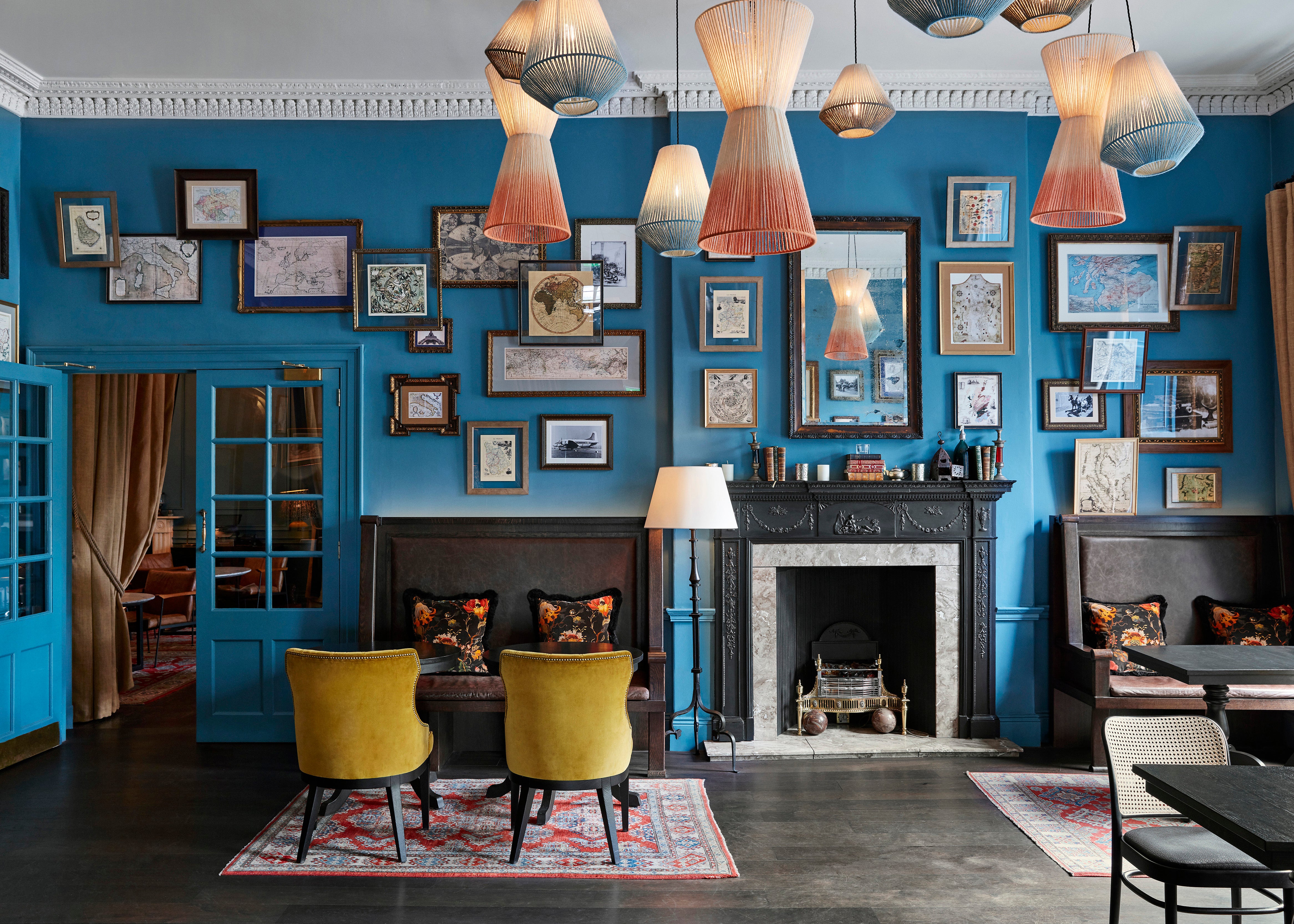
For a recent project in Scotland, the Kimpton Charlotte Square Hotel, artwork can be found in abundance in every room of the seven interconnected Georgian townhouses that comprise the property.

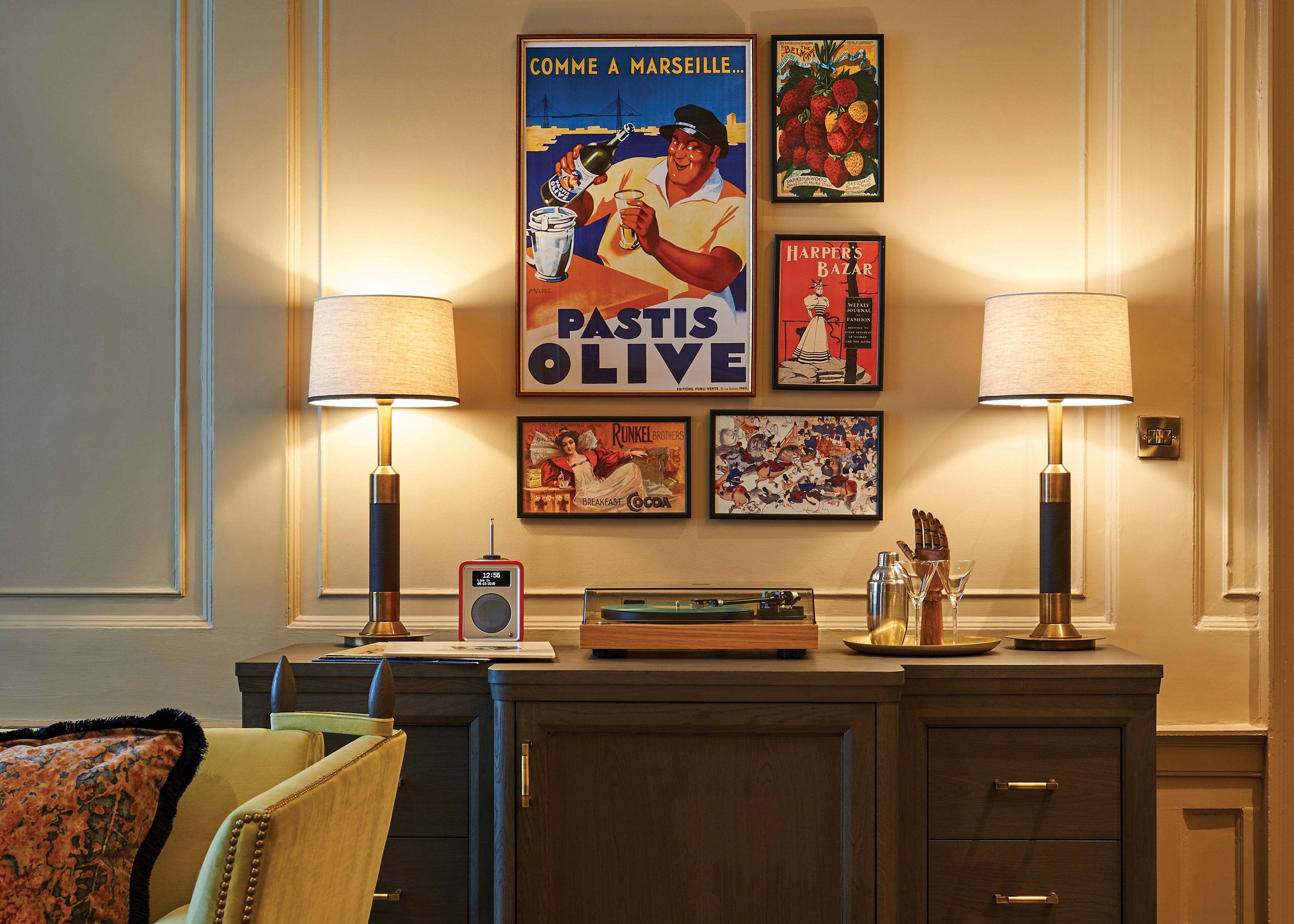
“For the hotel, we wanted the artwork to add personality, character, nostalgia and humanity,” and Littlefair and her team have done just that with a unique layering effect throughout.
For the designer, the Georgian architecture required an artwork pairing that reflected its heritage with an added nod to contemporaneity, achieved through this hanging technique.
“As there is added complexity with this technique,” Littlefair says, “you can create a stronger effect by sticking to frames that are similar in style and size or pick two sizes to overlap. Always remember that odd numbers look better than equal!”

Architectural considerations are paramount for Camilla Clarke, too, who is a creative director at Albion Nord, the design studio behind projects for the Chelsea Barracks and various country and urban homes.
“We look at viewpoints and vistas when it comes to hanging artworks, working with the architecture to determine the walls most in want of a beautiful piece of art,” she says. “For example, if you have a long corridor that opens out onto a large expanse of wall, this could be the perfect spot for an artwork that sits neatly within the doorframe from the perspective of the onlooker.”
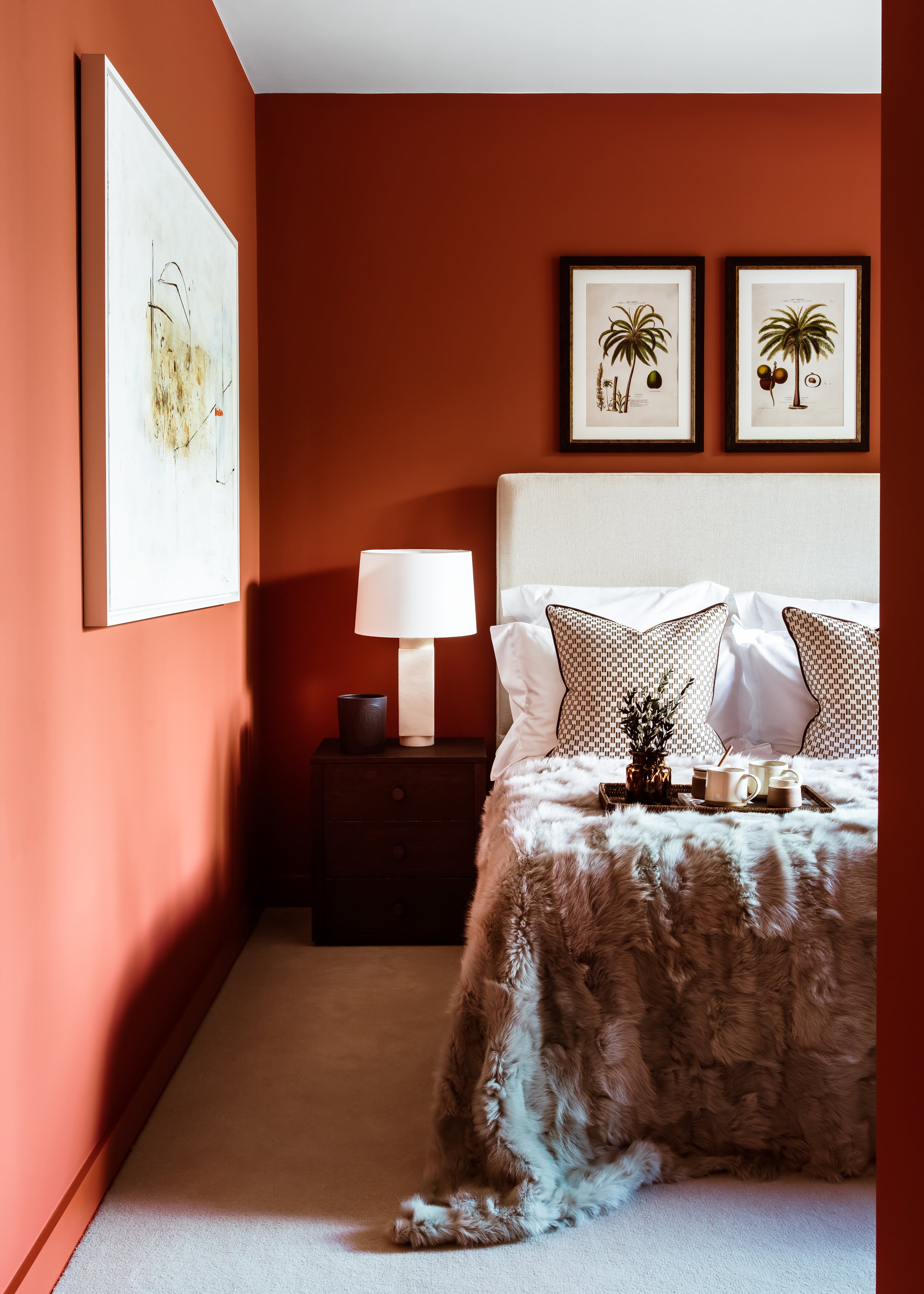
The context of the artwork amongst the milieu of colour in a room is also a deciding factor when it comes to decorating with a piece in mind. And according to Clarke, the apocryphal adage of choosing colours in a favourite piece to inform the colour of your soft furnishings can result in a scheme that feels too “matchy-matchy.”
Instead, she urges a more “holistic approach to contextualising your artworks in a space, with colours that complement and enhance the pieces on display”.

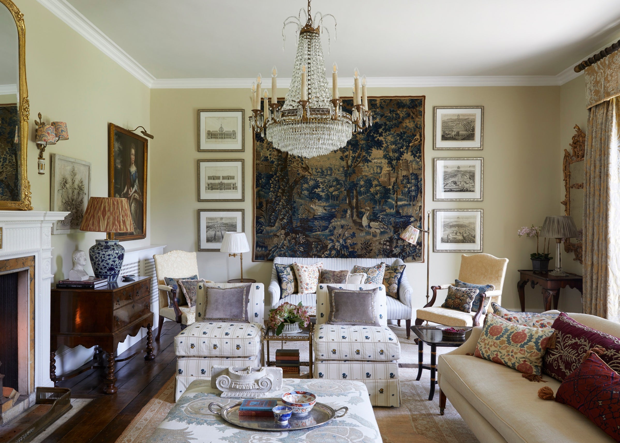
When it comes to sourcing art to display at home, Henriette von Stockhausen, co-founder of interior design studio, VSP Interiors, believes that sometimes, you have everything you need right under your nose.
“Don’t feel like you need to buy new pieces or source more work each time you want to add art to your home,” she says. “Reframing and re-grouping old pieces gives them a new lease of life. It’s about finding new contexts for your established collection of art, telling new stories with them in fresh ways.”
Join our commenting forum
Join thought-provoking conversations, follow other Independent readers and see their replies
Comments
Bookmark popover
Removed from bookmarks