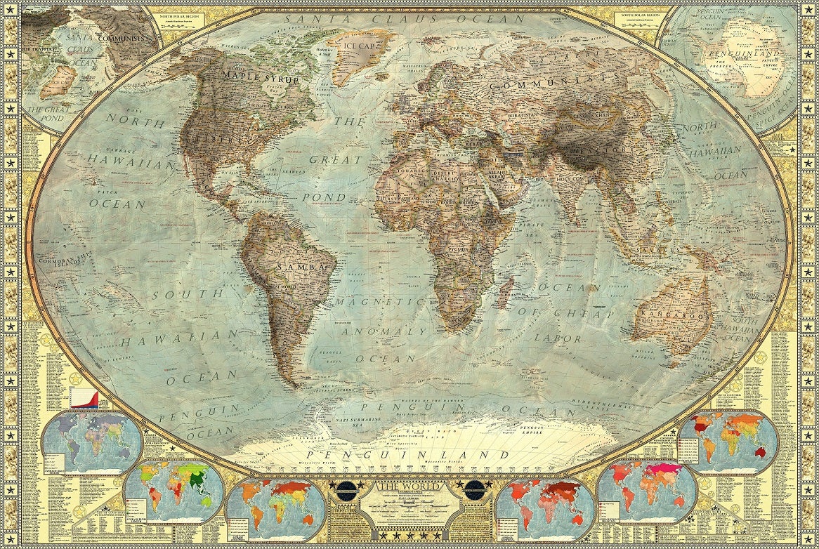
This map of the world in stereotypes is insanely comprehensive
Interestingly the UK is indeed made up of 95% tea leaves

Artist Martin Vargic has created a world map encompassing over 1800 different stereotypes of its countries, regions, seas and oceans, highlighting the absurdity of how some dismiss certain parts of the globe.
View a large image [6659 x 4462] of the map here, and close-ups in the gallery below
The standard political map alone took about three months to finish, drawing on publicly available geographic data, before another month and a half was spent adding the labels.
The resulting map is so detailed it crashed my browser twice trying to open it, but is well worth a zoom around.
It sees Norway being synonymous with its black metal scene, Russia associated with the Krokodil drug and Canada being mostly moose and ice hockey.
Vargic stressed that he doesn't agree with the stereotypes, the majority of which are basically oversimplifications, but wanted to highlight those that are commonly held by many westerners.
He was also quick to note that the map itself is a stereotype of a stereotype, as it works on preconceptions of a certain type of westerner's world outlook.
Vargic plans to improve and update the map in the coming years, incorporating more cultural and geographical differences and revisiting its pop culture references.
You can find out more about this fastidious project on his website.
Join our commenting forum
Join thought-provoking conversations, follow other Independent readers and see their replies
0Comments