The two maps that reveal we’re building too few houses and the ones we are building are in the wrong places
Population growth is greatest in the places where we're building the fewest number of houses

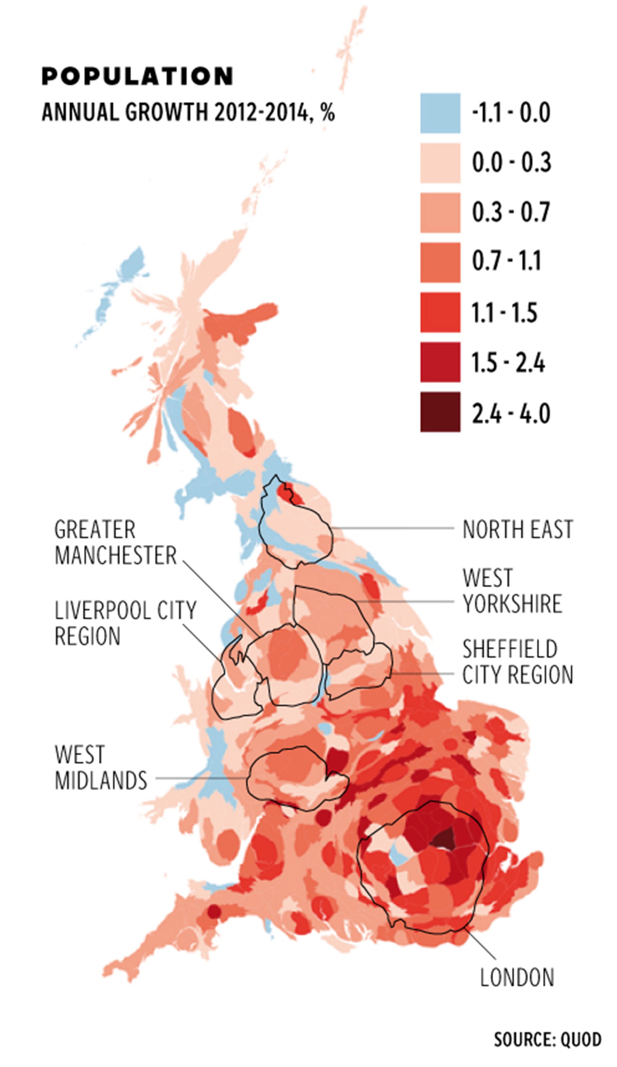
Two maps tell the story of one of the biggest problems facing Britain: the chronic lack of housing.
While the UK’s population is growing at an ever-faster rate, the level of housebuilding has fallen over recent years, even hitting a post-war low of 135,000 two years ago.
But the problem is even worse than the headline figures suggest when you look into where the houses that are being built are located: they’re not where they’re most needed.
The first map shows the rate of population growth in different locations across the UK – the darker the shade of red, the more people there are.

And the second map shows the rate of housebuilding across the UK – the darker the shade of red, the more houses are being built. The maps reveal a worrying inverse relationship between the two.
*For a note about the maps and why they are distorted, see below.
The situation is worst in London, where the Greater London Authority has estimated needs between 49,000 and 62,000 new homes a year to keep up with demand.
But the London Plan, the strategic planning team at the GLA, has set a target of just 42,000 a year. That figure is based on how many they believe can be accommodated, but last year the capital built almost half of that figure – 24,000.
Barney Stringer, director of planning consultant Quod who produced the data for the maps, said: “There is an overall shortage of housing and not enough housebuilding, and new homes are needed almost everywhere, but the high growth areas that need it most are not managing to provide new homes much faster than low growth areas.
He added: “The really big planning question for the next few years is whether the districts around London can and will provide for any of the growth that London can’t accommodate. The maps show quite how little is being achieved at present.”
The question is whether we must sacrifice one of the most "sacred cows" in British political life: the green belt. Sajid Javid, the Business Secretary was at pains to emphasise that the Government's recently announced plans to relax planning laws to spur on housebuilding would never infringe on the land surrounding towns and cities designated more than 50 years ago to be buiding-free.
But this pledge came shortly after figures released by ministers suggested there was not enough brownfield land in the UK to accommodate the 300,000 of homes needed to be built to meet the chronic shortage.
The Communities department estimates there is enough land for about 200,000 homes to be built on previously the brownbelt - previously developed sites in areas where housing is required.
Research by the business group London First shows the opportunity the green belt offers the UK's housing dilemma compared to the limitations of simply sticking to brownbelt areas.
In total, urbanised areas cover only 9.9 per cent of England and their actual built area covers 4.2 per cent of the total landmass, the study found. In contrast, the green belts around them cover 12.4 per cent of the total area of England.
London First, Mr Stringer, academics and even the OECD believe the green belt cannot be preserved perpetually. The OECD concluded that green belts constitute a "major obstacle to development around cities, where housing is often needed".
However the Council for the Protection of Rural England said their arguments were missing the point, insisting that the idea of green belts was primarily to prevent urban sprawl.
Whatever the short-term solution, the two maps above, combined with the data showing the potential capacity that the green belt offers, reveal an inherent problem with the UK housing market: too few houses, in the wrong places.
*A note about the maps: These are "cartograms" - maps that have been distorted in proportion to population. Cities are stretched, and countryside squashed until any two equal areas represent the same number of people. This sacrifices accurate physical geography for a much better picture of human geography. It avoids the problem of small urban districts – where most of us actually live – not showing up compared to large rural districts.
Join our commenting forum
Join thought-provoking conversations, follow other Independent readers and see their replies
0Comments