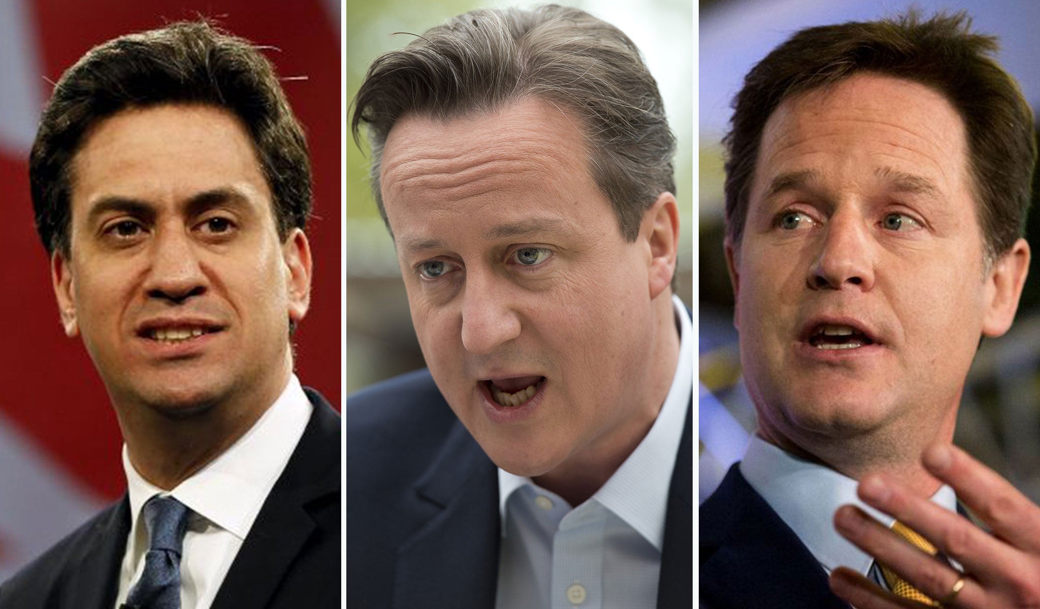
Election results: 10 charts that show how Britain voted
How many seats did each party win compared to votes? How did this change from 2010? What was the turnout? And how did the regions vote?

Your support helps us to tell the story
From reproductive rights to climate change to Big Tech, The Independent is on the ground when the story is developing. Whether it's investigating the financials of Elon Musk's pro-Trump PAC or producing our latest documentary, 'The A Word', which shines a light on the American women fighting for reproductive rights, we know how important it is to parse out the facts from the messaging.
At such a critical moment in US history, we need reporters on the ground. Your donation allows us to keep sending journalists to speak to both sides of the story.
The Independent is trusted by Americans across the entire political spectrum. And unlike many other quality news outlets, we choose not to lock Americans out of our reporting and analysis with paywalls. We believe quality journalism should be available to everyone, paid for by those who can afford it.
Your support makes all the difference.Conservatives won an unexpected majority in an extraordinary night of election results, winning 331 seats and taking them over the all-important threshold to be able to pass laws in the House of Commons.
But this only begins to tell the full story. The SNP surged to victory in Scotland, winning all but three of the 59 seats north of the border, while Ukip picked up just one seat despite winning the third largest share of the vote.
Here is the story of how Britain voted - told through 11 charts
Join our commenting forum
Join thought-provoking conversations, follow other Independent readers and see their replies
Comments