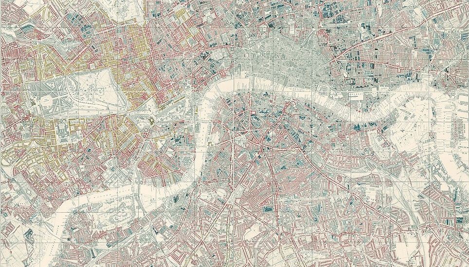
London's first 'poverty map' in 1899 shows a very different city to today
Maps dating back to 1575 exhibited by London map specialist Daniel Crouch Rare Books as part of Totally Thames festival

Your support helps us to tell the story
From reproductive rights to climate change to Big Tech, The Independent is on the ground when the story is developing. Whether it's investigating the financials of Elon Musk's pro-Trump PAC or producing our latest documentary, 'The A Word', which shines a light on the American women fighting for reproductive rights, we know how important it is to parse out the facts from the messaging.
At such a critical moment in US history, we need reporters on the ground. Your donation allows us to keep sending journalists to speak to both sides of the story.
The Independent is trusted by Americans across the entire political spectrum. And unlike many other quality news outlets, we choose not to lock Americans out of our reporting and analysis with paywalls. We believe quality journalism should be available to everyone, paid for by those who can afford it.
Your support makes all the difference.A handful of fascinating old maps of London have been released showing the divisions of rich and poor, the first attempts at a large-scale survey of the city and the last attempt to depict every single building in the capital.
The map above (large version here) was drawn by Charles Booth in 1899 and depicts areas of "chronic want" in black and wealth in "gold".
In some ways it does resemble the London of 2014, with Chelsea and Notting Hill still being the most affluent areas as they were at the turn of the 20th century, but in others it is starkly different, particularly in terms of how much central London and the east end have changed.
And given rocketing house prices and rent rates in the capital of late, you could argue that were a similar map drawn today the vast majority of it would be in gold.
The maps comes from the Mapping London exhibition which is part of the Totally Thames festival, with other earlier ones showing more pictorial images of London, including the earliest extant map created by Georg Braun and Franz Hogenberg in 1575.
Join our commenting forum
Join thought-provoking conversations, follow other Independent readers and see their replies
Comments