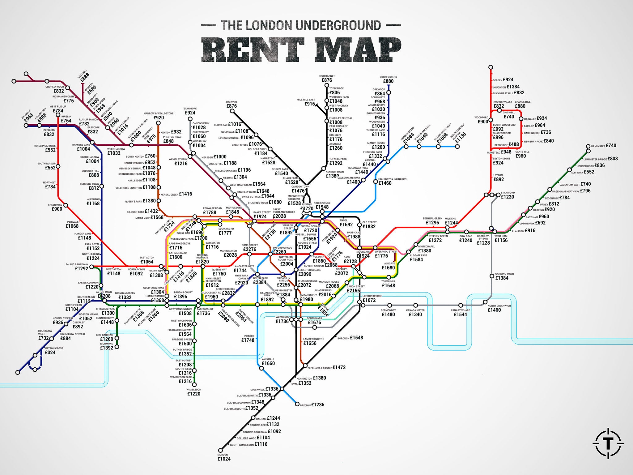
Alternative Tube map shows rent prices at London Underground stations
Rent in some areas was as high as £2,000

Your support helps us to tell the story
From reproductive rights to climate change to Big Tech, The Independent is on the ground when the story is developing. Whether it's investigating the financials of Elon Musk's pro-Trump PAC or producing our latest documentary, 'The A Word', which shines a light on the American women fighting for reproductive rights, we know how important it is to parse out the facts from the messaging.
At such a critical moment in US history, we need reporters on the ground. Your donation allows us to keep sending journalists to speak to both sides of the story.
The Independent is trusted by Americans across the entire political spectrum. And unlike many other quality news outlets, we choose not to lock Americans out of our reporting and analysis with paywalls. We believe quality journalism should be available to everyone, paid for by those who can afford it.
Your support makes all the difference.A new alternative Tube map has laid bare the eye-watering price of rent in most parts of London.
The map by the Thrillist website reveals the amount a tenant must pay for one bedroom within a kilometre of each Tube station on the London Underground network.

The diagram was put together using data compiled by property website Find Properly, and reflects how prices peak and trough in central London, including in the bustling tourist hotspots of Oxford Circus and Leicester Square.
Bank, which is at the centre of the City of London financial district, was also among the most expensive areas on the map, with one bedroom being rented for as much as £2,128.
Tenants were faced with similarly high prices in the upmarket west London areas of Hyde Park Corner and South Kensington, according to the data.
However, the map also reflects the divide in prices across the capital, with rent near the east London station of Dagenham Heathway being marked at £796, while prices in the proximity of the suburban west London station of Hatton Cross amounted to only £324.
A study published in June show that London rent was double the national average, at 10.7 per cent higher than in May 2014. The research was compounded by figures which showed that the capital is the third most expensive city to live in, after the wealth hotspots of the Cayman Islands and Switzerland.
Join our commenting forum
Join thought-provoking conversations, follow other Independent readers and see their replies
Comments