Loughborough becomes the latest university to be hit by a campus revolt over a new logo
Kings College London and UCA have also irked students over their rebranding

Your support helps us to tell the story
From reproductive rights to climate change to Big Tech, The Independent is on the ground when the story is developing. Whether it's investigating the financials of Elon Musk's pro-Trump PAC or producing our latest documentary, 'The A Word', which shines a light on the American women fighting for reproductive rights, we know how important it is to parse out the facts from the messaging.
At such a critical moment in US history, we need reporters on the ground. Your donation allows us to keep sending journalists to speak to both sides of the story.
The Independent is trusted by Americans across the entire political spectrum. And unlike many other quality news outlets, we choose not to lock Americans out of our reporting and analysis with paywalls. We believe quality journalism should be available to everyone, paid for by those who can afford it.
Your support makes all the difference.Students are well known for protesting against fees, wars and injustice – but it appears nothing annoys a modern undergraduate more than a badly-redesigned logo.
Loughborough University is the latest educational establishment to be hit by a campus revolt against attempts to update its corporate image.
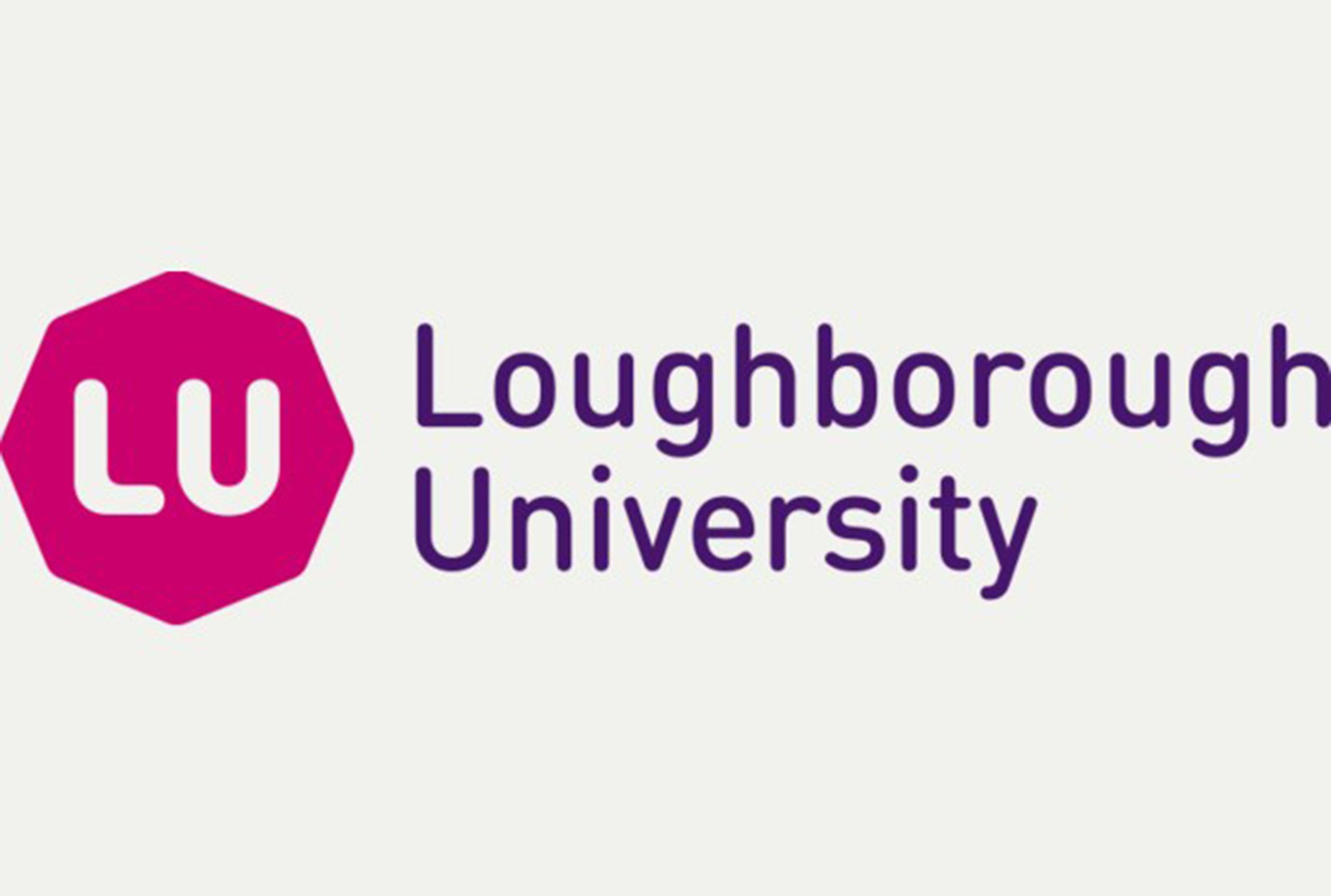
Within hours of the university unveiling its rebranded logo a petition was created demanding that the image - a pink octagon with white LU letters at its centre – be scrapped. The new image replaces the old logo of a purple shield with a pink square cut into the top right corner.
Emma Leech, Loughborough’s Director of Marketing and Advancement, claimed the redesign was “the first digital logo device” in Higher Education. Writing last month before the unveiling, she called the new logo “a visually agile, dynamic image that will allow us to take advantage of advances in technology”.

The petition to bin the new logo was set up by Loughborough graduate Scott Lawrence who said the shield emblem was an “iconic” reminder of prestige, heritage and respect associated with the institution whereas the new version “loses all of these values”.
Wags have already begun altering the image to poke fun. Graphic communication student Dan Scott added a ‘BE’ in pink letters next to the octagon with the tagline “soft and sensitive”.
More than 12,000 people have signed the Revoke 2015 Loughborough University rebrand petition on Change.org forcing Loughborough to announce it has ‘paused’ the project, although the new logo still features on its homepage.
A spokesperson said: “The strength of feeling around the change in the visual identity highlights just how passionate our students, alumni and the wider university community are about Loughborough.

“We are therefore proposing that the roll-out of the new identity is paused at this point to allow us to take stock and to listen to concerns, as we are aware that the majority of those commenting have only seen a very small part of a wider reputation and profile strategy.”
The row is the latest in spate of rebranding protests at institutions around the country. The universities concerned all told The Independent they want to rebrand to become more “contemporary” and “forward looking”. Many students prefer traditional, historic designs.
Epsom’s University for the Creative Arts (UCA) students were horrified last month when they were confronted with a change from their simple white and green design to a monochrome design using what look like matchsticks to represent letters. Some compared it to Soviet propaganda.
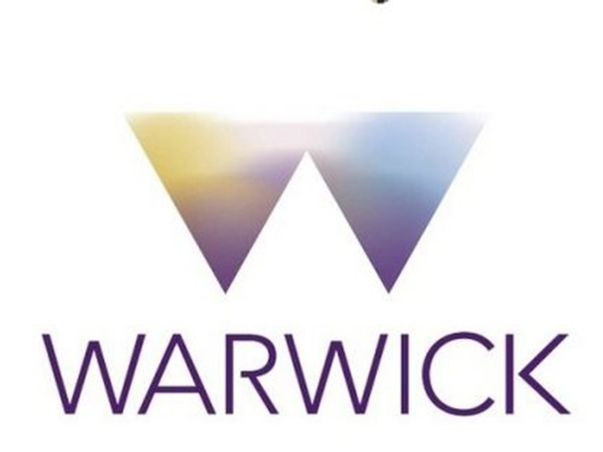
Warwick University has so far spent £80,000 on a rebranding process that coincides with the institution’s 50th anniversary with a new logo of two inverse pyramids joined together to form a W and coloured in ‘Warwick aubergine’ and ‘Warwick burnt orange’.

A university spokesman said the new logo would be used sparingly and that the historical crest will remain in use where appropriate.
King’s College London agreed to ditch its planned rebrand earlier this year after a proposal to drop ‘college’ from the university’s name met with overwhelming opposition from students.
Emily Braddock, a second-year theology student who led the campaign against the proposed new name, said it would “undermine almost 200 years of tradition, as well as sabotaging a worldwide reputation built on the name King’s College London.”
The best brands provoke a reaction
By Jim Dowling, Managing Director at Cake
What is it with logos? They cause such unnecessary stress. Twenty minutes on a Mac, mess around with some artwork and all hell breaks loose. Some poor, pleasant bloke with a beard and a massive pair of headphones was quietly doing arranging a few artwork files – and then bosh, people are signing petitions and screaming the house down.
So much emotion.
That’s the issue here. Logos aren’t about the colours, the typography and how it sits on the page. They are modest - and what ought to be insignificant - expressions of what products, brands or institutions stand for.
Loughborough University should be delighted by this response. 12,000 people have shown they care. Thousands more won’t have signed but will be sympathetic to the cause.
Research from Havas this week shows that 76% of the population couldn’t care less if brands simply disappear. Couldn’t give a monkeys. Unless brands, products and institutions play a meaningful role in peoples’ lives; ie be useful, make you laugh, make your life a bit better – then jog on. The opposite is happening at Loughborough, and that’s a great thing.
There is a simple lesson for Loughborough or anyone attempting a rebrand. You don’t own it. People that use and interact with your brand, create it and mould it. So listen to them, talk to them, ask them how they feel.
If the bloke with the headphones had thrown his design process open to those students, and asked for their ideas – we’d see a logo that conveys ‘prestige,’ ‘respect’ and the other emotions the students argue have been stripped away. And if people have been asked to get involved and contribute, they might start promoting it too. Loughborough can turn 12,000 signatures on a petition to 12,000 likes on a brand new “I love the new Loughborough logo,” with a just a little bit of listening.
Join our commenting forum
Join thought-provoking conversations, follow other Independent readers and see their replies
Comments