The Independent's journalism is supported by our readers. When you purchase through links on our site, we may earn commission.
Houses as homes: don't move, improve
Stop fretting about future buyers. Now's the time to make your house your own. By Kate Watson-Smyth

Your support helps us to tell the story
From reproductive rights to climate change to Big Tech, The Independent is on the ground when the story is developing. Whether it's investigating the financials of Elon Musk's pro-Trump PAC or producing our latest documentary, 'The A Word', which shines a light on the American women fighting for reproductive rights, we know how important it is to parse out the facts from the messaging.
At such a critical moment in US history, we need reporters on the ground. Your donation allows us to keep sending journalists to speak to both sides of the story.
The Independent is trusted by Americans across the entire political spectrum. And unlike many other quality news outlets, we choose not to lock Americans out of our reporting and analysis with paywalls. We believe quality journalism should be available to everyone, paid for by those who can afford it.
Your support makes all the difference.If one thing is clear about this year, it will be about doing up, not selling up. So now that we're finally treating our houses as homes, the time has come to get rid of all that bland beige décor that was created to entice potential buyers and start thinking about how we want to live rather than how we have invested.
Victoria Redshaw, of Scarlet Opus, is a trend forecaster specialising in interiors. Ahead of her appearance at Interiors Birmingham (18-21 January) she explains the look for 2009 and what we should be looking for now that we're improving instead of moving.
"It's time to move away from that bland beigeness of recent years and starting thinking of our homes as physical scrapbooks of ourselves," she says. "That means having things that you really love and that mean something to you. The trend will be towards spending, perhaps a little more, on a classic piece that you will love for a long time, which also goes towards the sustainability argument. Or, if you don't want classic, find something a bit more daring that you know you will like for years to come."
The key to being more daring is to concentrate on the accents. It's easy enough to change a feature wall or a set of cushions if you tire of the colour, but make sure your basics are classic. Grey is the new magnolia. Look for a warm shade of grey which works well on walls and can be teamed with brighter, more adventurous accent colours. "One of the strong colours is maroon," says Redshaw. "It works well in dining rooms – and as we can't afford to go out for dinner we should make our dining rooms, or the eating area of the kitchen, as much of a restaurant experience as possible."
Maroon and other colours of the Raj and Indian motifs are coming through strongly, Redshaw says. "This is due to the rise of India – Delhi is holding the Commonwealth Games [in 2010] and New Delhi is bidding for Formula 1 this year. Add this to the V&A exhibition on the Splendours of India at the end of the year, and you can see where the influences are coming from." And what are the main ideas? "Colours include golds, copper and bronze. Time to get rid of cold silver and look for paisleys and Kashmiri patterns. This can either be a younger Bollywood look or a more classic style which Graham & Green do so well."
Redshaw also suggests visiting www.etsy.com , a site selling handcrafted items by designers. "The handcrafted look will be big but slightly less rustic than previously. We are looking at warm colours, atmospheric lighting and a more cosseting feeling than in previous years."
Another trend is towards a more beachy, relaxed feel, where coral will be a strong colour. "This fits with the new President Obama and a feeling of change in the air," Redshaw says. "Indigo, sandy colours and mother of pearl are all strong looks teamed with natural woods. All of these work well with a neutral grey background and you can mix it with petrol and coffee colours."
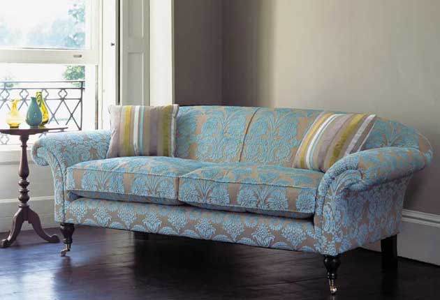
Shapes are curvy and organic. No more of those masculine hard lines. And it's time to lose the geometric patterns and striped carpets. "Carpet adds to the feeling of warmth, and comfort and pattern is coming back. It doesn't have to look like your Granny's Axminster any more."
Join our commenting forum
Join thought-provoking conversations, follow other Independent readers and see their replies
Comments