Windows 9 screenshots confirm the return of the Start Menu and an app-based desktop mode
Microsoft is apparently sticking with what they know for Windows 9

The public's reaction to Windows 8 was mixed for a number of reasons, but for lots of users the biggest complaint was one of the simplest: where was the Start Menu?
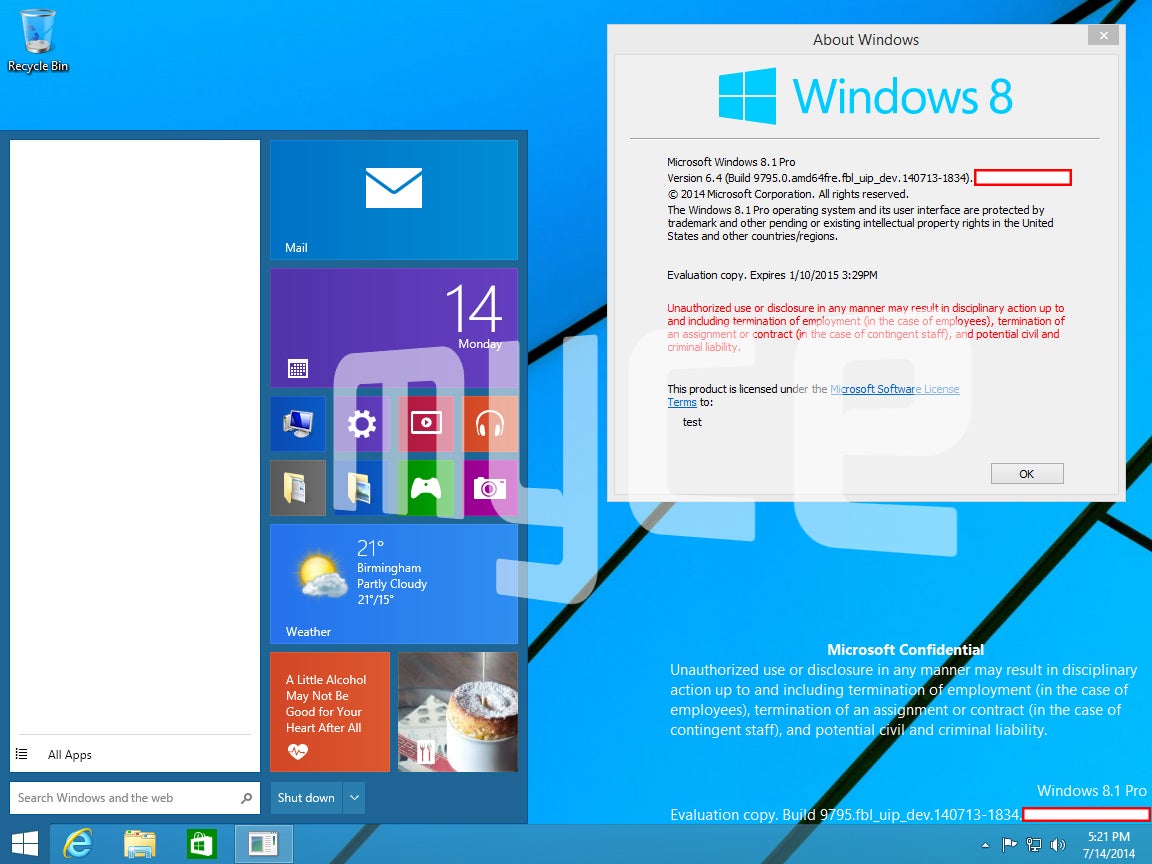
Microsoft confirmed this April that they’d be re-introducing the Start Menu into Windows 9, but newly-leaked screenshots have shown us a little more about the familiar feature.
The images published by Myce (above and below) show the Start Menu split between a traditional search bar on the left (presumably covering files, programs and settings) and pinned apps on the right (including shortcuts and live widgets displaying local weather as well as news stories -well, health and cookery stories).
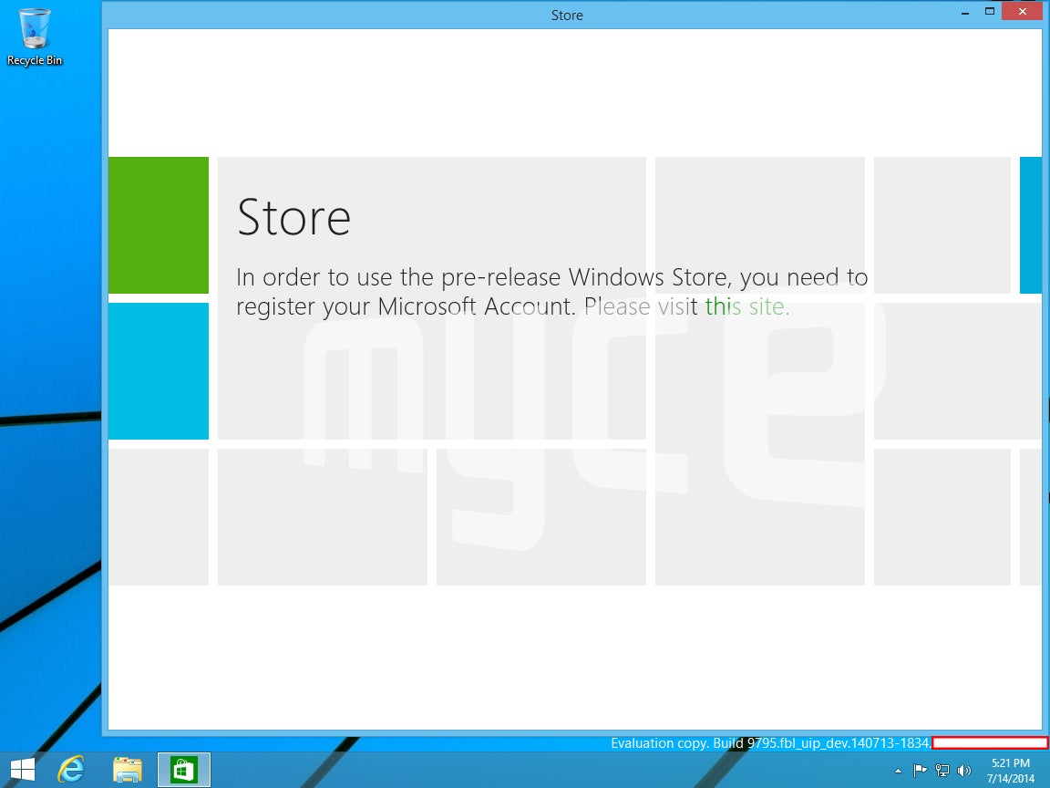
The second screenshot also suggests that Microsoft is planning to make its touchscreen-optimized apps function in the more traditional mouse-and-keyboard desktop environment - they'll be putting them in windows.

The split between these ‘Metro-style’ programs and the legacy software that most Microsoft users are familiar with has been one of the biggest challenges facing Microsoft – and it looks like the company is trying to overcome it by simply reintroducing more familiar controls, aka the minimize, maximize and close buttons.
Some diehard Windows fans will see this as a step back for the company (they'd previously thrown everything at creating a 'productive' OS that for tablets) but with Microsoft currently undergoing dramatic restructuring it might be a good idea to stick with what's tried and tested.
Join our commenting forum
Join thought-provoking conversations, follow other Independent readers and see their replies
Comments