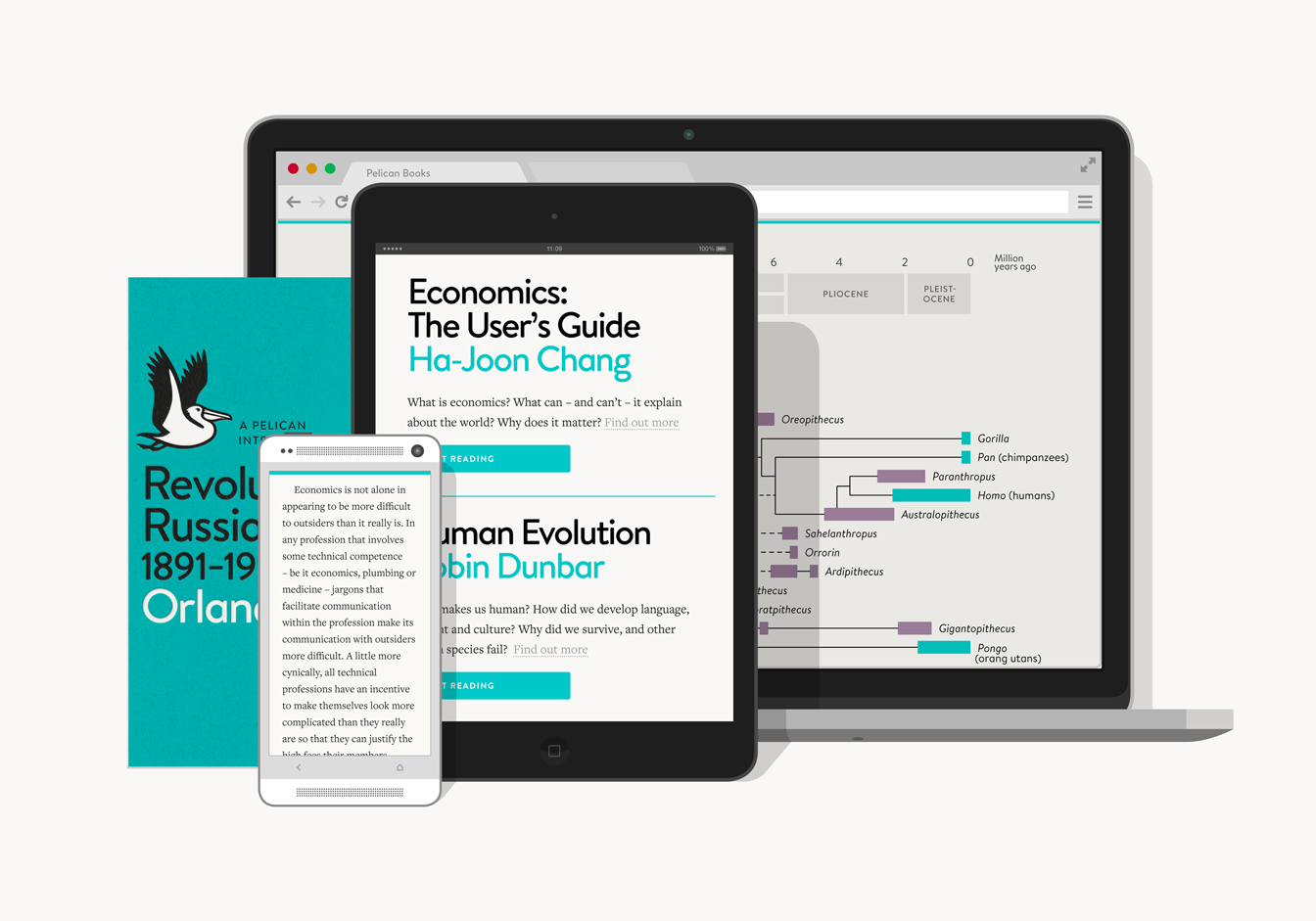
Pelican Books' new website is a pocket library accessible from smartphones and tablets
Following the re-launch of the imprint this May, Pelican's new site strives to keep true to the publisher's mission of accessible, educational books for all

Your support helps us to tell the story
From reproductive rights to climate change to Big Tech, The Independent is on the ground when the story is developing. Whether it's investigating the financials of Elon Musk's pro-Trump PAC or producing our latest documentary, 'The A Word', which shines a light on the American women fighting for reproductive rights, we know how important it is to parse out the facts from the messaging.
At such a critical moment in US history, we need reporters on the ground. Your donation allows us to keep sending journalists to speak to both sides of the story.
The Independent is trusted by Americans across the entire political spectrum. And unlike many other quality news outlets, we choose not to lock Americans out of our reporting and analysis with paywalls. We believe quality journalism should be available to everyone, paid for by those who can afford it.
Your support makes all the difference.When the Pelican imprint was set up in 1937 its founder Allen Lane wanted to sell a range of non-fiction titles that were as accessible as possible, declaring that he believed in the existence of “a vast reading public for intelligent books at a low price”.
He was right, of course, and Pelican books covering everything from socialism and psychology to aircraft identification and archaeology sold in their millions. Now, six months after the imprint’s re-launch, Pelican is striving to become even more available to that ‘vast reading public’ with a new website that blurs the line between ebooks and online browsing.
It works like this. You sign up, read a chapter and– if you like the book – buy it for £4.99. It’s then available on any internet-connected device, with passages you’ve highlighted and your reading position saved and synced across them all; you can be learning about australopithecines in Robin Dunbar’s introduction to human evolution on your tablet at breakfast and advance to Homo habilis on your smartphone at lunch.

It’s an alluring pitch, certainly, and well calculated to not only attract the imprint’s demographic (younger than most Penguin readers and, presumably, interested in self-education) but also to capitalise on faltering interest in ebooks. Revenues are continuing to grow in the sector, but nowhere near the explosive rates of past years, while younger people are still more likely than their parents to read a book - and across a wider range of formats than ever before.
Essentially, if Pelican still wants to be "the true everyman's library" - as Lane wrote in 1938 - then now seems like a good time to capitalize on the digital bookshelves that we all carry in our pockets and bags every day.
So how have they done? Well, the site certainly looks the part, keeping to the same distinctive, almost stark typography and layout of the re-launched imprint. The two sides - digital and physical - were actually “designed in tandem,” says in-house graphic artist Matthew Young, although he adds that there are still plenty of differences.
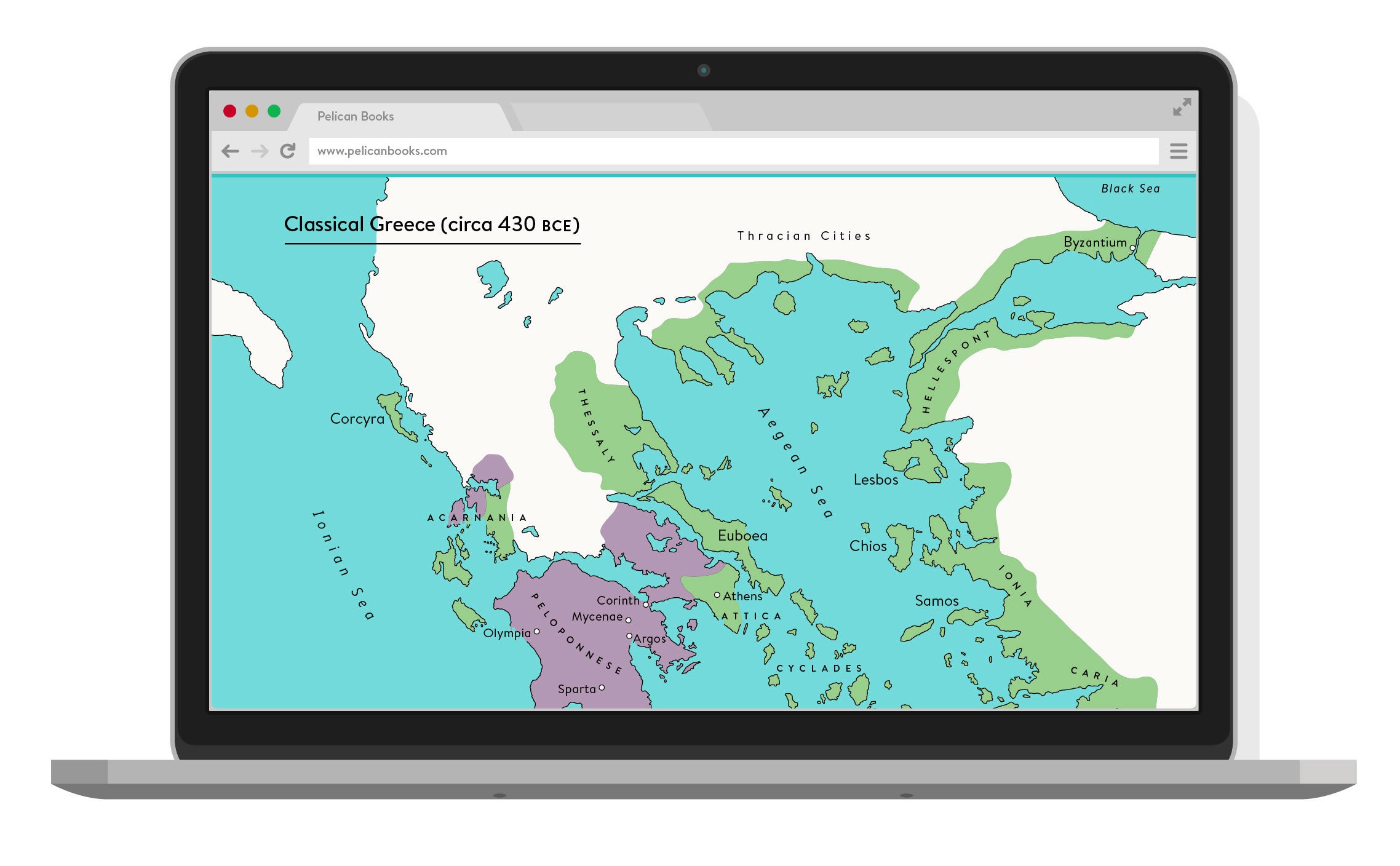
“Each format makes the most of its inherent qualities,” he says over email. “The paperbacks get lovley paper, Pantone inks and debossed covers - all things you can't do online - and the online books offer full-colour images and maps, animations, embedded videos and dynamic footnotes, etc - all things you can't do in print.”
He admits that there’s a danger when using digital formats to muddle the text with unwanted multimedia content, but says with the Pelican imprint there’s definitely opportunity to use “video, animation and interactivity to communicate a message more directly”. The graphics and footnotes then (see below) keep to this message - simple but ultimately unobtrusive.
nullnull“Ebooks are designed with print conventions that don't necessarily make sense on-screen,” says Young, “whereas the Pelican online books have been designed from the very beginning with the print and digital reading experience in mind.”
It shows and reading the books online – on any device – is as enjoyable as the experience can be on a lit screen (something that, in my experience, still makes it harder to concentrate for long sessions – though that might also be all the distractions that come baked to smartphones and tablets).
And after the site struggled through some early teething problems last week, the synced highlights and reading positions also worked seamlessly. It is quite disappointing that there’s far from a full library on offer (only the five re-launch titles are currently available) but Pelican say they plan to expand their archive in the future - hopefully including some older classics that haven't dated too poorly.
(Click here for a comprehensive catalogue of Pelican from the 1930s onwards - it includes their stunningly good covers.)
The one sticking point is that despite the aim of accessibility, titles purchased in the new format are only available on the site itself. Any ebook downloads (either for Kindle or in the epub format) have to be bought separately. A great shame for those that might want to catalogue their personal library – even if that appears in a computer folder, rather than on a bookshelf.
Join our commenting forum
Join thought-provoking conversations, follow other Independent readers and see their replies
Comments