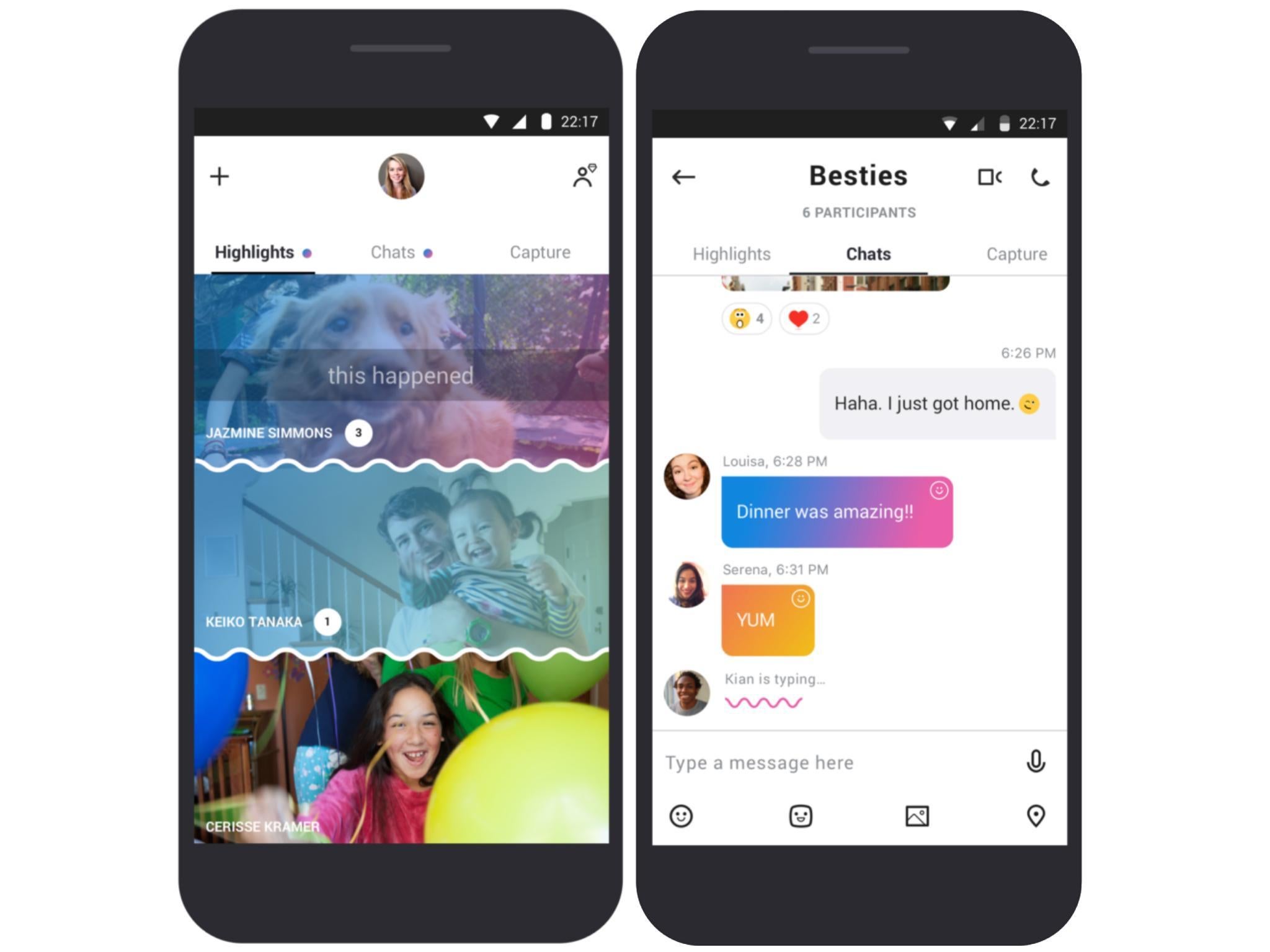
Skype has completely changed its app design and look
The messaging app has taken tips from Snapchat, WhatsApp and Facebook Messenger

Skype has undergone a dramatic overhaul, with Microsoft transforming the app into something barely recognisable.
It has become very similar to Snapchat, with picture- and video-sharing now a core part of the user experience.
The new-look mobile app started rolling out today, and Skype for desktop will be upgraded later this summer.
Highlights lets you quickly capture pictures and videos, and personalise them with emoji, text and drawings.
Your contacts can react to them with their own emoji and comments, and your Highlights will automatically self-destruct after seven days.
It’s Skype’s answer to Snapchat Stories, which has already been copied by Facebook, Instagram, Messenger and WhatsApp.

As you’d expect, the Chat screen still sits front-and-centre of the new Skype app, though it looks very different now.
You can pick your own colourful theme, and the user interface is much more modern-looking, putting it in line with popular messaging services like WhatsApp and Messenger.
You can also add bots to conversations, to make it easy for your group to buy tickets to an event, for instance, as well as add-ins from YouTube and Giphy.
However, Snapchat-like functionality is here too, in the form of Capture. This takes you straight from the conversation screen to your camera, encouraging you to share more pictures and videos.
New Skype seems a lot younger and more energetic than old Skype, which felt a little old and clunky compared to competing messaging services.
The new version of the mobile app is available on Android now, and will roll out to iOS soon.
Join our commenting forum
Join thought-provoking conversations, follow other Independent readers and see their replies
1Comments