Google unveils new logo – prepare to not have your mind blown
They see me kerning
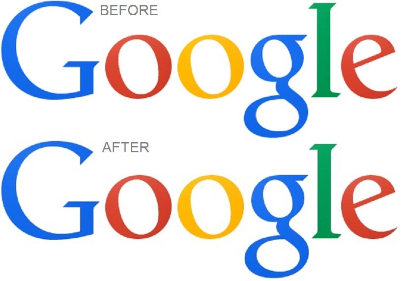
Google has revamped its logo much to the excitement of a small number of design geeks, moving the second 'g' a whopping one pixel to the right and taking the 'l' on a wild journey one pixel down and one to the right.
The minuscule change was spotted by eagle-eyed Redditors, with the fact that it was even picked up on being testament to the brand's power and omnipresence.
The change basically comes down to kerning, with Google adjusting the letters to improve the logo's readability and decipherability.
Also, the bottoms of the 'l' and 'e' previously didn't line up, which presumably left some employees in the company's design department weeping at their desks.
Here's how it looked before:
Here's how it looked after:
And there's a handy GIF of the change
Google has fiddled with its logo countless times throughout its history, previously switching from a more textural style to a more blank one, as many brands like eBay also have.
Join our commenting forum
Join thought-provoking conversations, follow other Independent readers and see their replies
0Comments