Four insights into Apple from iOS 7: Or, how design won't save the world
The tech giant showed off big changes in looks, but where was the real innovation?

Can Apple redesign anything - even flatness?
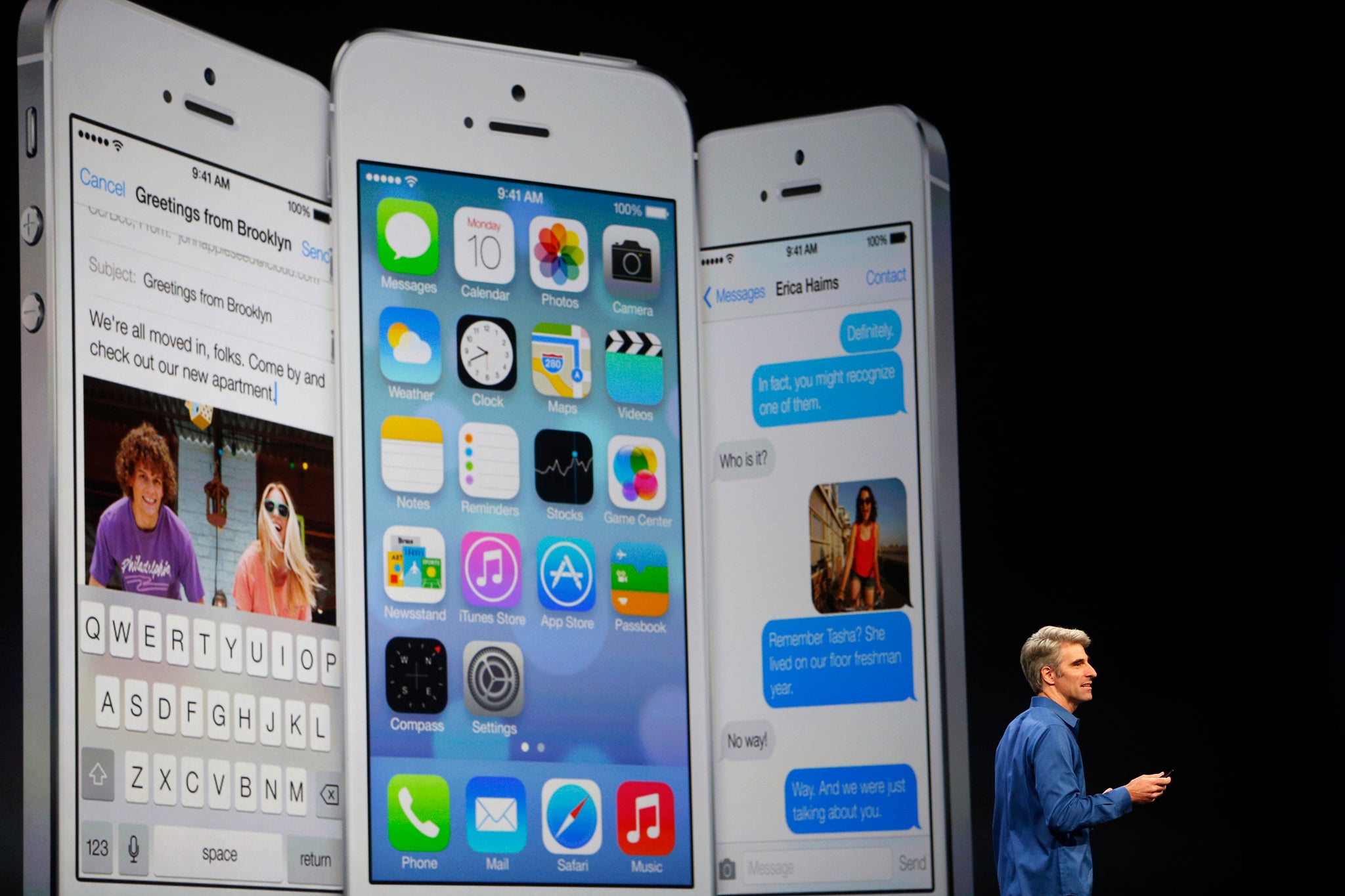
As we (and everyone else) predicted, the biggest design change for iOS 7 was going flat. Skeuomorphs were kicked out on their convincingly drop-shadowed backsides whilst icons and stock apps all received makeovers, with Craig Federighi mugging to the camera and assuring audiences at WWDC that “absolutely no artificial cows were harmed in the making of this user interface.”
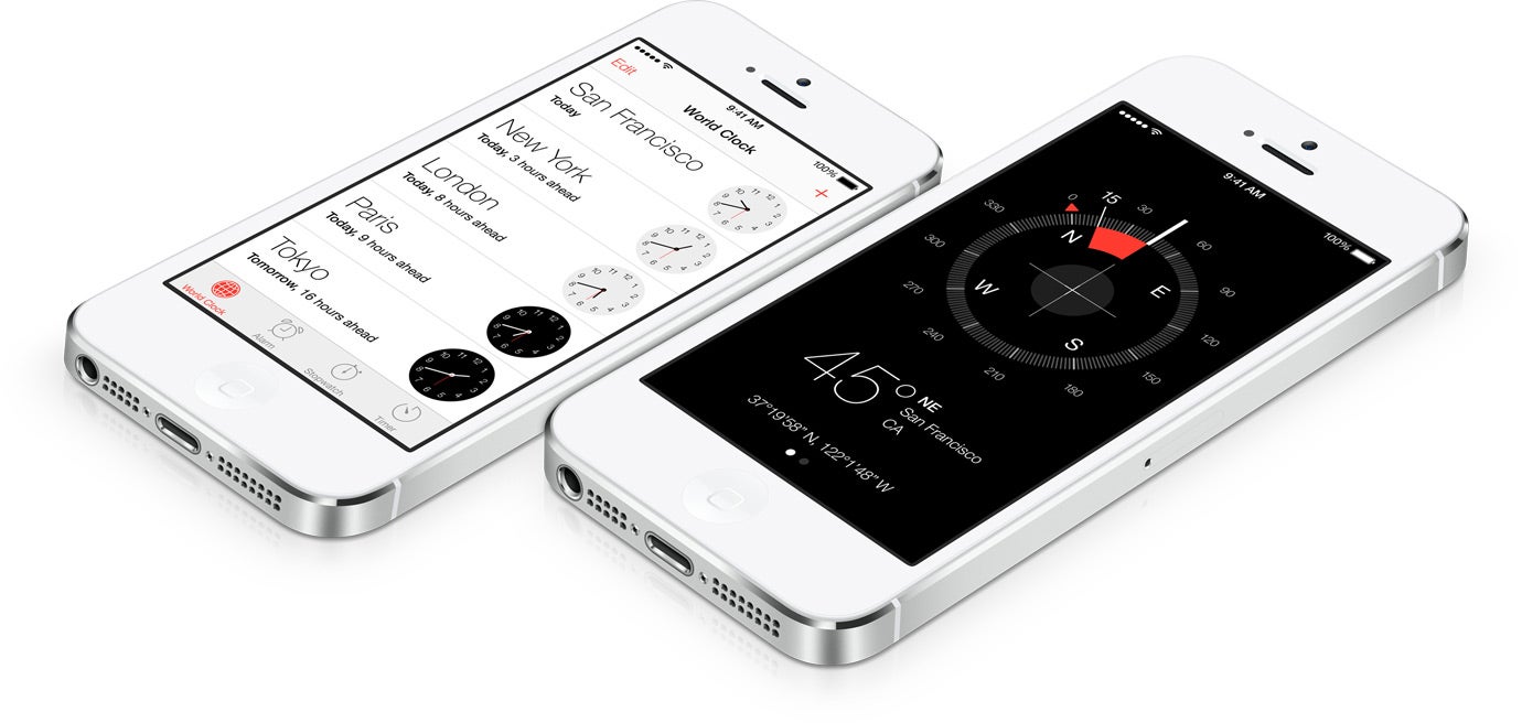
Despite this, it seems that ‘flat’ might not have been the right word for the changes and perhaps we should be using ‘layered’ instead. The introduction of parallax wallpapers is perhaps the most obvious example of this, adding an illusion of depth by keeping the icons static and shifting around the wallpaper behind, but layers were everywhere
(Sidenote - ‘parallax’, a lovely sounding word, also provides compensation for not getting to say ‘skeuomorph’ any more)
As well as wallpapers there's the addition of the swiped up command center and the overlaid notification center; both additions that use translucent screens to emphasise their temporary importance - the real content lies below.

But despite Apple’s new take on what flat means the reaction to the new look of iOS 7 has in no way been uniformly positive. Joshua Topolsky’s review for The Verge was particularly notable, branding the new look “simply confusing” before launching into a catalogue of Apple's errors: “Inconsistent look and feel. Harsh colors. No harmony. No core theme.”
These haven't been the voice of lone outrage and Twitter has been especially vocal in its complaints - check out the Tumblr Designers Complaining for a catalogue of the best reactions.
That Apple might mis-step when it comes to design has been so surprising that it’s even been alleged by The Next Web that the icons were “primarily designed” by members of Apple’s marketing and communications department, rather than the traditional art teams. They also claim that iOS 7 isn’t even the finished product, that it’s firmly a “work in progress”.
Whilst the latter suggestion seems very unlikely - why would Apple showcase an unfinished product so extensively, spending so much time and publicity extolling its virtues? - the concept of a shake-up at Apple HQ makes sense, especially if the aim was to actually create an entirely fresh look for mobile.
Unfortunately, the 'look' has proved divisive, and even its innovations might not be all that original.
Apple stole, but it always has...
As well as criticizing the redesign plenty of people have also pointed out that many of iOS 7’s ‘new’ features have been cribbed from other manufacturers. Writing over at ZDNet, Steve J. Vaughn-Nichols has called it “a derivative copycat not only of Android but of almost every other major mobile operating system out there.”
Apple’s new swipe-up 'control centre' that gives access to important settings like airplane mode, volume, WiFi and the like first appeared as a swipe-down feature in Android skins for LG, Samsung, and HTC whilst the new multi-tasking feature has been around in HTC phones for a while.
And this is without mentioning touches like the new focus on type in the interface (very Windows Phone) or the addition of built-in camera filters (old news for HTC or Instagram).

However, this probably isn't even a problem. In fact, Apple have proved many times before that this is what it does best: it takes existing designs and it make them its own - it makes them better.
The iPad is the classic example of this. Microsoft have been making tablets since 2001 (they even named the form), but with just a single, brilliantly-executed product Apple smashed open the market and have owned it ever since.
Apple also certainly benefited from being in the right place at the right time, but it’s impossible to deny that it their philosophy of “a thousand no’s for every yes” (something that’s probably as relevant to their marketing as it is to their design) does differentiates them from the competition. However, even this might not be enough this time around.
A drastic make-over, but only skin-deep
Apple’s approach to product has always embraced the concept of the ‘walled garden’ (lovely to be in, but don’t try to get out) and some industry commentators thought that WWDC 2013 might be the right time for the tech giant to open up the gates a little, allowing more access to third-party developers to build software for their iOS.
Instead, Apple have simply expanded the reach of their walls – creating apps that replace existing third-party equivalents for features such as the flashlight or number blocking for calls, texts and FaceTime.
Although this particular example is positive for users (offering more reliable apps without the hassle of downloading), it shows the company’s determination to keep the Apple experience on as tight a leash as possible. Unfortunately, this might be choking the life out of its software.
Apple’s obsession with controlling the experience of their products is clouding how they might open up their software to innovation and wider services.
A comment made former Apple employee Patrick Gibson that “Google is getting better at design faster than Apple is getting better at web services” back in 2012 has been swishing about dangerously once again (after being highlighted by The Verge and John Gruber), and it really is spot on.
Apple’s computer based web services (Gibson picks out iCloud, MobileMe and the like as examples) have always been far from perfect, and as smartphone use is further dominated by online applications, we might see the rot continue to spread.
Discouraging third-party developers by limiting the importance of their products is only a minor symptom: Apple is focusing too much on design, and not enough on developing their internet-integrated services.
The Apple maps disaster is good example for mobile, and whilst WWDC highlighted its use on desktops, no-one actually came out and said 'Yes. It sucked. But it's cool: we fixed it.' That might have been more welcome news.
Despite all this, there were hints of fresh thinking
Tucked away in the corner of a single slide during WWDC, the announcement the Apple will be expanding iPhone and iPad support for gaming controllers was near invisible news. Yet it's a story with big potential.
The market for mobile gaming has long been moving away from dedicated hardware like the Nintendo’s DS to smartphones and Apple have been leading this charge. Just looking at handsets sold gives a quick idea of the potential: Apple sold 109 million iPhones in the last four quarters – Nintendo sold 98.5 million in the last four years.
The exact announcement was that iOS 7’s SDK (its ‘software development kit’ – basically a how-to guide to help non-Apple companies make products that work with Apple’s own) would support “MFi game controllers” - hardware authenticated by Apple themselves.
A document spotted by TouchArcade even shows the company’s basic blueprints for such controllers, with two styles featured – one that fits around the iPhone, placing a D-pad and shoulder buttons and action keys on either side of the screen, and a standalone option that looks very similar to the basic controller for the Nintendo’s Wii.
Although such controllers already exist, the lack of Apple support means that games developers have to write their own support for each individual third party controllers. By creating a single interface blueprint Apple have made it much easier for developers and gamers alike to use external controllers with games.
The Verge also pointed out that with Apple’s AirPlay already allowing Apple TV to act as a conduit between TVs and iOS games, it’s entirely possible that the company might start moving into the home gaming market – especially as low-budget console form factors (like the GameStick) continue to gain momentum.
It's a small thing to pick out of a two-hour presentation from Apple, but in some ways it was one of the more exciting bits of news. Apple may have produced an amazing computer in the Mac Pro, but the hoo-hah over iOS 7 seems more symbolic than anything else. Let's hope that this company, a company which used to create whole markets seemingly overnight, has a couple more tricks left in the bag.
Join our commenting forum
Join thought-provoking conversations, follow other Independent readers and see their replies
0Comments