Inspiring home of the week: A Japanese-influenced space with views across San Francisco
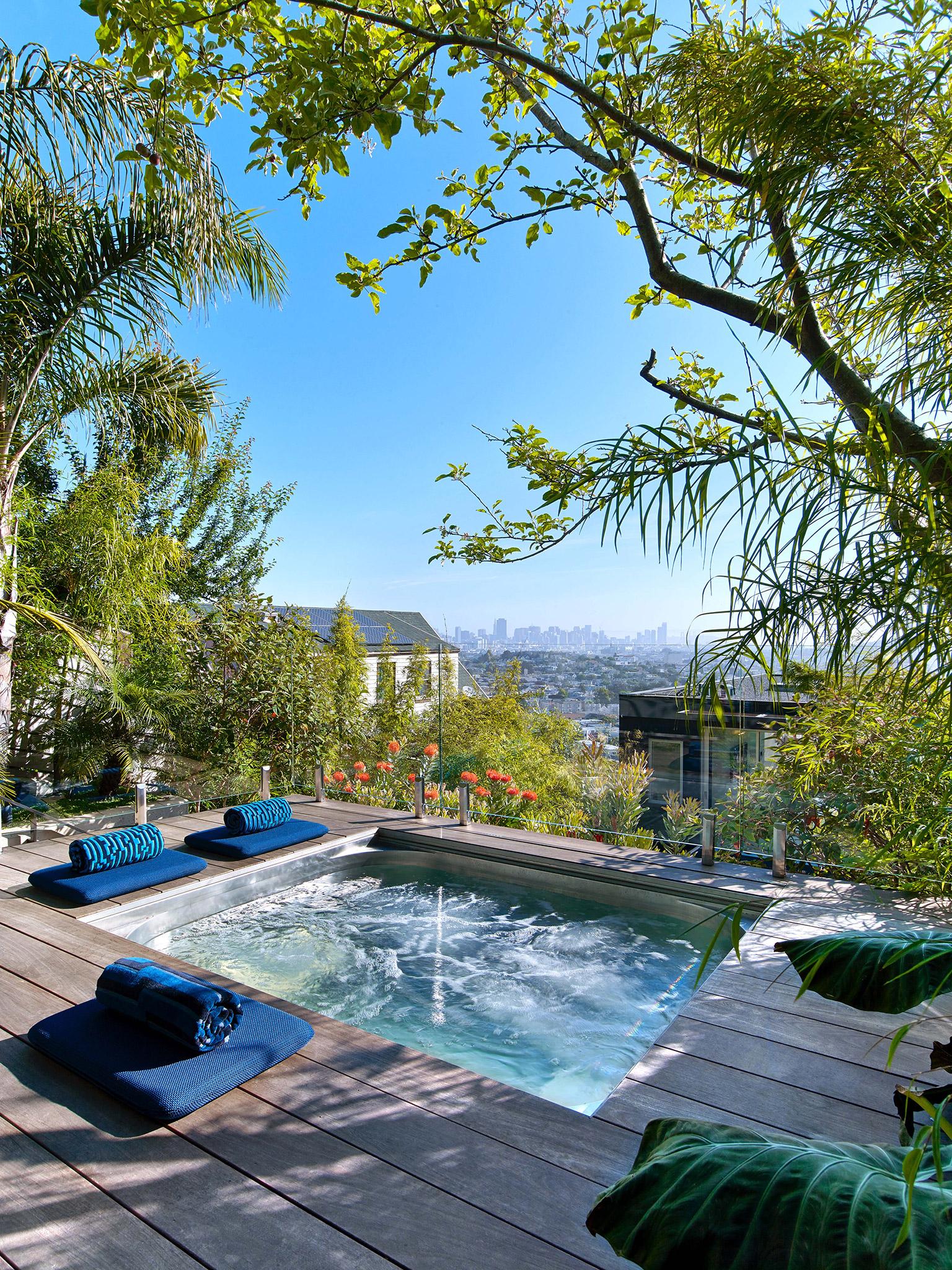
The home built for an entrepreneur features a tiered garden with a Jacuzzi, BBQ fire pit and a lawn for catching sun rays

Your support helps us to tell the story
This election is still a dead heat, according to most polls. In a fight with such wafer-thin margins, we need reporters on the ground talking to the people Trump and Harris are courting. Your support allows us to keep sending journalists to the story.
The Independent is trusted by 27 million Americans from across the entire political spectrum every month. Unlike many other quality news outlets, we choose not to lock you out of our reporting and analysis with paywalls. But quality journalism must still be paid for.
Help us keep bring these critical stories to light. Your support makes all the difference.
The US city of San Francisco is famed for its elegant and ornate Victorian and Edwardian homes known as ‘painted ladies’. So, architects tasked with designing homes that make locals say ‘wow’ certainly have their work cut out.
But with the Glen Park Residence - featuring a moody, charred wood facade inspired by the Japanese process called shou sugi ban - US-based firm CCS Architecture have designed a home that would turn the head of even a veteran Bay area resident.
Inspired by iconic twentieth century architect Le Corbusier, who famously said a home is a “machine for living”, the project combines cosy and “introverted” living spaces with “extroverted” communal areas, most notably the tiered top floor with stunning views across the hilly city which features a jacuzzi, a sun-trap lawn and a fire pit for BBQs. The fourth floor features an especially designed mirrored cube which allows visitors to drink in the vista.
We spoke to Melissa Werner of CCS Architecture about the home her firm designed for a San Francisco entrepreneur.
Tell us a little about your practice. There are two offices in New York and San Francisco. F founded the San Francisco office in 1992, which has 15 people. Then I founded the New York office in 2005, which has 10.
What is your practice known for? We are known for primarily two project types. Restaurants, which range from large epic destination ones to boutique shops in farmers markets. And high-end modern residential projects, which range from ground-up homes, to city homes, to urban lofts.
How would you sum up the project in five words? Modern, minimalist, refined, sophisticated, iconic.
What was the brief for this project? This view home was carefully created for a San Francisco entrepreneur. This is his first residence and he worked avidly with the design team while also becoming cultivated in architecture and design.

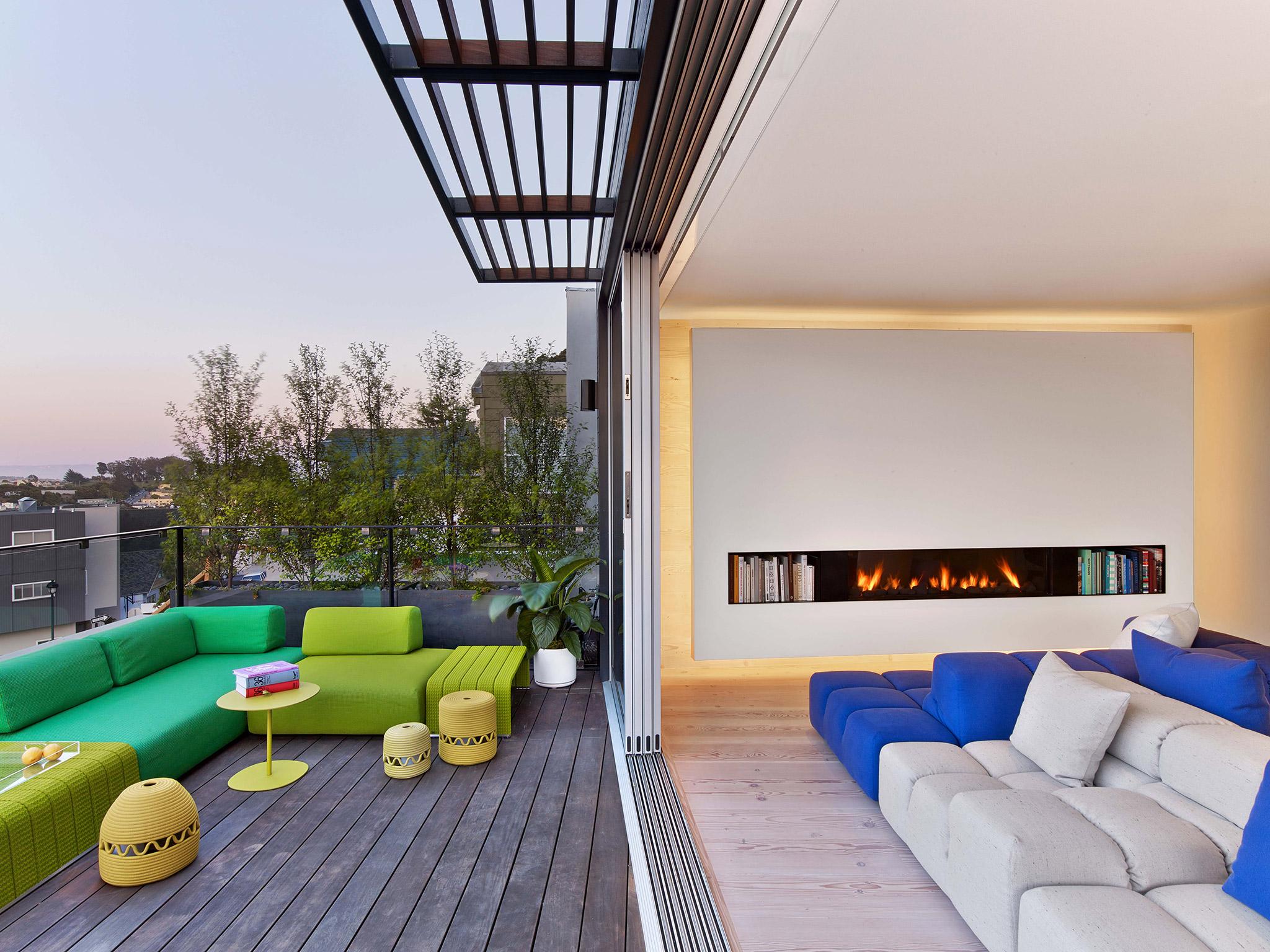
The house was created for everyday living, intimate meetings, and occasional entertaining. It’s meant to be a ‘place’ to share ideas with others and foster a sense of community. Architecturally, the building is designed to capture the views, bring in the daylight, and establish a sense of calm through simplicity and open space. Since the views progress from great to amazing as one moves up through the house, the main living space is at the top, which is the fourth floor. This space opens up on both ends, with the living room to city views one way and with the kitchen to the terraced yard at the other. Within this main space are three notable design elements: the floating fireplace wall, the polished stainless steel ceiling over the dining table, and the steel, glass, and wood staircase, which drops down though all of the floors and acts as a vertical counterpoint. Overall, it’s restrained white minimalism balanced with wood, colour, and the city beyond.
The third floor has the study, music room, and master suite. The master bathroom has floors and walls of carefully selected and matched Carrara marble slabs that are contrasted with dark fixtures to evoke a spa. The second floor has a guest suite and the media lounge. The first floor has the two-story entry with a red pivot door that was fabricated in Italy. Wide-plank reclaimed Douglas Fir floors are in most rooms, which are meant to be a common denominator to the design. The Douglas Fir is also on the stairs, and is combined with blackened steel and glass.
Unlike the white interior, the exterior is charcoal and meant to look iconic. The wood siding, which is Cypress, was custom charred and then installed. In Japan this type of siding is called shou sugi ban, where the charring renders the wood less flammable and with a stable dark finish. Here it was selected for those reasons, for its unique beauty, and to distinguish the home from its neighbours.
Although the spectacular views are the main connection to the outside, the terraced yard is also meant to play a significant role in the experience of the house. It was designed and built by Sculpt - a bay area landscape firm. It steps up through a series of board-formed concrete walls and is bordered with tall landscaping to privatise it. Each level has a specific function. The first is an outdoor kitchen and fire pit for gathering. The second is stainless steel Jacuzzi for plunging. The third is a lawn for sunning.

The fourth and final level has ‘The Cube’ designed by CCS, which is a 10’x10’x10’ mirrored cube slightly rotated to juxtapose it to the site. From the house and yard levels below, it’s meant to be a mysterious and changing sculptural object that reflects the landscape, the sky, and the view depending on your viewpoint. It essentially photographs its surroundings. Inside the cube, it transforms to a circular drum-shaped space with an oculus to the sky. The actual and conceptual path is that you ascend up through the house, then up through the yard to the highest place on the site with the best city views, and then you go around to the back of the cube through a portal, and enter it. Once inside, since the view of the sky is now the only view, the city and its action is pleasurably left behind. Its DNA is based on a James Terrell Sky Space. The structure of the cube is reinforced fiberglass, which allows for the tapered oculus to come to a knife-edge. It was craned into place in five pieces and then had the exterior and interior finishes applied. The circular seating is precast concrete with integral heat, while the walls are white marker board, and the ceiling is felt. It’s meant as an intimate place for ideation, conversations and contemplation

What did you hope to solve as you designed this home? We wanted to make it a unique masterpiece for the owner; custom fit to his personality and lifestyle. At the same time, we wanted to maximise the views and light.
What makes this space unique? Each floor is distinct. The lowers floors with bedrooms are intimate and sort of introverted. The top floor, which is living really opens up both ends to views and nature and so this part being the top and the crescendo is very extroverted. As a common thread, it’s all very white.
What was your inspiration for this project? The views created a lot of inspiration. And like most projects, the work of Le Corbusier and light filled Mediterranean rooms. Materially, the idea of blending light walls and ceilings colors with wood inspired design directions.
What was the toughest issue you encountered when this building was being designed and built? It went smoothly and nothing was very tough. If anything, it was getting the façade to be iconic and different than the neighbors’. Its features black charred wood (typical to Japan), which isn’t common in San Francisco.

What do you wish you could change in hindsight? I like it as it is.
What sort of experience do you hope people using this space have? Soothing and calming.
Please add anything else you feel is important. Creating a successful project is often tied to having a good client and a strong team. This had both.
Subscribe to Independent Premium to bookmark this article
Want to bookmark your favourite articles and stories to read or reference later? Start your Independent Premium subscription today.
Join our commenting forum
Join thought-provoking conversations, follow other Independent readers and see their replies
Comments