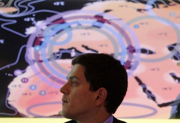
Government launches map to highlight global warming threat

Your support helps us to tell the story
From reproductive rights to climate change to Big Tech, The Independent is on the ground when the story is developing. Whether it's investigating the financials of Elon Musk's pro-Trump PAC or producing our latest documentary, 'The A Word', which shines a light on the American women fighting for reproductive rights, we know how important it is to parse out the facts from the messaging.
At such a critical moment in US history, we need reporters on the ground. Your donation allows us to keep sending journalists to speak to both sides of the story.
The Independent is trusted by Americans across the entire political spectrum. And unlike many other quality news outlets, we choose not to lock Americans out of our reporting and analysis with paywalls. We believe quality journalism should be available to everyone, paid for by those who can afford it.
Your support makes all the difference.A nightmare in the not-very-distant future: the map below shows the enormous temperature rises which British scientists believe the planet may be experiencing in as a little as 50 years from now if global warming remains unchecked.
Released by the Government today, it illustrates a rise in global average temperature of four degrees Centigrade by 2060, and as such represents a dramatic acceleration of previous forecasts made as recently as 2007 by the UN’s Intergovernmental Panel on Climate Change (IPCC).
The point of the map, launched by the Foreign Secretary David Miliband and the Energy and Climate Change Secretary, his brother Ed, is to show that a four-degree average temperature rise over the whole globe (which takes into account the seas as well as the land surface) equates to very much greater rises over the land alone, especially at higher latitudes – as one goes north or south towards the poles. The darker the colour, the higher the heat increase.
Thus, although Britain may see an average rise of three degrees – which itself would have very damaging consequences in terms of drought and extreme heatwaves – Siberia and northern Canada may experience an immense rise of 12 degrees or even more. Scientists believe this may trigger a climate “tipping point” – the melting of the permafrost under the northern tundras which, if it happened, would release large amounts of trapped methane gas, which in turn would boost global warming yet further.
Over the Arctic Ocean in the far north, the rise might be a colossal 15 or even 16 degrees, which would mean the complete disappearance of all the Arctic ice in summer and spell extinction for ice-dependent wildlife such as polar bears and walruses.
But wildlife is the least of it. The map shows rises of five degrees in Asia, seven degrees in Africa and parts of the US and eight degrees in the Amazon rainforest, all of which will have devastating consequences for some of the world’s poorest people. Rises like this are likely to lead to maize and wheat yields falling by 40 per cent across the world, and rice yields in China, India, Banglasdesh and Indonesia falling by 30 per cent – all at a time when world population is expected to grow from 6.9 billion today to more than 9 billion people.
Water resources are likely to be severely affected by a 70 per cent reduction in run-off around the Mediterranean, southern Africa and large areas of South America, forest fires are likely to be much more dangerous everywhere and warming-induced sea-level rise will affect millions more people in low-lying nations such as Bangladesh.
The IPCC’s latest forecast, issued in 2007, suggested an average rise of 1.8 to four degrees by 2100, but recently Hadley Centre scientists have revised both the extent and the timescale, suggesting that if global warming remains unchecked, a four-degree rise is now possible as early as 2060 – very much in the lifetime of people born today. This is because emissions of carbon dioxide are rising around the world far faster than was anticipated even a few years ago.
In essence, the map represents what researchers now think likely to happen if emissions are not controlled by the world community, which is meeting at Copenhagen in December to try to construct a new global climate treaty.
Speaking at the Science Museum, where the map was launched, the Foreign Secretary warned of a “high pressure” future of water and food shortages, mass migration and conflict if the world failed to tackle the problem. “The reason for publishing this map is that for many people, not only in our own country but around the world, the penny hasn’t yet dropped that this climate change challenge is real, it's happening now,” David Miliband said. The effects were not in “some far flung future” but 4C rises could happen in his children’s lifetime, he said, adding: “And the penny hasn’t dropped that Copenhagen is the chance to address the challenge – on a global scale.”
Join our commenting forum
Join thought-provoking conversations, follow other Independent readers and see their replies
0Comments