Star Wars typographer reveals the story behind that iconic opening title sequence
Typographer Dan Perri's crawling text is as famous as the films themselves

Your support helps us to tell the story
From reproductive rights to climate change to Big Tech, The Independent is on the ground when the story is developing. Whether it's investigating the financials of Elon Musk's pro-Trump PAC or producing our latest documentary, 'The A Word', which shines a light on the American women fighting for reproductive rights, we know how important it is to parse out the facts from the messaging.
At such a critical moment in US history, we need reporters on the ground. Your donation allows us to keep sending journalists to speak to both sides of the story.
The Independent is trusted by Americans across the entire political spectrum. And unlike many other quality news outlets, we choose not to lock Americans out of our reporting and analysis with paywalls. We believe quality journalism should be available to everyone, paid for by those who can afford it.
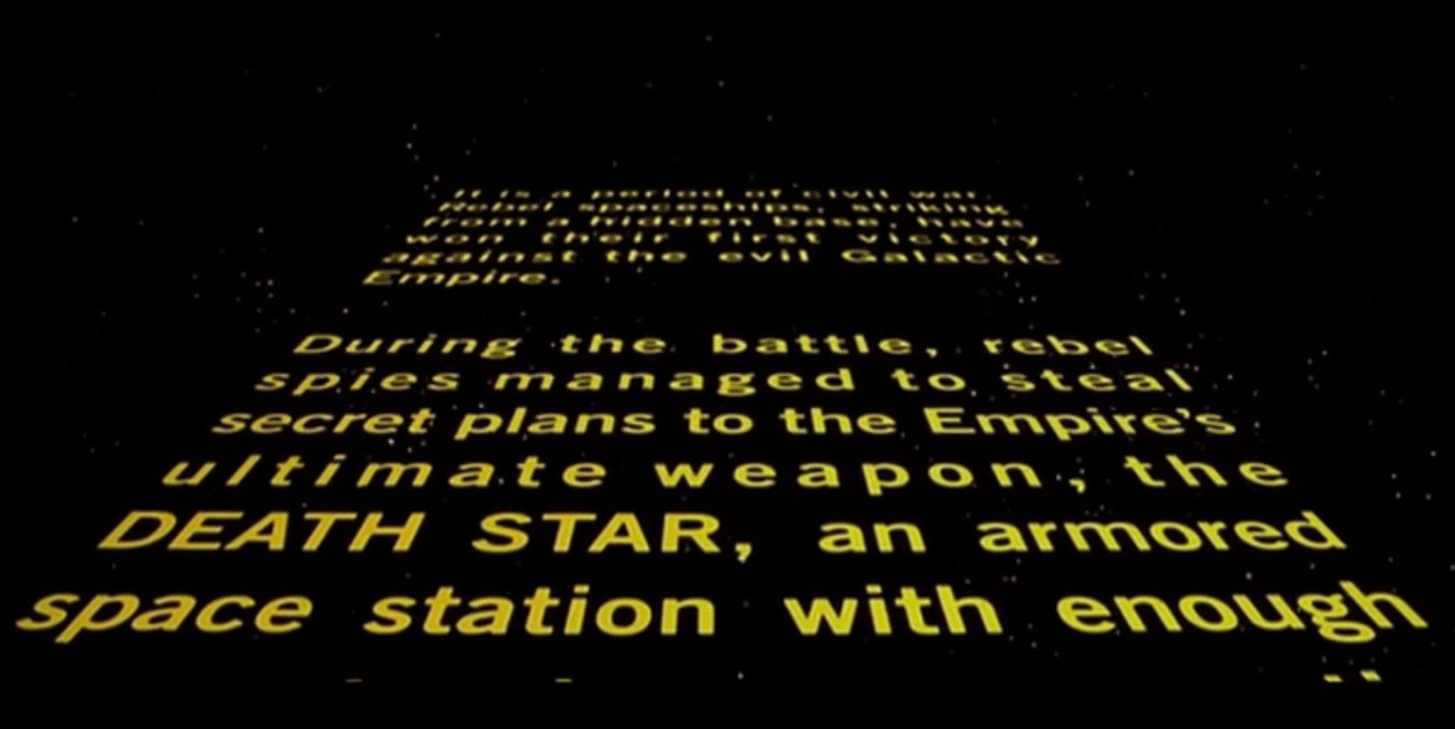
Your support makes all the difference.The opening title sequence of Star Wars, with its scrolling yellow letters, is as iconic as the movies themselves.
Typographer Dan Perri is the man behind the crawl. The prolific designer has spent 40 years working on the first thing cinemagoers see when a film begins: its title. From Taxi Driver and The Exorcist to Airplane! and Nightmare on Elm Street, Perri has worked on more than 400 films and TV projects.
Many title companies today offer assembly line solutions but Dan has stuck firmly to offering personal attention to each and every movie, ensuring that the end title accurately sets the tone from the moment the lights go down.
Perri spoke to film magazine Little White Lies recently, telling Adam Woodward in an interview that “a good title conveys a message while relating to the most important elements of the story or lead character”.
For 1977’s sci-fi smash Star Wars, later renamed Star Wars: Episode IV - A New Hope, director George Lucas asked Perri to study Thirties and Forties serials such as Flash Gordon and Buck Rogers for inspiration. It was only when he saw the 1939 dramatic Western Union Pacific, about the building of the railroad across the American West, that he settled upon the idea of an opening shot “looking down the track with the titles rolling up the track towards the camera”.
“I visualised that in outer space with the titles rolling away from the camera,” he said. “George wanted this preamble explaining to the viewer what had happened in the story up to that point, so I had to deal with several lines of text as opposed to a handful of words.”

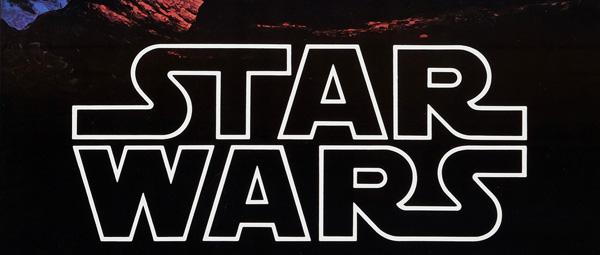
Peri experimented with various different techniques before achieving his aim by rolling the text out from underneath the camera “toward an invisible horizon line”. The last thing to add was the logo, that comes just ahead of the preamble, “blasting onto the screen and then travelling back towards the horizon, pulling the legend that follows into shot”.

Lucas describes the opening sequence bewitchingly in the Star Wars screenplay: “A vast sea of stars serves as the backdrop for the main title. War drums echo through the heavens as rollup slowly crawls into infinity.”
Join our commenting forum
Join thought-provoking conversations, follow other Independent readers and see their replies
Comments