David Hockney's Painting and Photography at Annely Juda Fine Art, review: An unfortunately banal exhibition
What is striking about the representations of people in this exhibition is the fact that they evoke nothing in particular

Your support helps us to tell the story
From reproductive rights to climate change to Big Tech, The Independent is on the ground when the story is developing. Whether it's investigating the financials of Elon Musk's pro-Trump PAC or producing our latest documentary, 'The A Word', which shines a light on the American women fighting for reproductive rights, we know how important it is to parse out the facts from the messaging.
At such a critical moment in US history, we need reporters on the ground. Your donation allows us to keep sending journalists to speak to both sides of the story.
The Independent is trusted by Americans across the entire political spectrum. And unlike many other quality news outlets, we choose not to lock Americans out of our reporting and analysis with paywalls. We believe quality journalism should be available to everyone, paid for by those who can afford it.
Your support makes all the difference.My first encounter with David Hockney was aged 11, when the teacher of my primary school class pinned a reproduction of his 1967 painting A Bigger Splash to the blackboard and told us to copy it. We were oblivious to the cool modernism of the Los Angeles scene, the balance of monotone blue on blue, the elegance, the gay erotics which so often featured in Hockney’s paintings of this time. What ensued was 30 muddy copies of the copy.
Hockney’s trick of showing the moment just after the surface of the water has been broken, the white plume of froth rising up, the person who has jumped into the pool invisible and underwater, points to both his sense of humour and his life-long interest in playing games with representation itself. The moment of the splash is a split-second, but the froth took Hockney seven days to paint. As he has suggested, the border around the image blocks the illusion that the viewer can crawl straight into the painting, indeed, jump in the swimming-pool herself.
While A Bigger Splash is absent, a similar kind of game-playing is evident in an exhibition of Hockney’s brand new painting and photography, which has just opened at Annely Juda Fine Art, London. All the works were made this year and last year in Hockney’s Los Angeles studio, where he relocated from his hometown of Bridlington, Yorkshire, in 2013, following a stroke and the tragic death of one of his assistants. They follow the profusion of vast vivid landscapes of Bridlington, which Hockney made on his iPad for the 2012 Royal Academy blockbuster, A Bigger Picture, the title a reference to that 1960s swimming-pool.
While the iPad paintings celebrated the wild English countryside, these new works are notable for their limitation to the interior of the studio. They all show scenes inside; the outside world has been temporarily renounced.

In Hockney (2013), the engrossing documentary made by Randall Wright, the artist is quoted as saying that changing style or subject matter does not mean a rejection of what came before; it is simply the act of looking round a different corner. This is a nice way of describing his many decades of creative restlessness, which has ranged over new technologies, people and places, but remained remarkably consistent.
Hockney’s oeuvre is benign. His joyous colours are inspired by Matisse, his fascination with form by Picasso. His work is rarely menacing; rather, it is friendly. For this reason, he has been cast as a national treasure, which runs the risk of making his work seem banal.
Unfortunately, this exhibition is banal. For the most part, at least. The works veer from traditional portraiture to experiments in Photoshopped “photographic drawings”. They seem to be offcuts, experiments in perspective, with heavy-handed references to art history, but an overall effect that is amateurish. Hockney’s sophistication as an artist lies in his great draughtsmanship and colour, not his use of digital technology.
Now 77, Hockney moved from Bradford to study at the Royal College of Art in 1959, before living in America for many years. He was a prominent figure in British Pop Art, achieving early fame for his bleached blond hair and strange outfits as well as his art. His working-class origins have informed his democratic approach to art, which he has always seemed ready to explain to a general public. This has helped to make him the most renowned living British painter following the death of Lucian Freud.

The best works here are the simplest ones: my favourite painting in the exhibition is The Chair (2015), which shows nothing more than a chair, unmanipulated by technology, somehow tender and vulnerable, with its bandy wooden legs, sky blue background, and soft shadow. This is a chair indebted to Van Gogh – not innovative, but bright and sunny.
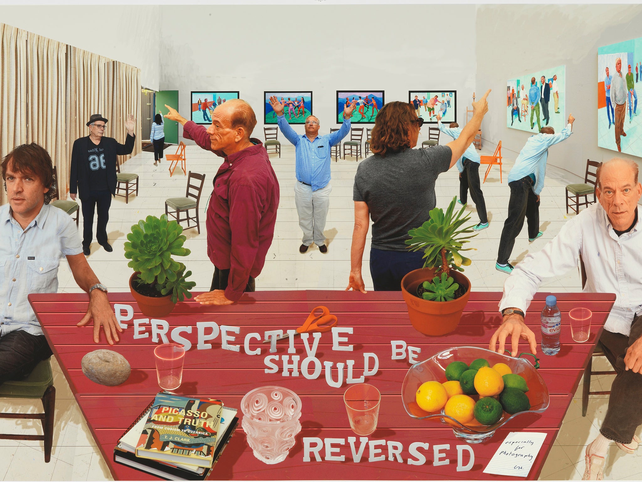
In The Chairs (2014), the single chair of the painting has been cloned and multiplied, filling the space of the artist’s studio. Hockney photographed the chair from a range of angles, then inserted it into this digital montage, or “photographic drawing”. The Chairs seems akin to The Birds in the sense of a sudden proliferation of a thing of its own accord. The image is not threatening, however, but nonsensical. The scene has no resonance. Photographs of two men are shown in the foreground, sitting on chairs and chatting. Another man is entering through a green door in the far corner, carrying yet another chair. Hockney is fascinated by optics; the chairs offer multiple perspectives in the Byzantine or Cubist tradition, deviating from the single perspective tradition of Western art, but this is an in-joke.
What is striking about the representations of people in this exhibition is the fact that they evoke nothing in particular. Far from Hockney’s stylised and chic portraits of Seventies London, such as Mr and Mrs Clark and Percy (1970-1), or his loving portraits of his mother, these faces indicate no story of interest. They are neither contemporary nor dated, neither English nor American. They could be anyone, but their generic quality is itself not a feature of the work. They are not men without qualities, haunted by a lack of identity, but simply not rendered in an aesthetically interesting way. Here Hockney has not made a virtue out of banality – they are just forgettable.
Worse still is an image in the same series in which most of the chairs have been replaced by photographs of people, standing at odd angles to one another and pointing at Hockney’s paintings, which hang on the walls of the studio. Rather than directing the gaze of the viewer to the art, the focus rests on the absurdity of the scene. One man stands with both arms raised like an evangelist, his blue shirt untucked. What is the point of this?
The work is jarring, but perhaps not in the way that Hockney wished. His aim is to distort perspective by photographing the chairs close up. They appear as lucid as though they were near, but they are small and far away. He writes in the catalogue: “Each photograph has a vanishing point, so instead of just one I get many vanishing points. It is this that I think gives them an almost 3D effect without the glasses. I think this opens up photography into something new.”
A vertiginous effect is shown in A Bigger Scrabble Players (2015), a digital montage in which three men play Scrabble. The Scrabble board itself is squeezed to offer a reverse perspective; the letters tilt dizzyingly towards the viewer. The men appear hyper-real, as Hockney intended, which does confuse the sense of distance from the image. However, the image is once again not interesting.
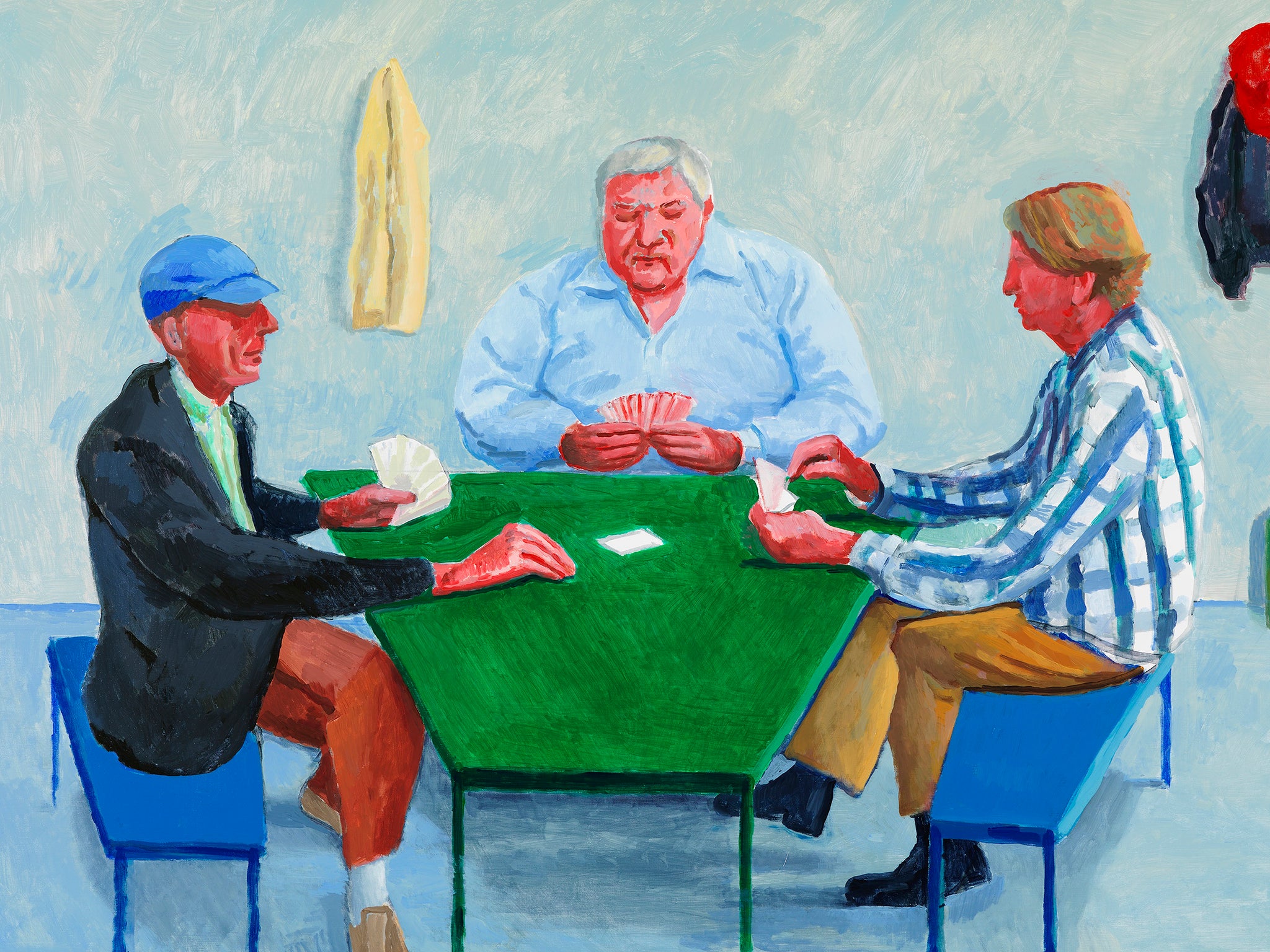
In A Bigger Card Players (2015), the same three men play cards at the same green table, though instead of a blue curtain behind them, Hockney’s paintings hang on the wall. This comes closer to creating a “3D effect without the glasses”. There is an illusion of inhabiting the same space as the subjects in the artwork, but this is quickly dispelled by the fact that the viewer is (most likely) not insane.
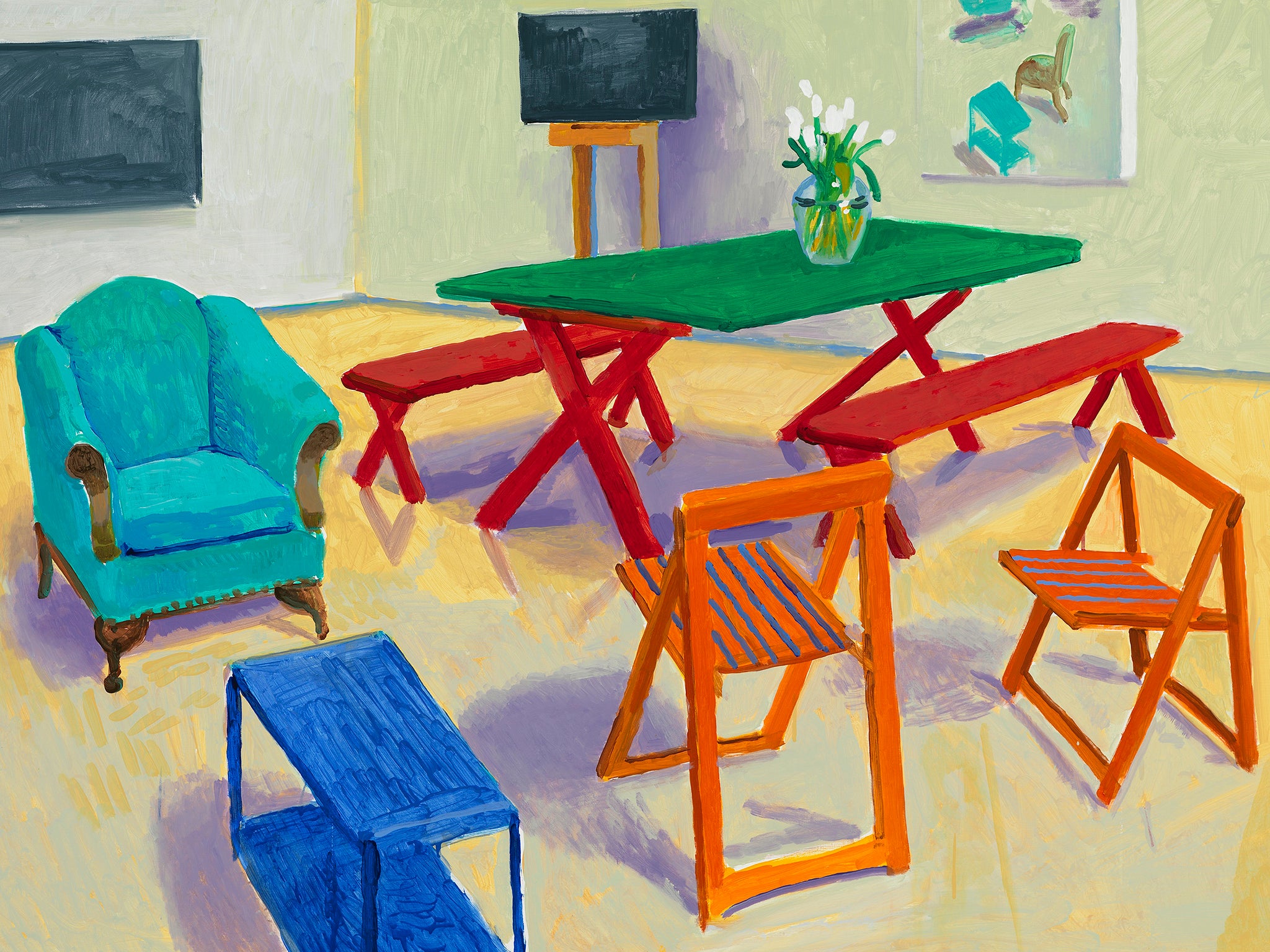
The image of the men playing cards recurs. The most successful paintings are Card Players #1, #2, and #3, which are straightforward, with no Photoshopped elements. They are pleasant, inoffensive. Hockney has said that he can understand why Old Masters such as Caravaggio also painted card players: they sit still for long periods without acknowledging the artist. The most enchanting paintings here, however, are those in which people are absent. Studio Interior #1, #2, and #3 show fabulously coloured arrays of furniture, irregular, but not vertigo-inducing. Only the canvases on the easels and the walls point to a darker state: they are stormy black monochromes, a welcome break from all this cheeriness.
David Hockney: Painting and Photography; Annely Juda Fine Art, London; to 27 June
Join our commenting forum
Join thought-provoking conversations, follow other Independent readers and see their replies
Comments