Great Works: For the 5 Vowels (U) (1976) Dom Sylvester Houédard

For free real time breaking news alerts sent straight to your inbox sign up to our breaking news emails
Sign up to our free breaking news emails
Some people hold on to it, but the typewriter, the old manual, is almost gone from our hands and our lives. We went electric, then word-processor, then laptop. In the process, the gap widened from finger to mark. Tangible paper has turned into intangible screen (and ink need never emerge at all). Yet, in the meantime, we still haven't thrown away our pens. And so on our desk today there lies an open chasm: between pure handiwork and the cleanest mechanisation.
Or that's how we often see the distinction, hand against machine. But in The Nature and Art of Craftsmanship (1968) the craftsman and teacher David Pye defined the difference more accurately. The contrast, he said, was between "the workmanship of risk" and "the workmanship of certainty". Almost all workmanship employs tools or machinery (and hands). The question is the relationship between means and end. How far can the precise form of the work be guaranteed? How far will there be some play in it, making the result risky, unpredictable?
Pye said: "The most typical and familiar example of the workmanship of risk is writing with the pen, and of the workmanship of certainty, modern printing." The computer page – non-printed, immaterial – would only be a further advance in certainty, another move in the direction away from handwriting.
Around the time that Pye wrote his enlightening book on craftsmanship, the poet and Benedictine monk, Dom Sylvester Houédard, was turning the manual typewriter into a visually creative medium. His works offer an object lesson in art and certainty and risk. He called these typed pages "typestracts". Pye mentions the typewriter too. He considers it "an intermediate form of workmanship, that of limited risk. You can spoil the page in innumerable ways, but the n's will never look like u's, and however ugly the typing, it will almost necessarily be legible."
That's true, if you use the machine in the standard way. But if you type an n, take the page out, put it in upside down and type a u, they will look very similar. And if you fill a page with typing, then put it in again and type over it, legibility will start to go. This is the kind of way Houédard proceeded. He used the manual machine more manually than most, and beautifully. He employed standard equipment. His typestracts were all typed on a portable Olivetti Lettera 22 (a fact, he said, Olivetti showed no interest in). He limited himself to the normal ink ribbons, with their normal colours, blue, black and red, along with various coloured carbon papers too.
Houédard's workmanship combines Pye's categories. He uses the typewriter's "certainty" elements. There's the fixed hold of the page, the set spacing between characters, the straight and parallel alignment of the lines. There's the fact that all his marks are struck with his machine's available 86 key heads. He also exploits the typewriter's "risk" elements, the source of what (by strict secretarial standards) would be considered failings, slips and spoils. The keys can be struck with variable pressure. The ink ribbons fade. The roller can be disengaged, the page moved freely through it or reset at a different angle. Keys can be repeatedly overprinted.
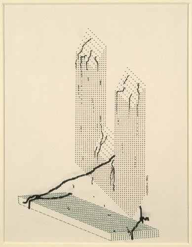
Houédard's visual repertoire is as wide as his medium allows. Some of his typestracts are made with the letter keys, and composed from words. Some have the graphic keys – the dashes, the dots, the brackets – doing most of the work. Typestracts can be abstract indeed, flat shimmering surfaces, in which areas of colours of different intensity mesh and blend. Or they can use their strokes to construct quasi-images, often three-dimensional forms. For the 5 Vowels (U) is like that. It comes from a group of five images, each one a variation on the shape of a vowel. Here, the letter U is translated into a straight-edged solid, a two-pronged structure. It's reminiscent of a tower block or a tuning fork.
A letter is an obvious enough subject for typewriter art, but there aren't any u's or other letters used in this U-structure. Its planes are made entirely from full stops, more and less widely spaced. These dots are in regular lines and columns, and most of them are set on the page in the normal upright way, and very tightly. But the dots that form the wider-spaced, up-facing planes run at diagonals. Houédard didn't do this freehand. He turned the page in the machine, and used stencils to guide his slanted forms. In other words, he added some extra "certainties" to the typewriter's built-in regularities.
The two-pronged U-structure seems to be floating off the ground, or rather just above a separate oblong base. (It could be a 3D underlining.) The U-structure is typed in black ink, but this base is in green – carbon paper? - and it's constructed not from dots but from a stitching and criss-cross of dashes.
What makes the U-structure look weightless is the way it's joined to this base. A length of string, knotted around the ends of the base, and threaded through the U, is holding it down. Now this length of string is a piece of freehand drawing (though very laborious). It is created by gradually moving the page by hand through the roller, as numerous individual black strokes are closely overprinted and accumulated into a loose, fat, twisted line.
The strokes are so dense, so merged together, it's a little hard to identify which key has been used to make them, but probably it's the capital O. And they're struck with a degree of "risk" – an uncertainty as to where they will exactly land on the page – that's beyond even the messiest typist or the jerkiest machine. This imprecision imbues the knotted string with its fluid or organic character. There are other drawn lines, but thinner and shorter. They hang on the tops and sides of the U-structure. They're probably made from dots. They look like seaweeds trailing down it, or sea-worms slithering up it. There are further tiny drippings or droppings, descending and going off the bottom. All these marks give the U-structure a feeling of being underwater. That makes sense of its weightlessness. Perhaps that's what U stands for.
By turning the typewriter to these novel purposes, this typestract uses it both with and against its grain. It employs its existing regularities and vagaries, and then introduces new ones. Some of these are very alien to a typewriter's habits, like the exact but oblique alignments, or the free drawing. But they're combined with normal typing practices, like the lines of dot dot dots... The familiar only makes the strange seem stranger. The typestract shows a medium being put through its paces, and a body being put through a machine. It sets certainty in dialogue with risk, painting with text. It stresses typewriting as motion. As dsh wrote: "typestracts – rhythm of typing – action poetry."
For the 5 Vowels (U) can be now seen at the ICA, on the Mall, London SW1, in a show called Poor. Old. Tired. Horse., a very miscellaneous anthology of visual-verbal artworks, until 23 August. There are a dozen typestracts, including the rest of the 5 Vowels. They'll remind those who can remember of the nature and art of the manual.
About the artist
Dom Sylvester Houédard (1924-92), priest, scholar and avant-garde poet, preferred to spell himself in lower case – and signed himself simply as dsh. He was a unique figure in British culture. Born in Guernsey, he worked in British Army Intelligence, and joined the Benedictine Prinknash Abbey in Gloucestershire. In 1959, he was ordained. He became literary editor of the Jerusalem Bible (the Catholic English translation), and wrote theological works on Meister Eckhart. At the same time, he was a leading figure in the British wing of the Concrete Poetry movement. As well as numerous shape poems and typestracts (the name had been coined by the Scottish poet Edwin Morgan), he invented the beautiful palindrome "drawninward" (it reads both ways, but it's drawn inward to the "I" at its centre) and the brilliant word turnover "deus/snap" (in which God snaps himself). He worked on the borderlines of Western and Eastern spirituality, and of Christianity and modern art. He said: "inevitably i feel my own work as the continuation of the tradition of benedictine poets and artists..." He needs to be recalled. (Houédard is pictured above left with Pete Brown, Bob Cobbing and Ernst Jandl performing the Kurt Schwitters sound poem "Fury of Sneezing" at Arlington Mill, Bibury, Gloucester, June 1966).
Subscribe to Independent Premium to bookmark this article
Want to bookmark your favourite articles and stories to read or reference later? Start your Independent Premium subscription today.
Join our commenting forum
Join thought-provoking conversations, follow other Independent readers and see their replies