Serpentine Pavilion 2015: Spanish architects create most playful design to date
'Less if bore' for Jose Selgas and Lucia Cano
Your support helps us to tell the story
From reproductive rights to climate change to Big Tech, The Independent is on the ground when the story is developing. Whether it's investigating the financials of Elon Musk's pro-Trump PAC or producing our latest documentary, 'The A Word', which shines a light on the American women fighting for reproductive rights, we know how important it is to parse out the facts from the messaging.
At such a critical moment in US history, we need reporters on the ground. Your donation allows us to keep sending journalists to speak to both sides of the story.
The Independent is trusted by Americans across the entire political spectrum. And unlike many other quality news outlets, we choose not to lock Americans out of our reporting and analysis with paywalls. We believe quality journalism should be available to everyone, paid for by those who can afford it.
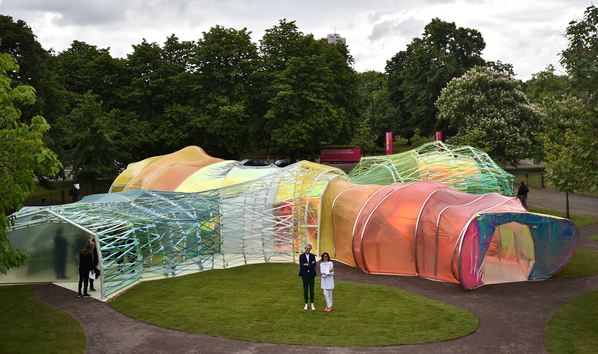
Your support makes all the difference.When the 2015 Serpentine Gallery pavilion was unveiled in London hyperbole beckoned. How, exactly, can the semi-opaque structure designed by the Spanish architects, Jose Selgas and Lucia Cano, aka Selgas Cano, be described? Riot of colour? Plastic fantastic? Surreal shimmer? Too glib.
But as Ed Vaizey, the Minister of Culture, Media and Sport uttered his anodyne tuppence worth of praise for the pavilion, a line from Marx and Engels’ 1848 Communist manifesto sprang to mind: “All that is solid melts into air.”
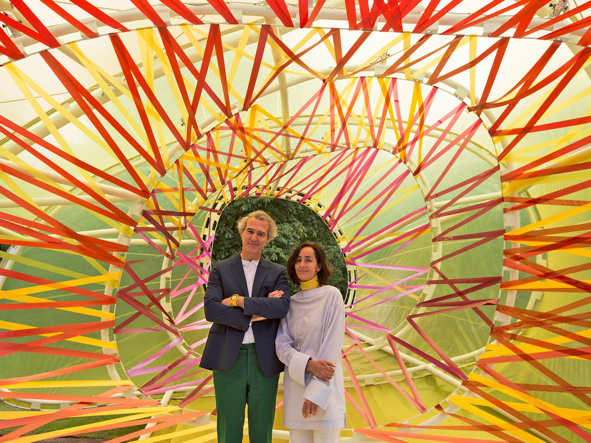
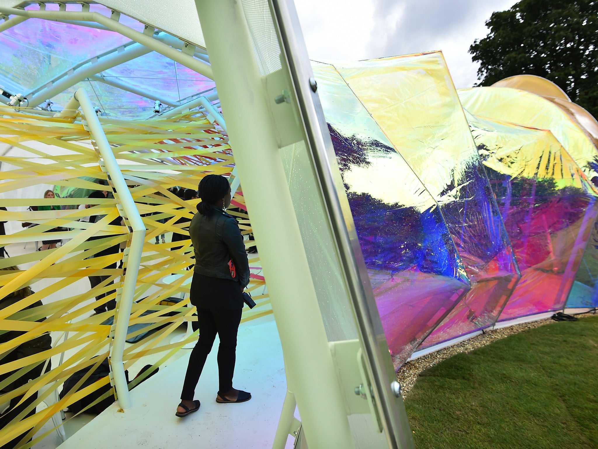
The pavilion a kind of amoeba whose four blobby pseudopodia reach out across the grass. You don’t so much walk into it as get vaguely absorbed by it. Everything about the structure, and its plastic harlequin coat of many colours, seems deliberately unresolved. The perspectives waver. The colours are distinct in places, chromatically freaky in others. It feels like a “thing” rather than architecture with a capital A.
Selgas Cano – whose Second Home scheme in Spitalfields announced the architects as very original in the way they created meandering spaces for business start-ups – have made no attempt to design a pavilion whose form provides a visual brandmark. “With some of the pavilions,” says Jose Selgas, “you get one image of them. This is different. You have to deal with it another way.”
He’s right. There is no obvious single way to use this pavilion: it creates an almost purely sensual experience that feels extemely loose-fit. The structure has a centre, except that is doesn’t feel central. The eye(and the feet) wander, fidgeting over the colours and details – the joins in the plastic, the clips and flanges that attach the plastic to the curves and angles of the white-painted steel frame, the gay strips of coloured plastic tied to the steel tubes and trembling in the breeze.
It’s the perfect setting for the Serpentine Gallery’s co-director, Julia Peyton-Jones, vivid in a bulbous but chic black beret, pink shirt, and chunky, red-lozenged necklace. In this pavilion, she might almost be a character from the Edwardian era novels of the German writer, Paul Sheerbart, whose ideas about coloured glass in architecture are an inspiration to Selgas Cano.
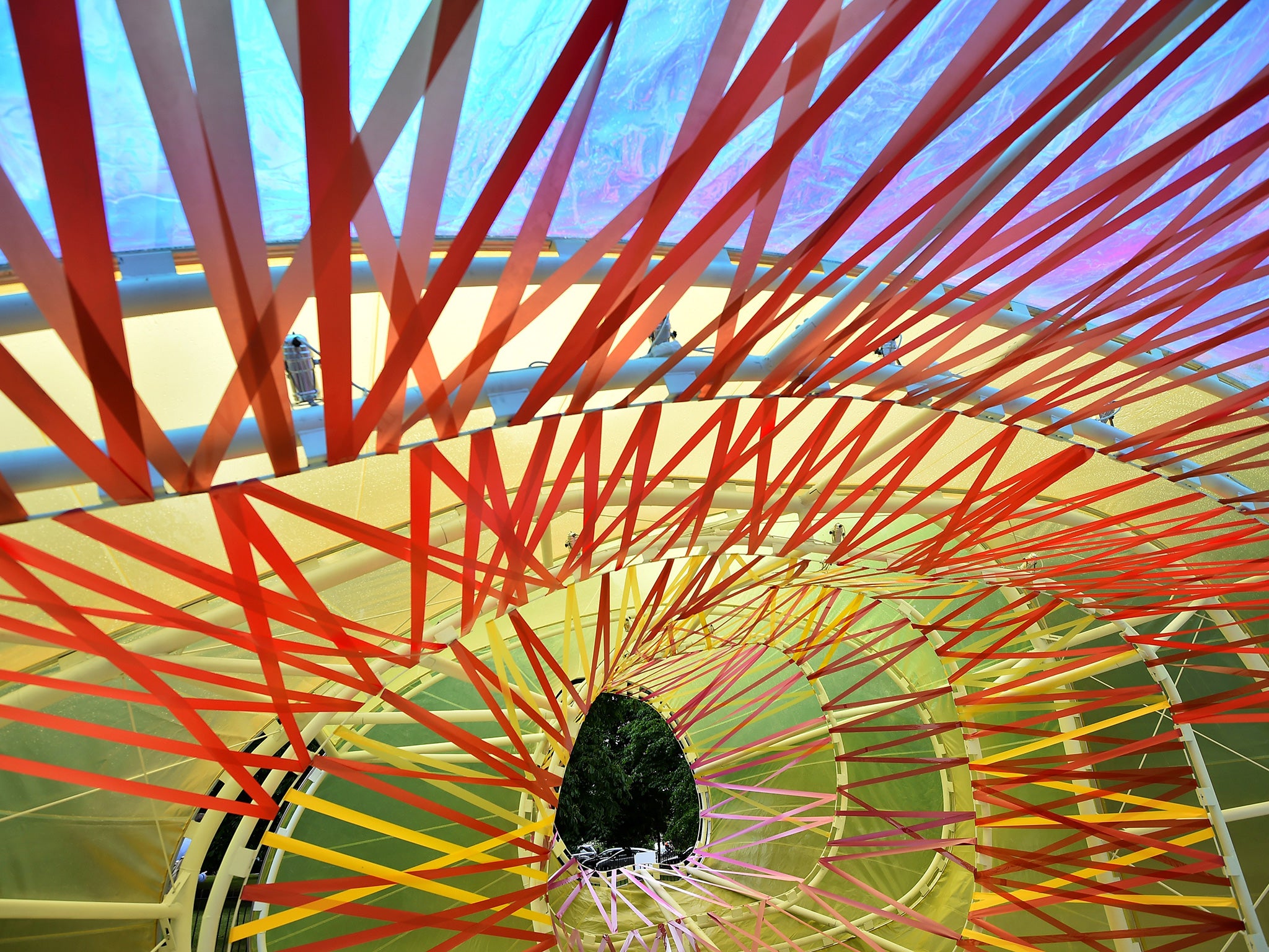
The architects speak of seeking a way to “allow the public to experience architecture through simple elements – structure, light, transparency, shadows, lightness, form, sensitivity, change, surprise, colour and materials.” But not in a checklist way, because it’s impossible to experience these things in distinct ways. The wavering tube-like spaces generate shape-shifting complexities of colour and structure that suggest a kaleidoscope in mid-melt.
The pavilion recalls two famously contradictory architectural statements. “Less is more!” declared the arch-modernist, Mies van der Rohe. “Less is a bore!” was the riposte of the godfather of postmodernist design, Robert Venturi.
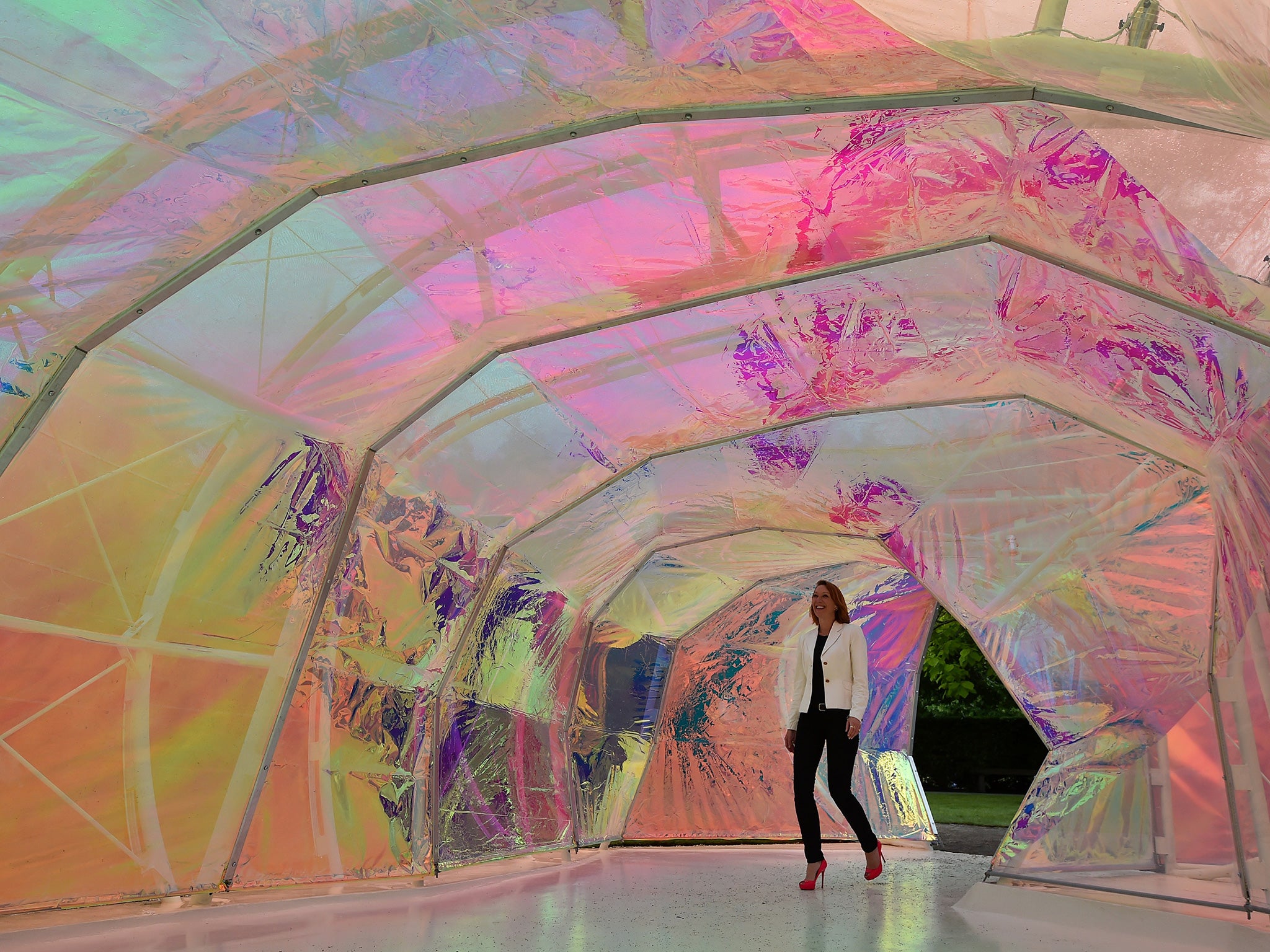
The architecture of the pavilion is stuck, like a butterfly, in the intersecting webs of these two proclamations. If you ignore their colours, the thin layers of plastic are very less-is-more. But the structure to which the pavilion’s delicate skin is attached is rather obtrusive: a surprising, and visually apparent, amount of steel-framed “grunt” was needed to achieve what is otherwise a softly-surfaced riddle of sensual effects. A case, perhaps, of all that is airy melting into solidity?
Mies van der Rohe is famous for another dictum: “God is in the details.” Not here they’re not. But they probably don’t need to be because, as Jose Selgas emphasises: “They told us this must be a temporary pavilion, and we’re very obedient!” In other words, this is a pop-up and drop-down fun palace, designed and completed in six months – and architectural fine-points are irrelevant.
Of all of the 15 Serpentine summer pavilions to date, this is the most playful. It looks, and feels, incomplete, which is probably its most intriguing quality. Selgas Cano have not created a pavilion that’s beautiful in any obvious way. But this is certainly the most beautifully childish pavilion in the 15-year history of the Serpentine Gallery’s annual contribution to fun and games in Hyde Park.
Join our commenting forum
Join thought-provoking conversations, follow other Independent readers and see their replies
Comments