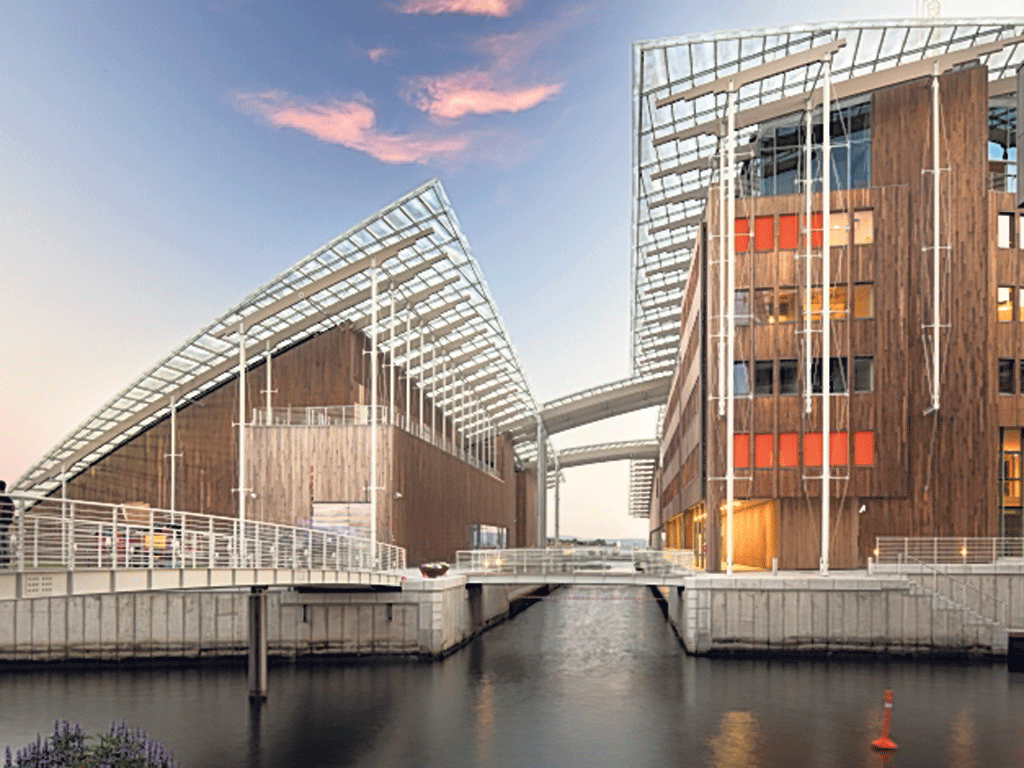
London's got the Shard – Oslo has the Comb-over
Renzo Piano has made his mark in the Norwegian capital

Your support helps us to tell the story
From reproductive rights to climate change to Big Tech, The Independent is on the ground when the story is developing. Whether it's investigating the financials of Elon Musk's pro-Trump PAC or producing our latest documentary, 'The A Word', which shines a light on the American women fighting for reproductive rights, we know how important it is to parse out the facts from the messaging.
At such a critical moment in US history, we need reporters on the ground. Your donation allows us to keep sending journalists to speak to both sides of the story.
The Independent is trusted by Americans across the entire political spectrum. And unlike many other quality news outlets, we choose not to lock Americans out of our reporting and analysis with paywalls. We believe quality journalism should be available to everyone, paid for by those who can afford it.
Your support makes all the difference.Iconic architecture usually comes complete with a punchy, bolt-on metaphor. In London, the feted architect Renzo Piano has given us the Shard, and the Pop art Central St Giles development, where the future is always much too bright. And now, in Oslo, Piano's Astrup Fearnley Museum has a swerving, high-sheen carapace of glass. Welcome to the Comb-over where, according to the Italian maestro, mental disturbance will make you feel better.
Welcome, in fact, to the epicentre of art-mafia-driven change in this most charming of Scandinavian capitals. As from February, those who can afford it can gaze down on the Comb-over from the angular balcony of the £2,500-a-night Oslo Suite of The Thief, Oslo's first six-star hotel. No porn channels here, just video art – and, by special arrangement, works from the Astrup Fearnley's massive collection on the walls of its 120 rooms.
This cheek-by-jowling of the culturally refined and the commercially wannabe-refined typifies Oslo's approach to new development. Around the museum lies the faux glitzy architecture of the mixed-use buildings in Oslo's arts and shopping quarters, Aker Brygge and Tjuvholmen. The architecture of the former is described by the Norwegian architect Ingerid Helsing Almaas as "a dressed-up bimbo on the arm of clean-shaven, double-breasted market forces."
Norway has a population of just five million, but generates petrodollar earnings and cash reserves worth the equivalent of more than half a trillion dollars annually; in those terms, Norway is the second wealthiest country in the world.
The architecture of the Astrup Fearnley Museum does not dramatise this hyper-wealth, but it certainly pumps up the volume of one of the world's most important private collections of modern and contemporary art. Jeff Koons's droll penetrations, Cindy Sherman's morbidly waxy poseurs, and Gilbert and George's panel God Loves Fucking, typify the 1980s vibe of the art on offer here.
The architecture that contains these sexualised visuals is rather demure and tailored with fastidious precision. "You must be really stupid if you do the same thing [architecturally]," says Piano. "You have your language, yes, but you tell different stories." The language of the design is absolutely characteristic of Piano's approach to museum buildings over the past decade: simple rectilinear forms oversailed by elegant, delicate-looking grids of glass or fins; not stupid, then, just familiar.
Despite its vitreous lounge-lizard comb-over, the museum is a pretty straightforward demonstration of modernist design; the aspen-clad walls of the buildings are smooth to the touch and razor sharp in their finer details, emphasising simple formal clarity. "This is fundamentally a roof with pieces under it", says Piano.
The cleverest design move is very simple. The fjord-side building, containing temporary exhibitions, is separated by a slim new canal from the permanent-collections building, and an office building. This removes any sense of overwhelming architectural mass, giving the museum ensemble the same scale as the surrounding commercial developments.
A key design inspiration was the Louisiana Museum of Art in Denmark, whose galleries meander in a big, irregular loop, some above ground, some partially buried in a hillside overlooking the Oresund.
The art experience is at its most interesting, and tense, in the permanent-collections buildings. Here, the galleries have unsettling spatial dissonances generated by the almost random, cut-and-paste arrangement of the spaces. Damien Hirst's bisected livestock, the pudendas of his Adam and Eve Exposed, and the seven panels of Matthew Barney's magisterially repellent Cremaster 5 paintings are perfectly at home in spaces that are, ultimately, a kind of architectural bondage.
Join our commenting forum
Join thought-provoking conversations, follow other Independent readers and see their replies
Comments