Fulton Centre hub in Manhattan named Building of the Year thanks to technique which channels light underground
Redesign of New York transport hub offers light at the end of the tunnel for benighted commuters

Your support helps us to tell the story
This election is still a dead heat, according to most polls. In a fight with such wafer-thin margins, we need reporters on the ground talking to the people Trump and Harris are courting. Your support allows us to keep sending journalists to the story.
The Independent is trusted by 27 million Americans from across the entire political spectrum every month. Unlike many other quality news outlets, we choose not to lock you out of our reporting and analysis with paywalls. But quality journalism must still be paid for.
Help us keep bring these critical stories to light. Your support makes all the difference.
Designing a groundbreaking, hi-tech new station to connect several subway lines in one of the world’s busiest cities is not just a matter of funnelling passengers in the right directions and keeping the trains running smoothly; now it’s also about channelling natural daylight underground.
The Fulton Centre hub in the heart of Manhattan has just been named Building of the Year by The Architects’ Journal, thanks largely to the sunlight it delivers to commuters via a scheme designed by a British firm.
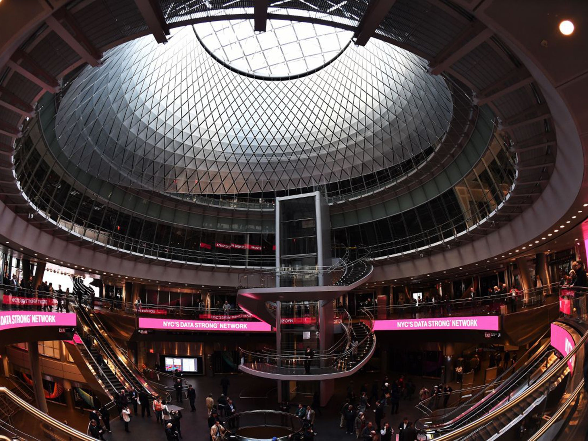
Grimshaw Architects’ means of directing light deep into the bowels of the huge transport interchange is the first of its kind: a six-storey funnel lined with a suspended mesh of 952 precisely positioned, diamond-shaped aluminium reflectors – and it is about to show off its star feature in the brightest of ways.
The station’s first summer solstice, on 21 June, should see around nine hours of reflected daylight streaming down through the atrium.

Grimshaw’s New York-based team was led by deputy-chairman Andrew Whalley and partner Vincent Chang, who said the design concept had come fairly quickly. “We were fascinated that the depth [of the subway lines] was so shallow. That meant light, exposure to the sky.”
The design – part of a $1.4bn multi-line masterplan laid out by UK engineering company Arup – was also inspired by biologist E O Wilson and his theory of biophilia: that people work and live better if they feel connected with nature.
This let-there-be-light element is not the only first that the hub has achieved. Because of delays caused by design and scheduling disputes over the still-uncompleted $3.7bn World Trade Centre transport hub, the Fulton Centre has set the benchmark for civilised subsurface interchanges in a city whose subway systems – originally built by competing companies – are notoriously badly linked.
At the original Fulton interchange, passengers waiting for trains endured packed platforms that were also used as corridors by those struggling to other lines via cramped switch-back routes. Things couldn’t be more different now.
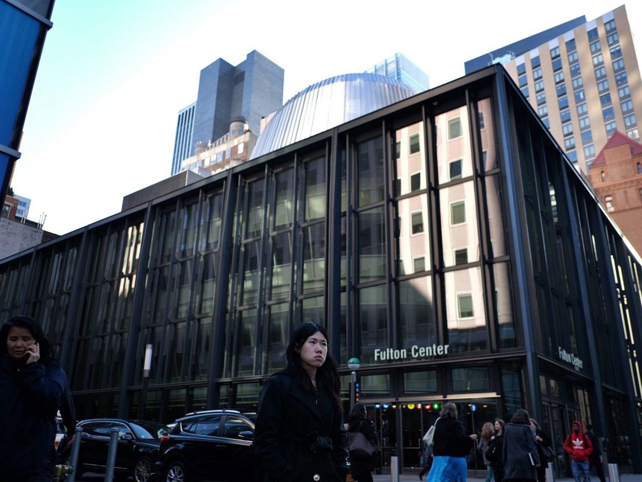
From the outside, the Fulton Centre gives no strong visual clues about the experience waiting for you within.
The base structure is an elegant but unshowy steel-framed box, a homage to New York’s historic iron-and steel-framed buildings such as the 19th-century Corbin next door. Rising from its no-nonsense base is the metal-sheathed dome that funnels light into the central circulation spaces below.
It is only when you walk into the ground-floor piazza that the drama of the architecture begins to unfold. Suspended above you is a two-storey “ring doughnut” of accommodation, currently being prepared as offices and restaurants that will overlook Fulton Street and Broadway.
Between the floor and the lower edge of the doughnut, you get your first glimpse of the central arena. Commuters swoop down into it on one of the four big banks of escalators, moving past huge bifurcated, multi-storey columns.
It is impossible not to look up at the daylight sluicing through the oculus and shimmering across the reflector array, which was co-designed by James Carpenter. It is positively theatrical: a commuters’ theatre-in-the-round.
Ultimately, though, the architecture is about making human movement between the lines for trains 4 and 5, and trains A and C, as efficient and pleasant as possible. And so the design’s “wow” factor duly segues into the “how” factor – a clarified system of connections that has finally erased the Centre’s troglodytic atmosphere.
But other, more satisfying kinds of history have been accentuated: one of the escalators cuts through the foundations of the Corbin building; elsewhere, a section of decorative wall tiling on one of the platforms is restored.
The architectural sophistication of Grimshaws’ untangling of this infamously herniated bit of infrastructure, right in the heart of New York’s financial district, has led to more major commissions in the US. The practice is currently designing transport-hub masterplans in LA and Washington, DC.
Now, they just hope they get their big moment in the spotlight on 21 June. Matt Franks, a lighting expert with Arup, told The New York Times: “The one thing we have to hope is that it’s sunny.”
Join our commenting forum
Join thought-provoking conversations, follow other Independent readers and see their replies
Comments