Britain's ugliest buildings: Which monstrosities should be nominated for the Dead Prize?
Following the architect Cameron Sinclair's introduction of the Dead Prize, an award for ugly buildings, John Rentoul reflects on some of the biggest blots on the UK landscape

Your support helps us to tell the story
From reproductive rights to climate change to Big Tech, The Independent is on the ground when the story is developing. Whether it's investigating the financials of Elon Musk's pro-Trump PAC or producing our latest documentary, 'The A Word', which shines a light on the American women fighting for reproductive rights, we know how important it is to parse out the facts from the messaging.
At such a critical moment in US history, we need reporters on the ground. Your donation allows us to keep sending journalists to speak to both sides of the story.
The Independent is trusted by Americans across the entire political spectrum. And unlike many other quality news outlets, we choose not to lock Americans out of our reporting and analysis with paywalls. We believe quality journalism should be available to everyone, paid for by those who can afford it.
Your support makes all the difference.What I love about Cameron Sinclair is that, when he was 16 and read an article about the 10 worst buildings in Bath, he decided to "track down every architect mentioned and ask why their project was deemed a failure". As he said: "Just imagine a 16-year-old at your office asking why your project sucks."
I can, and I wish people would do it more. I wish I had had the gumption to go and find Sir Basil Spence and ask: "What were you thinking?" I can't now, because he died in 1976, but not before he had designed the old Home Office building, now the Ministry of Justice, in Petty France. You know the one: the concrete mushroom just off St James's Park in London.
And he designed Kensington Town Hall, which is near The Independent's office in west London. When I walk the last part of the way to work, from Notting Hill Gate, the backstreets of Victorian houses are a delight, and you can see why rich people like to live here. But then there is the bit where I have to cross a road without turning my head to the right in case I should catch a glimpse of the 1970s ugliness and be struck down by the unfeeling arrogance of it.
So all praise to Sinclair, the co-founder of Architecture for Humanity, who has launched the Dead Prize to recognise bad buildings and honour their failings. Nominations for the prize are open until 1 November, and suggestions can be submitted via Twitter to @deadprize. His focus is "getting a better understanding of how a design failed" and to "hopefully do something to rectify these designs against humanity".
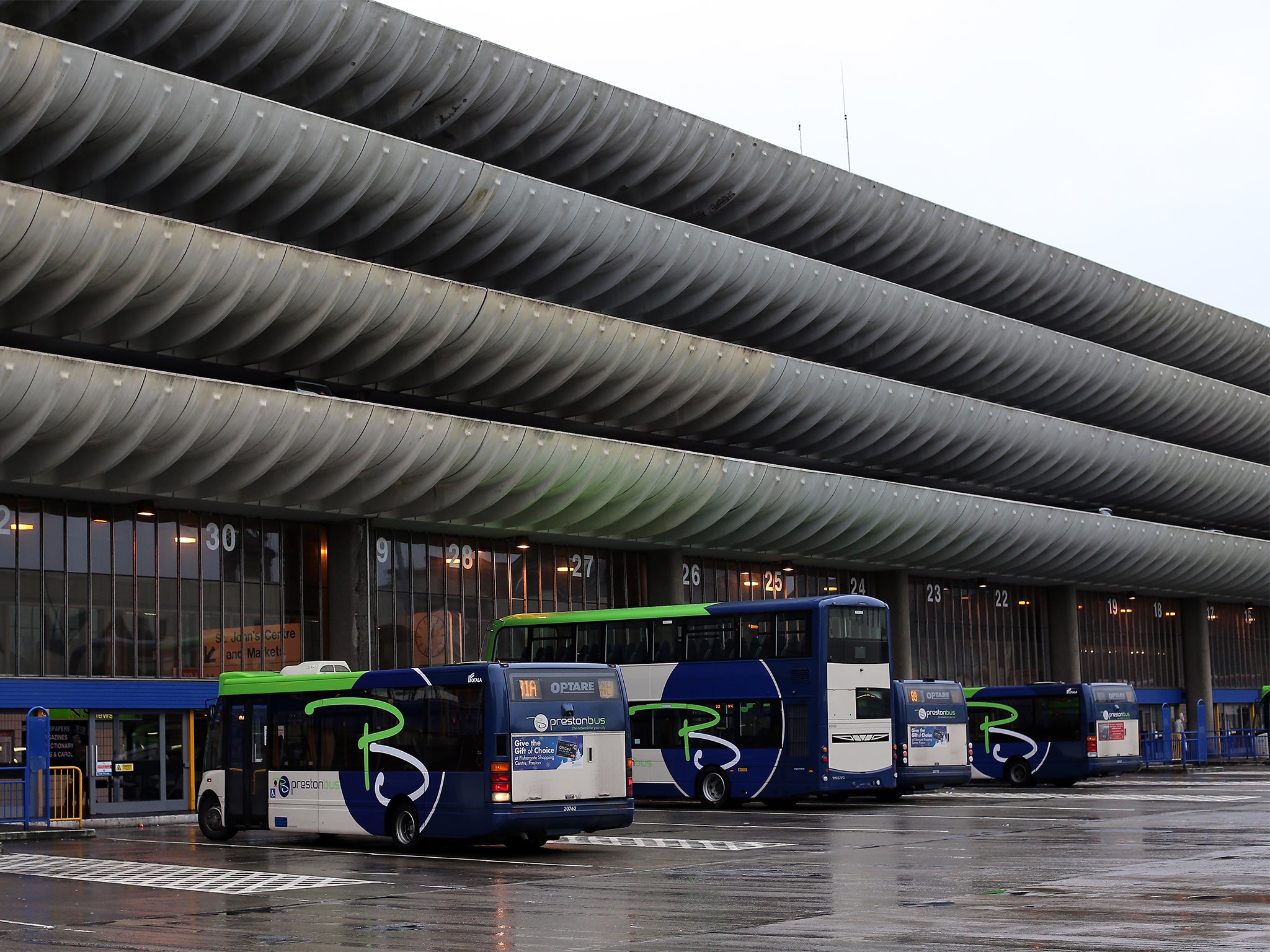
As soon as I have written this, I shall nominate all of the Top 10 Horrible Buildings which I compiled recently for The Independent on Sunday's magazine. As well as Sir Basil's gruesome legacy, I listed Preston bus station ("concrete lasagne"), the University of York's Central Hall ("the spaceship", in the middle of "the largest plastic-bottomed lake in Europe"), the Southbank Centre in London – and Buckingham Palace, just to prove that old buildings can be ugly, too.
I could easily have compiled a Top 100. There are so many not well-known buildings which perhaps have even more of a lowering effect on the quality of life of the people who cannot avoid them. Council estates such as Thamesmead in south-east London or Southwyck House in Brixton, or Brunel University in Uxbridge.

I admit my selection was biased: most of them are not just in Britain but in London. The Dead Prize is worldwide in scope – it was launched in Dubai – but I stick to what I know. It helps if you see these things week in and week out. Sometimes time softens the shock and can even turn it into affection. The ArcelorMittal Orbit, for example. I could not believe how bad that was when I saw the plans. Now, though, I think the twisted red metal tower is beautiful.
However, there is one building that I see nearly every week which I grow to dislike more each time. I cannot believe that I left it out of my Top 10. Now, I can put right my omission, by nominating it for the Dead Prize. I hereby name the Walkie-Talkie, a tower block in the City of London that is hideous, out of scale, wrong, a stupid shape, bigger at the top. It has a ridiculous white border around its unattractive outline.
Sinclair says he doesn't want to "name and shame", although I don't see how he can do one without the other, and the Walkie-Talkie is certainly a crying shame. deadprize.org
Join our commenting forum
Join thought-provoking conversations, follow other Independent readers and see their replies
Comments